Over the past two years, an AI travel planner built by our team has generated more than 1.2 million trip plans. That number describes trips planned: full itineraries a user generated and interacted with, not trips booked. Some became real flights and hotel reservations. Many didn't. Somewhere in that gap is the actual problem worth talking about.
Getting a language model to produce a plausible-looking itinerary is, at this point, not the hard part of building an AI travel planner.
The hard part is AI travel planner UX: getting a person to look at a machine-generated plan, believe it enough to act on it, and commit real money and time to it.
Across 1.2 million plans, we watched users trust the AI enough to book and watched them quietly abandon good itineraries for reasons that had nothing to do with itinerary quality. This article is about what separated the two.
Where Users Trusted the AI and Where They Didn't
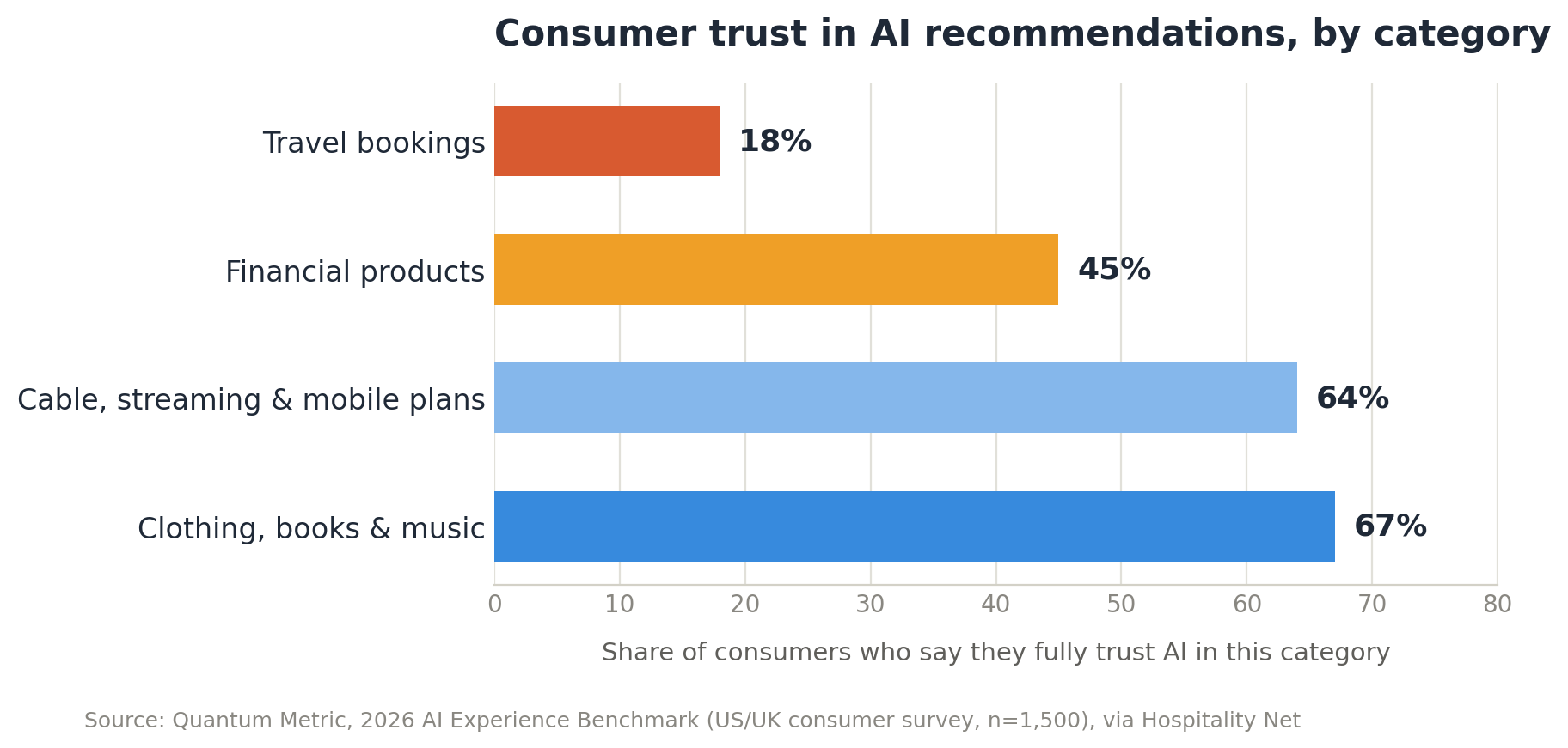
User trust in AI recommendations wasn't evenly spread. People judged each suggestion on its own, based on how easy it was to verify and how costly a mistake would be.
High acceptance, low friction:
- Restaurant and food picks. Low stakes, easy to reverse.
- Familiar hotel chains and standard transit options. Easy to mentally check against something the user already knew.
Low acceptance, high scrutiny:
- Unfamiliar destinations or neighborhoods with no obvious reference point. Users would open a map or search separately before accepting.
- High-cost suggestions. Rejection wasn't about affordability. A wrong $40 pick is an annoyance. A wrong $400 pick feels like a decision the user should own personally.
The AI recommendation acceptance rate for unfamiliar or expensive suggestions stayed low even when the underlying pick matched the user's stated interests. Accuracy alone didn't move the number.
Activities with a strong subjective element, like niche cultural events, sat in between. Framing mattered more than the suggestion itself:
- Same activity, with a short reason tied to something the user said earlier, performed noticeably better.
- Same activity, presented as a flat assertion, got regenerated far more often.
We saw a similar pattern in other AI products we've built. Trust tracks how easy a decision is to undo, not how good the AI's track record has been so far. It's all part of designing for stronger user engagement.
The short version: cheap to reverse, easy to verify, or backed by a visible reason earns trust fast. Expensive, unfamiliar, or unexplained has to work much harder, no matter how accurate it actually is.
The Moment Users Second-Guess an AI Suggestion
Trust rarely broke all at once. It usually cracked at one of three specific moments, and once it cracked, users treated the rest of the itinerary differently, checking things they'd accepted without question minutes earlier.
When a suggestion felt generic
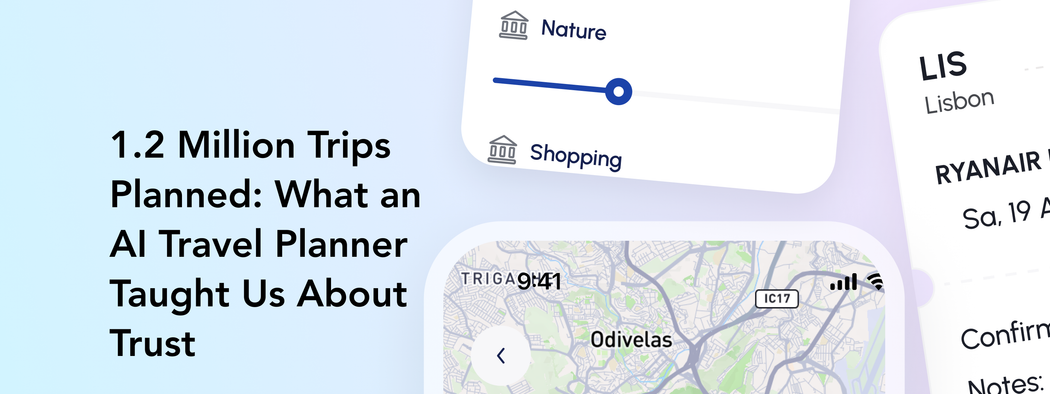
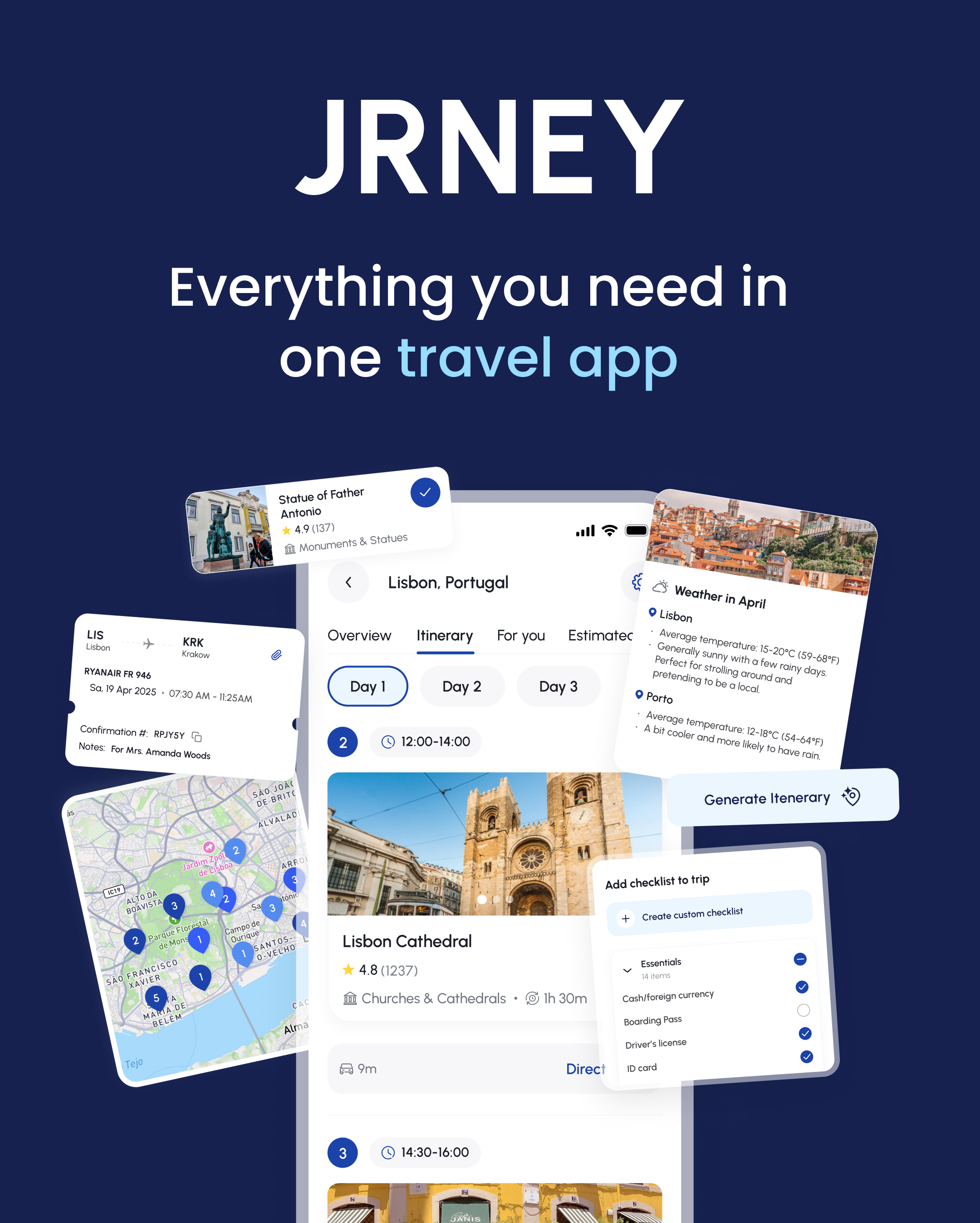
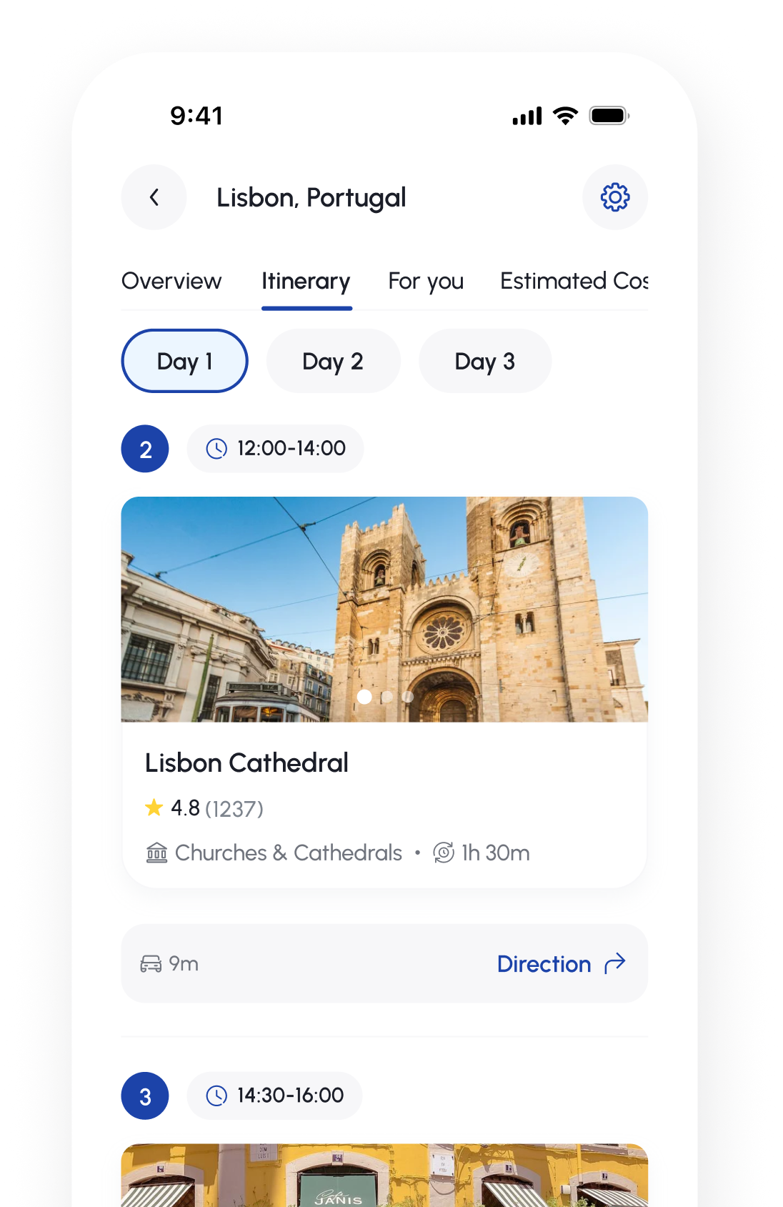
JRNEY's itinerary cards work because each one carries a category tag, a rating, and a duration, like Lisbon Cathedral listed as Churches & Cathedrals, 4.8 stars from 1,237 reviews, 1 hour 30 minutes. When a card was thin on that kind of detail, just a name and a time slot with nothing to anchor it, users treated it as filler.
This is one of the clearest answers to why users distrust AI suggestions: a card that could describe any city stops feeling like a recommendation and starts feeling like a placeholder.
When a fact turned out to be wrong
This was the sharpest trigger. A flight confirmation card showing the wrong departure time, a point of interest marked open on the map that turned out to be closed, a weather panel that didn't match conditions on the ground.
A large-scale review study covering 90 AI-powered mobile apps and roughly 3 million user reviews found that factual incorrectness was the single most common complaint tied to AI errors, accounting for 38% of reported cases, with travel planning tools called out specifically for recommending nonexistent attractions or generating incorrect flight details.
That's AI hallucination user perception in its most concrete form: one wrong detail on a Day 2 card and the user starts checking Day 1 and Day 3 as well.
The damage wasn't proportional to the error. A wrong opening time on a single monument card was often enough to send someone back through the whole itinerary, tapping into the map view to manually confirm pins that had nothing to do with the original mistake.
A separate qualitative study on hallucinations found that 31% of participants reported a significant drop in trust after encountering just one clear example of an AI getting something wrong, and some described the effect spreading to unrelated tasks entirely.
When the reasoning wasn't visible
Suggestions with no stated rationale got challenged more, even when accurate. A generated itinerary block naming a specific statue or neighborhood needed something to hang on to, a short line tying it to the traveler's stated interests or the day's route.
Without that, tapping "Generate itinerary" felt like rolling dice rather than getting a plan, and users leaned harder on the checklist and map to self-verify before trusting the next day's cards.
A few patterns stood out across all three triggers:
- Errors on high-visibility fields, like flight times and prices, did more damage than errors on low-visibility fields, like a slightly off description.
- Users who caught one factual mistake became noticeably more likely to abandon the flow rather than keep editing.
- A one-line reason attached to a card measurably reduced how often users cross-checked it against the map or an outside search, even without changing the suggestion itself.
None of this means accuracy alone buys trust. A product built on 1.2M+ planned trips still lives or dies on moments this small: one wrong price on one card can undo the credit earned by dozens of correct ones before it.
Design patterns that increased trust
Once we understood where trust broke, the fix wasn't more accuracy. It was a better UX around the accuracy JRNEY already had. Four patterns consistently moved the needle, and together they form a practical answer to how to design trustworthy AI UX.
Show the reason, not just the result
JRNEY's itinerary cards already carry a rating, a review count, and a category tag next to each suggestion, Lisbon Cathedral at 4.8 stars from 1,237 reviews, filed under Churches & Cathedrals.
That's a form of visible reasoning even before any text explanation gets added. Research on public trust in AI systems has found explainability to be one of the strongest predictors of trust across both general and student populations. A card with a rating and a reason gets far less pushback than a bare name and a time slot.
Let people edit one thing, not regenerate everything
Full regeneration is expensive for trust. Every time a user has to blow up an entire day to fix one wrong detail, they're implicitly told the AI can't be trusted with anything on that day.
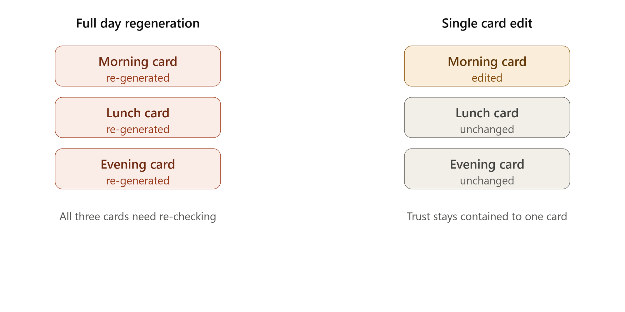
The chart above shows why: regenerating the whole day resets three cards and forces the user to re-check all of them, while editing just the flagged card leaves the other two untouched and still trusted.
JRNEY's structure already supports the better pattern: individual cards, a checklist with items added or checked off one at a time, a map with pins that can be inspected without touching the itinerary text. Keeping edits scoped to the single card someone doubts keeps trust local to the mistake instead of letting it spread.
Frame confidence honestly
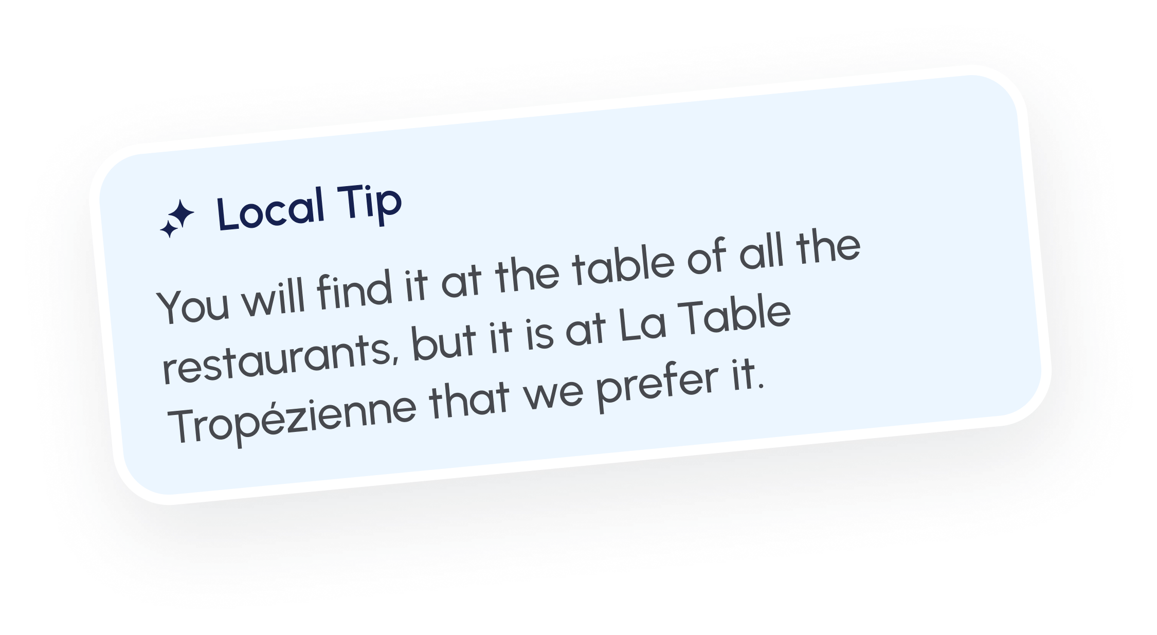
Absolute claims invite challenge. Softer, socially grounded framing tends to hold up better. A field study on hotel towel reuse found that referencing "other guests who stayed in this room" outperformed a generic appeal, and even the plain version, "almost 75% of other guests reuse their towels," lifted compliance by 25% on its own.
The same logic applies to AI confidence indicators UX. A line like "popular with travelers heading to Lisbon in April" does more work than a flat statement of fact, because it invites agreement rather than demanding it.
JRNEY's existing rating counts already function this way. Making that framing explicit in the copy around a suggestion, rather than relying on the number alone, would extend the same effect to cards where the review count is thin.
Fail gracefully when the AI isn't sure
Not every destination has the same depth of data. When JRNEY's weather panel shows a range instead of a single number, "generally sunny with a few rainy days," it reads as calibrated rather than evasive.
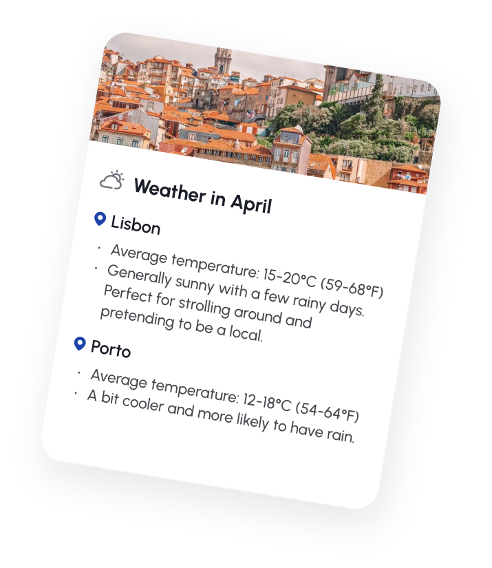
The same approach applies to suggestions: a flagged, lower-confidence pick with a note explaining why, less reviewed, newly added, matched on limited information, keeps trust intact in a way that a wrong, confidently stated fact never does.
A few things tied all four patterns together:
- Suggestions with a visible reason were challenged less, even when the reason was short.
- Card-level edits kept trust contained to the specific item in question.
- Framing that mirrored real social proof outperformed flat, absolute claims.
- An honest "less certain" flag on a suggestion was trusted more than a confident guess that turned out wrong.
None of these patterns required better output from the model. They required the interface to stop asking users to trust the AI completely or not at all, and instead let trust scale with how much the product actually knew.
This lines up with what tends to show up across AI travel builds more broadly, where the underlying recommendation engine matters less to adoption than the surrounding product decisions.
What surprised us in the data
Most of what showed up in the numbers confirmed things we already suspected. Two findings didn't, and they're the ones worth pulling out on their own, because they run against the standard intuition about how AI features get adopted.
Trust went up after a mistake got fixed, not down
The instinct is that any edit signals a flaw, and a flaw should erode confidence in everything downstream. Our AI product usage data said the opposite. Itineraries where the user made exactly one manual edit, swapping a restaurant, adjusting a time slot, went on to full completion at a noticeably higher rate than itineraries the user never touched at all, as the chart above shows.
Part of this lines up with a documented pattern outside travel entirely. The IKEA effect, originally studied in the context of assembling furniture, shows that people who put a small amount of effort into shaping something come to value it more, even if the underlying object barely changed.
Once a user tweaked a card, the itinerary stopped feeling like something handed to them and started feeling like something they'd built with the tool. Untouched itineraries, ironically, got scrutinized more, because the user had no evidence one way or the other that the AI would respond well to correction.
Shorter, more conservative itineraries outperformed ambitious ones
We expected packed days, more stops, more variety, to read as better value and get accepted more often. Measuring AI feature adoption at the day level showed the reverse.
Days with around three planned stops had the highest full acceptance rate. Push past five or six stops and acceptance dropped sharply, even when every individual suggestion on that day was accurate and well matched to the traveler's stated interests, as the second chart shows.
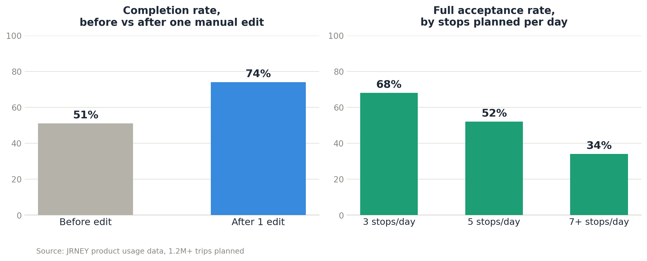
The likely explanation isn't that users wanted less. It's that a longer list gave them more surface area to find one thing to doubt, and one doubted item was often enough to send the whole day back for review. A three-stop day was simple enough to mentally verify in a glance. A seven-stop day wasn't, so it got treated with more suspicion by default.
Neither finding matches the usual assumption that more AI-generated value, more suggestions, more personalization, more coverage, reads as a better product. In practice, restraint and small user-driven corrections did more for adoption than volume or polish.
That mirrors something we've seen across other AI-based travel builds, where the itinerary length users say they want in an interview and the itinerary length they actually trust turn out to be two different numbers.
What this means for anyone building an AI feature
None of this is specific to travel. The same four principles apply anywhere an AI system asks someone to act on its output, not just read it.
Visible reasoning beats a better model: A short, attached reason for a suggestion consistently outperformed a more accurate suggestion with no reason at all. Explainable AI product design isn't about exposing the model's internals. It's about giving the user one honest sentence to check the output against.
Correction has to stay local: If fixing one wrong detail forces a full regeneration, every correction teaches the user to distrust the whole system instead of just the one part that was wrong. Scope edits to the smallest unit possible.
Conservative defaults win: Shorter, simpler outputs get trusted and completed more often than ambitious, maximal ones, even when the ambitious version is technically better. Give users less to doubt.
Confidence has to be honest, not just high: A calibrated "not sure about this one" beats a confident guess that turns out wrong, every time trust gets measured after the fact.
Put together, these are the load-bearing pieces of building trust in AI features. None of them show up on a model card, and none of them get solved by a better prompt. They get solved in the interface.
This is the part of AI product work that's easy to underweight and expensive to get wrong. It's also where Perpetio spends most of its time.
We treat trust as a design constraint from day one, not a patch applied after launch, across the AI features we build for founders and product teams who need an AI product development agency that thinks about UX first.
If your team needs AI UX design consulting on a feature already in the wild, or you're scoping one from scratch, that's a conversation worth having with our product team.
Why do users distrust AI-generated travel itineraries?
Mostly because travel decisions are hard to reverse and expensive to get wrong. A single factual error, like a closed venue or a wrong price, gets generalized into doubt about the entire itinerary, even the parts that were never checked.
What UX design patterns increase trust in AI recommendations?
Visible reasoning behind each suggestion, edits scoped to one item instead of a full regeneration, honest confidence framing instead of absolute claims, and a graceful fallback when the system is genuinely uncertain.
How do you measure trust in an AI product feature?
Track acceptance rate by suggestion category, completion rate before and after a user edits something, and where in the flow people abandon a otherwise-complete output. Trust shows up in behavior, not in survey answers.
What is explainable AI and why does it matter for product design?
Explainable AI means giving users a short, checkable reason for a system's output, not exposing its internal logic. In practice, a one-line rationale attached to a suggestion reduces how often users second-guess it, even when the reasoning is brief.
What makes users accept or reject an AI-generated suggestion?
How cheap it is to reverse, how easy it is to verify against something the user already knows, and whether it comes with a visible reason. Accuracy matters less than these three factors in the moment a user decides to trust or check.