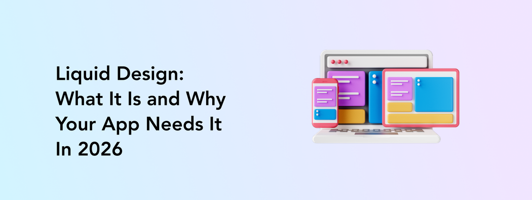
Liquid UI design is often seen as the next generation after responsive design. Instead of adapting only to screen sizes, it also adapts to user behavior, context, and flow.
Liquid design is an approach where layouts and interface elements continuously adapt to the user’s environment and actions.
The interface changes dynamically to reduce confusion and make interactions feel more natural and effortless.
In this article, we will explore what liquid design is, how it differs from responsive design, and how to implement liquid design in your products.
The Problem With Fixed Design in a Multi-Device World
Outdated app design struggles in a world where users constantly switch between phones, tablets, laptops, foldables, TVs, and wearables.
A rigid layout that looks fine on one screen can quickly become frustrating on another. Try to remember what a pain it is to scroll through a non-adaptable website on your mobile browser.
Device fragmentation is growing every year. In 2026, there are more than 5.7 billion smartphone users worldwide and over 7.5 billion active devices, showing that many people now use multiple devices daily.
And that’s only mobile devices! Most people also use computers, smart TVs, tablets, etc.
The challenge is not only screen size. Different operating systems, device brands, resolutions, and hardware capabilities all affect the user experience. Android fragmentation alone still spreads users across several OS versions and device types.
As a result, fixed interfaces and rigid layouts can feel outdated very quickly. Users expect apps to move naturally across devices. They want to start watching a show on their phone and continue where they left off on the smart TV. And this goes for every action.
Liquid Design vs Responsive vs Adaptive: What's the Difference?
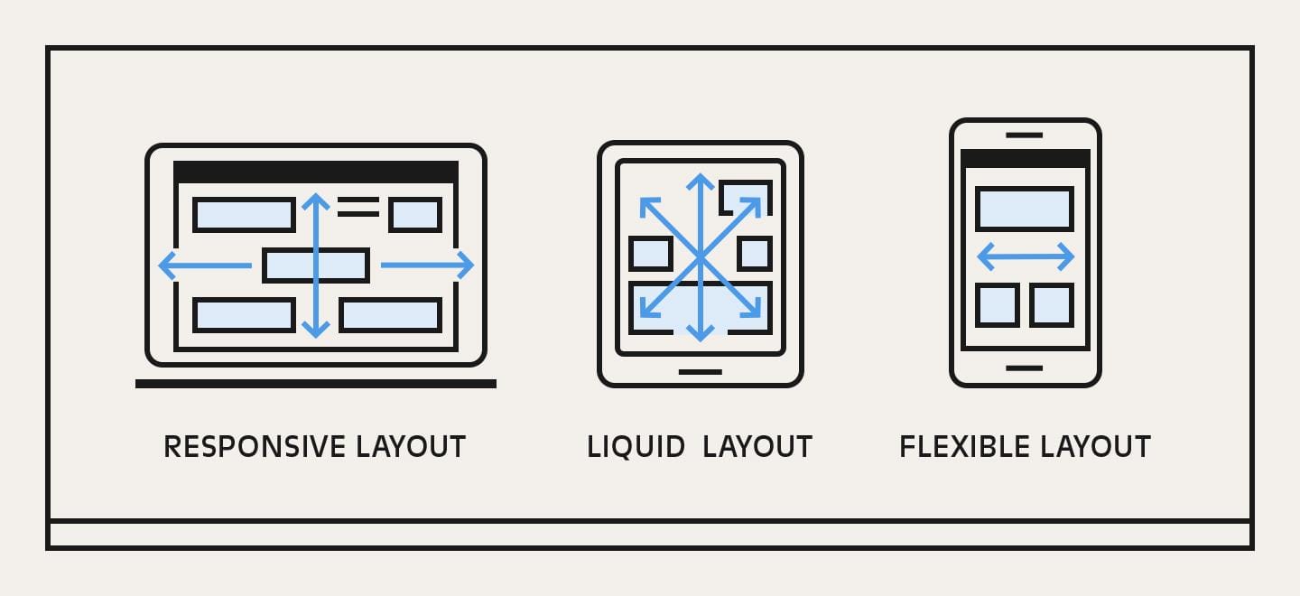
Responsive, adaptive, and liquid design all help apps work across different devices, but they do it in different ways:
- Responsive design resizes layouts to fit screens.
- Adaptive design loads predefined layouts for specific devices.
- Liquid design goes further by continuously adjusting the interface based on how people interact with the app in real time.
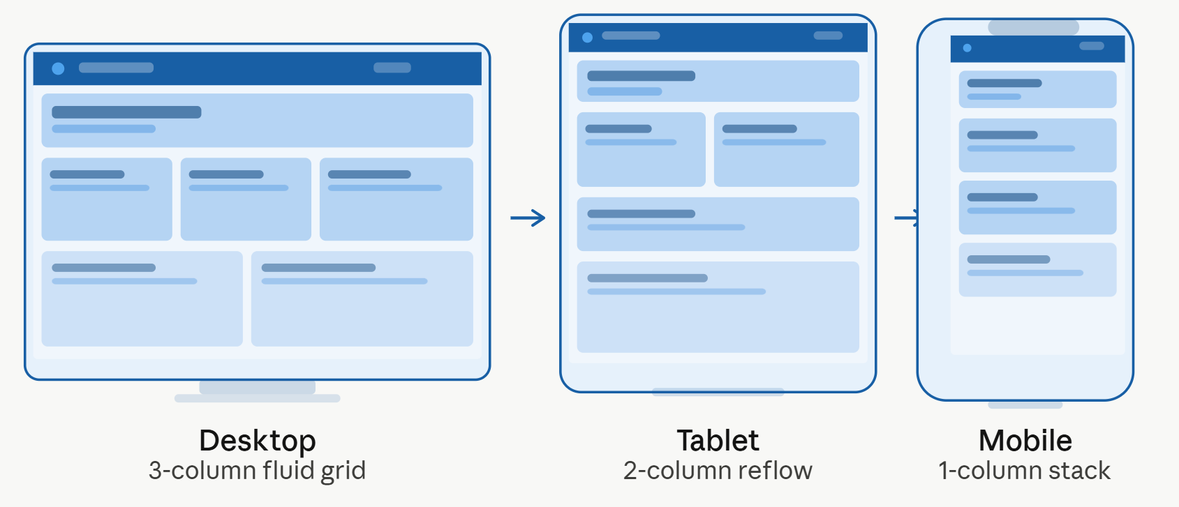
Responsive design uses flexible grids and elements that automatically resize depending on screen dimensions.
For example, a shopping app may rearrange product cards from four columns on a desktop to one column on mobile.
Adaptive or flexible design uses several fixed layouts designed for specific screen sizes. The app detects the device and loads the layout that fits best.
Say, a news app may show a completely different navigation menu on tablets than on smartphones.
Liquid design creates interfaces that continuously adapt while the user interacts with the product. The layout, content, and interface elements can shift dynamically to reduce cognitive load.
For instance, a productivity app may surface shortcuts, tools, or actions based on what the user is currently doing.
Core Principles of Liquid UI Design
Liquid design is built around flexibility, usability, and interfaces that adapt naturally to people’s actions and devices.
Unlike traditional layouts that stay mostly static, liquid interfaces continuously adjust to create smoother and more intuitive interactions across different environments.
Flexible structure over fixed screens
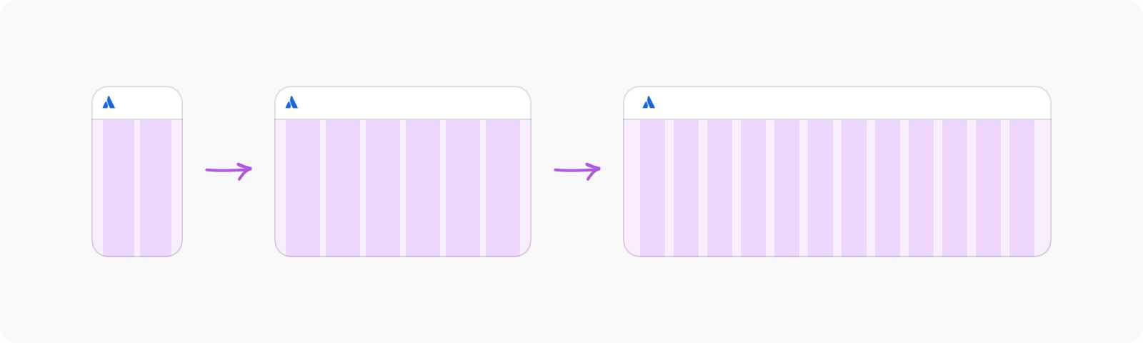
Liquid design uses fluid grid layouts that expand and shrink automatically across different devices. A music app, for example, may display multiple playlists side by side on desktop, then stack them vertically on mobile without breaking spacing, readability, or navigation.
This approach helps products stay visually balanced no matter the screen size. Instead of creating completely separate layouts for every device, designers build systems that adapt proportionally. This is especially important today as users move between phones, tablets, foldables, laptops, and ultra-wide monitors throughout the day.
Flexible layouts also make future updates easier. When new features or content blocks are added, the interface can reorganize naturally without forcing teams to redesign entire screens.
Content that stays easy to use
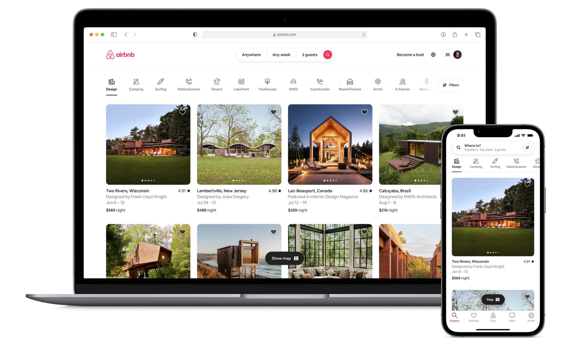
Every element is designed to stay clear and functional, no matter the screen size. Text remains readable, buttons stay easy to tap, and images scale properly so users do not need to zoom in, rotate the screen, or search for hidden actions.
This principle focuses heavily on reducing friction. For example, ecommerce apps may enlarge product images and checkout buttons on smaller devices to improve usability. Navigation menus can simplify automatically when screen space becomes limited.
The goal is to keep the experience comfortable and intuitive in real situations, whether someone is quickly checking information on mobile or browsing longer content on desktop.
Adaptive UI components
Liquid interfaces react to how people use the device. A navigation bar may turn into swipe gestures on mobile, larger tap targets may appear for touchscreens, or menus may reposition automatically when the device switches from portrait to landscape mode.
Adaptive UI components also respond to user behavior. Frequently used actions may become easier to access over time, while less important elements stay hidden until needed. This creates cleaner interfaces that feel more personalized without overwhelming users.
Streaming apps, productivity tools, and navigation platforms already use this approach to make interactions faster and more natural.
Interfaces that evolve in real time
The interface can reorganize itself while the user interacts with the app. For example, a productivity platform may surface editing tools only when someone starts writing, or a shopping app may highlight recently viewed items and quick checkout actions during browsing.
This dynamic behavior helps reduce cognitive load because users only see relevant information at the right moment. Instead of forcing people to navigate through multiple screens and menus, the interface adapts to their actions.
Real-time adaptation is one of the biggest differences between liquid design and older UI approaches. It transforms interfaces from static layouts into experiences that actively guide users through tasks more naturally.
Why Businesses That Ignore This Will Fall Behind
App design trends in 2026 are moving toward adaptive, frictionless, and highly personalized experiences. Users expect apps to feel simple from the first tap. When interfaces feel slow, cluttered, or outdated, people leave quickly.
The numbers already show how expensive poor UX can be. Research from Forrester found that every $1 invested in UX can return up to $100 in ROI. At the same time, 88% of users say they are unlikely to return after a bad experience.
Poor UX cost is not only about losing users. Confusing interfaces increase support requests, slow down onboarding, reduce conversions, and make customers lose trust in the product.
Some reports estimate that poor UX costs businesses up to $1.4 trillion annually in lost revenue.
This is why liquid design is becoming more important. Apps that adapt naturally to users feel faster, easier, and more modern. Businesses that continue relying on rigid layouts and overloaded screens risk looking outdated in a market where user expectations keep growing.
How to Transition Your App to a Liquid Design System
Moving toward liquid design does not mean rebuilding your entire product from scratch.
Most companies start with gradual app modernization by improving layouts, simplifying user flows, and making the design system more flexible over time.
The key is to focus on the parts of the experience that create friction first, then scale improvements across the product step by step.
Audit rigid layouts and overloaded screens
The first step is understanding where your current interface stops feeling natural for users. Many outdated app designs were originally built for only a few screen sizes, which creates problems today across foldables, tablets, ultra-wide monitors, and smaller mobile devices.
Start by reviewing screens with high bounce rates, abandoned actions, or negative feedback from users. Look for layouts where buttons overlap, text becomes difficult to read, navigation takes too many steps, or important actions disappear on smaller screens.
Real-world examples are easy to spot. In many older ecommerce apps, product filters may take up half the screen on mobile, forcing users to scroll excessively before seeing actual products.
In finance apps, dashboards often become overloaded with charts and numbers that feel impossible to process on smaller devices.
This stage is also where teams often discover inconsistencies between platforms. A feature may work smoothly on iOS while feeling cluttered on Android tablets. These gaps create friction that directly impacts retention and conversions.
At Perpetio, design audits usually combine UX reviews, analytics, and real device testing to identify which parts of the product create the biggest usability issues first.
Build reusable and adaptive UI components
Once the biggest UX problems are identified, the next step is replacing rigid layouts with scalable and adaptive UI components.
Liquid design works best when products are built from reusable elements that can reorganize naturally across different screens and interaction types.
This means designing components that are flexible from the start. Cards may expand or shrink depending on available space. Navigation menus may switch from horizontal tabs to bottom sheets or gesture-based controls. Buttons may resize automatically for touch interactions.
Streaming platforms are a good example of this approach. On a desktop, users may see several rows of content previews at once. On mobile, those same components stack vertically while keeping spacing, readability, and interactions consistent.
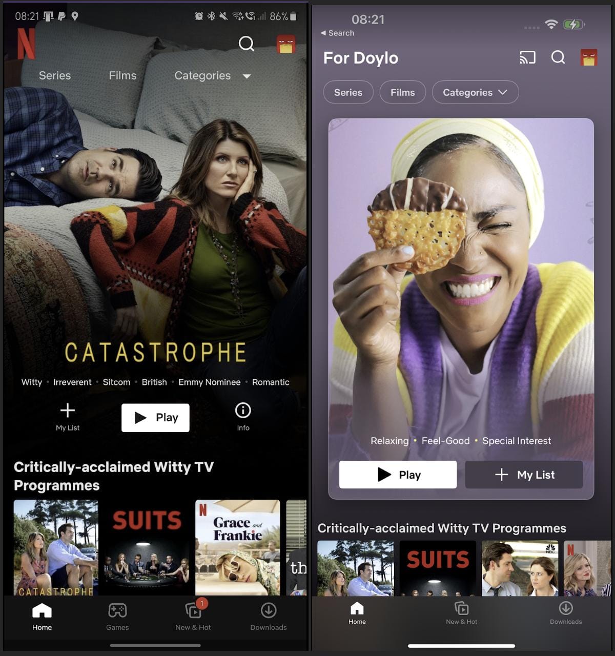
Reusable systems also make future app modernization much easier. Instead of redesigning every screen separately, teams can update a single component and apply changes across the product. This improves design system scalability and reduces development time in the long run.
At Perpetio, scalable component libraries are often built together with developers from the beginning. This helps ensure that the design system works smoothly in real products, not only in static mockups.
Simplify user flows
One of the biggest goals of liquid design is to reduce cognitive load. Many apps fail because they try to show everything at once. Users open a screen and immediately face too many menus, settings, notifications, and actions competing for attention.
Liquid interfaces focus on progressive disclosure. Features appear when users actually need them.
For example, editing tools in content creation apps often stay hidden until a user selects an image, video, or text block. Ride-sharing apps keep the booking process simple by showing only the next necessary action instead of displaying all available settings immediately.
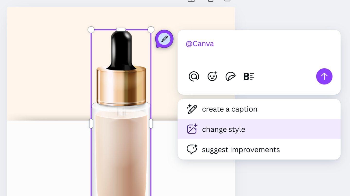
This approach feels more natural because people are guided step by step rather than forced to process everything at once.
A practical way to improve user flows is by mapping the most common user journeys inside the app. Look at how many taps are needed to complete key actions such as checkout, booking, onboarding, or account setup. Then remove unnecessary screens, duplicate actions, or rarely used elements from the main flow.
In many cases, simplifying the experience increases engagement more effectively than adding new features.
Design for real use scenarios
Liquid design cannot be tested only in Figma or on one laptop screen. Interfaces need to be evaluated in real situations and across real devices.
A layout that looks clean during design reviews may become difficult to use outdoors in bright light, on foldable screens, or while someone is navigating with one hand. This is why modern UX teams increasingly test products in practical scenarios instead of relying only on static prototypes.
For example, food delivery apps often optimize their interfaces for quick one-handed interactions because many users place orders while walking, commuting, or multitasking. Fitness apps adapt layouts for wearable devices and landscape orientations during workouts.
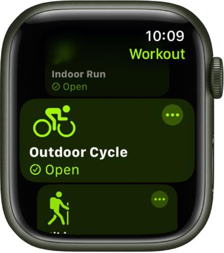
Testing should also include slower internet conditions, different accessibility settings, and older devices. Smooth transitions and animations on high-end phones may feel laggy on older hardware if interfaces are overloaded.
At Perpetio, real usage testing is an important part of our app creation and modernization process because it helps uncover friction that may never appear during internal reviews.
Continuously improve with user behavior data
Liquid design is not a one-time redesign project. User expectations, devices, and interaction patterns continue changing every year, which means interfaces should evolve continuously as well.
Analytics tools, session recordings, heatmaps, and usability testing help teams understand how people actually interact with the product after launch. They reveal where users hesitate, ignore actions, abandon flows, or repeatedly tap the wrong elements.
For example, if analytics show that users consistently skip a secondary menu or struggle to complete onboarding on tablets, the interface can be adjusted dynamically to make those actions more visible or easier to access.
Some companies now personalize interfaces in real time based on user behavior. Streaming apps reorganize recommendations depending on viewing habits. Ecommerce platforms surface recently viewed products or simplify repeat purchases for returning customers.
These small adaptive improvements are a core part of liquid design. They help products stay intuitive over time while supporting long-term design system scalability and app modernization.
Final Words
Liquid design is quickly becoming one of the biggest app design trends in 2026. Users expect products to feel natural across every device, adapt to their actions, and stay easy to navigate without unnecessary complexity.
Flexible interfaces improve usability, support long-term design system scalability, and help products stay competitive as user expectations continue to grow.
If your product still relies on rigid layouts or outdated flows, this may be the right time to rethink the experience.
As a UI/UX design agency and app development partner, Perpetio helps companies modernize digital products through scalable design systems, adaptive interfaces, and app redesign services tailored to real user behavior.
You can explore Perpetio’s UI/UX design services or contact the team to get a free product consultation.
What is liquid design in UI/UX?
Liquid design is an approach to UI/UX where interfaces are not fixed layouts, but flexible systems that adapt continuously to context, device, and user behavior.
What is the difference between liquid design and responsive design?
Responsive design adjusts layouts to fit different screen sizes, while liquid design also adapts structure and content based on user actions and context. In short, responsive fits the screen, liquid fits the user.
Why do businesses need to update their app design?
Businesses update app design to improve usability, increase conversions, and meet modern user expectations. Better UX directly impacts engagement and revenue.
How much does it cost to redesign an app with liquid UI?
Costs typically range from around $10,000 for small apps to $200,000+ for complex platforms depending on scope, features, and level of redesign.
Is liquid design relevant for mobile apps in 2026?
Yes, it is increasingly relevant as users expect apps to adapt to the device and context. Users quit uncomfortable apps quickly.