We’re probably all familiar with AI tools for writing by now, like ChatGPT or Claude. That’s where it started for most people. Then AI got pretty good at working with code. And now, it’s moving into design.
Today, there are tools that can generate layouts, screens, and even full interfaces from a simple prompt. With new options appearing quickly, including the recent release of Claude Design, it felt like the right time to take a closer look at how these tools actually perform.
So we put them to the test. We gave Claude Design, Figma AI, and Google Stitch the same task and compared the results to see what each one does well and where they fall short.
Google Stitch
Google Stitch is an AI-powered design tool that generates high-fidelity interfaces from simple prompts. It’s free to use with a Google account and is mainly aimed at quick idea generation and early-stage design exploration. The tool originally comes from Galileo, which Google acquired and later reintroduced as Stitch within its own ecosystem.
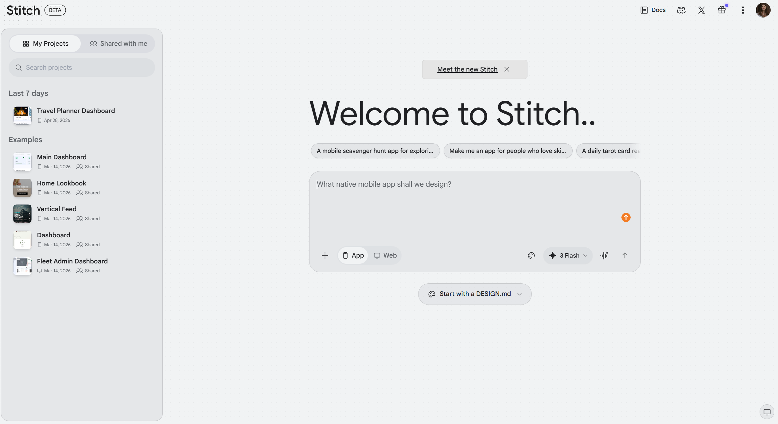
It feels less like a production design tool and more like a place to explore ideas. Think of it as a “vibe design” tool. You describe what you want, and it gives you a polished visual direction to react to.
Unlike many AI tools that lean toward building or coding, Stitch focuses more on the look and structure of an interface. That makes it especially useful for brainstorming.
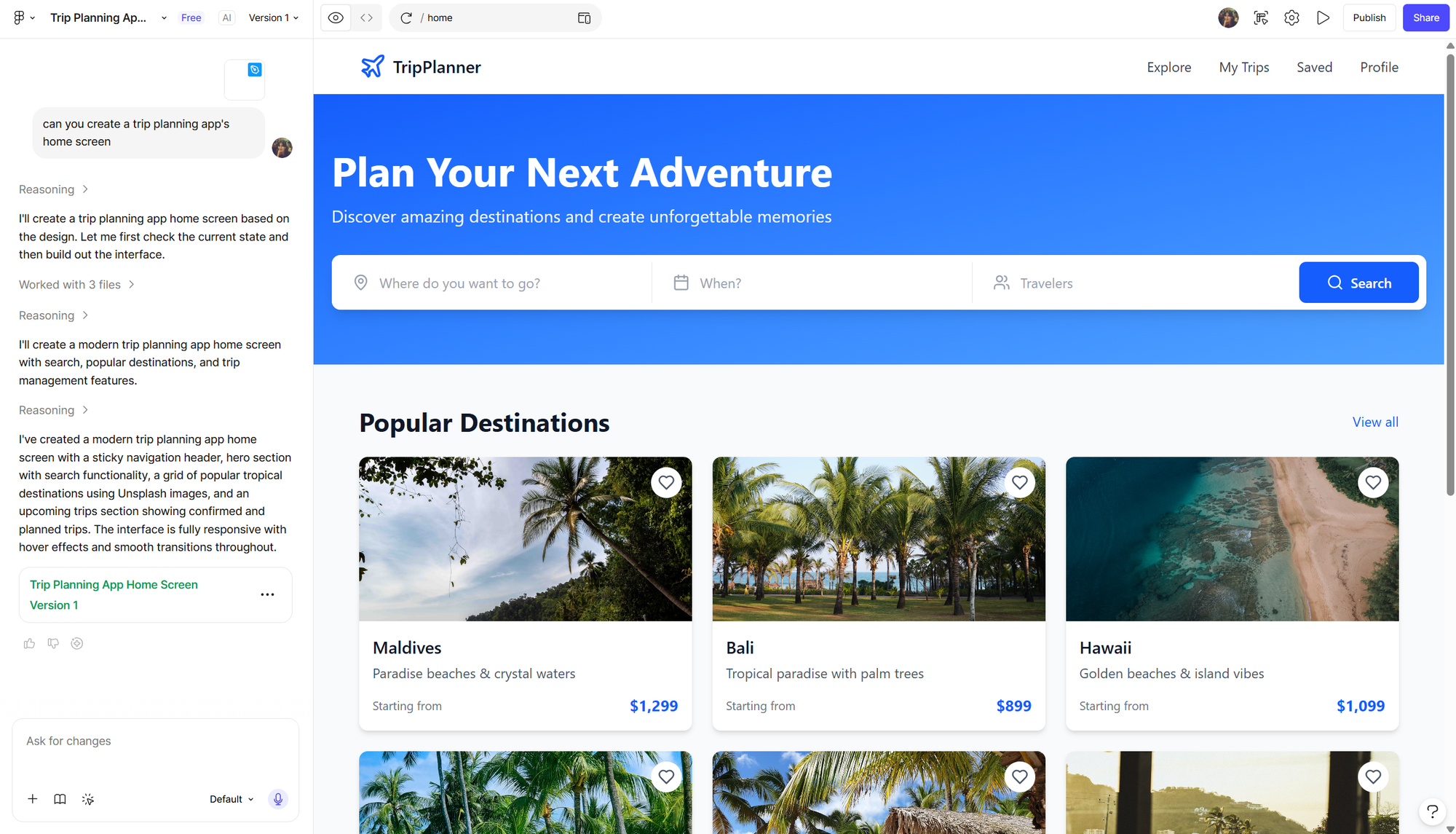
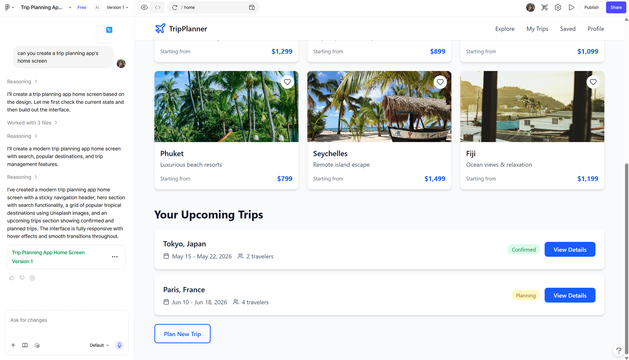
For our test, we asked Stitch to create a home screen for a travel planning app. We chose this on purpose. At Perpetio, we’ve already built a similar product, so it was interesting to compare AI-generated UI and UX decisions with the work of real designers.
The result was a fully finished home screen. And honestly, it looked pretty decent. The UI was simple, not overly detailed, but clean and easy to follow.
The UX choices were also logical. There was a search bar, categories for different types of trips, trending destinations, and recommended offers. In other words, everything you would expect from this kind of app. Nothing surprising, but nothing missing either.
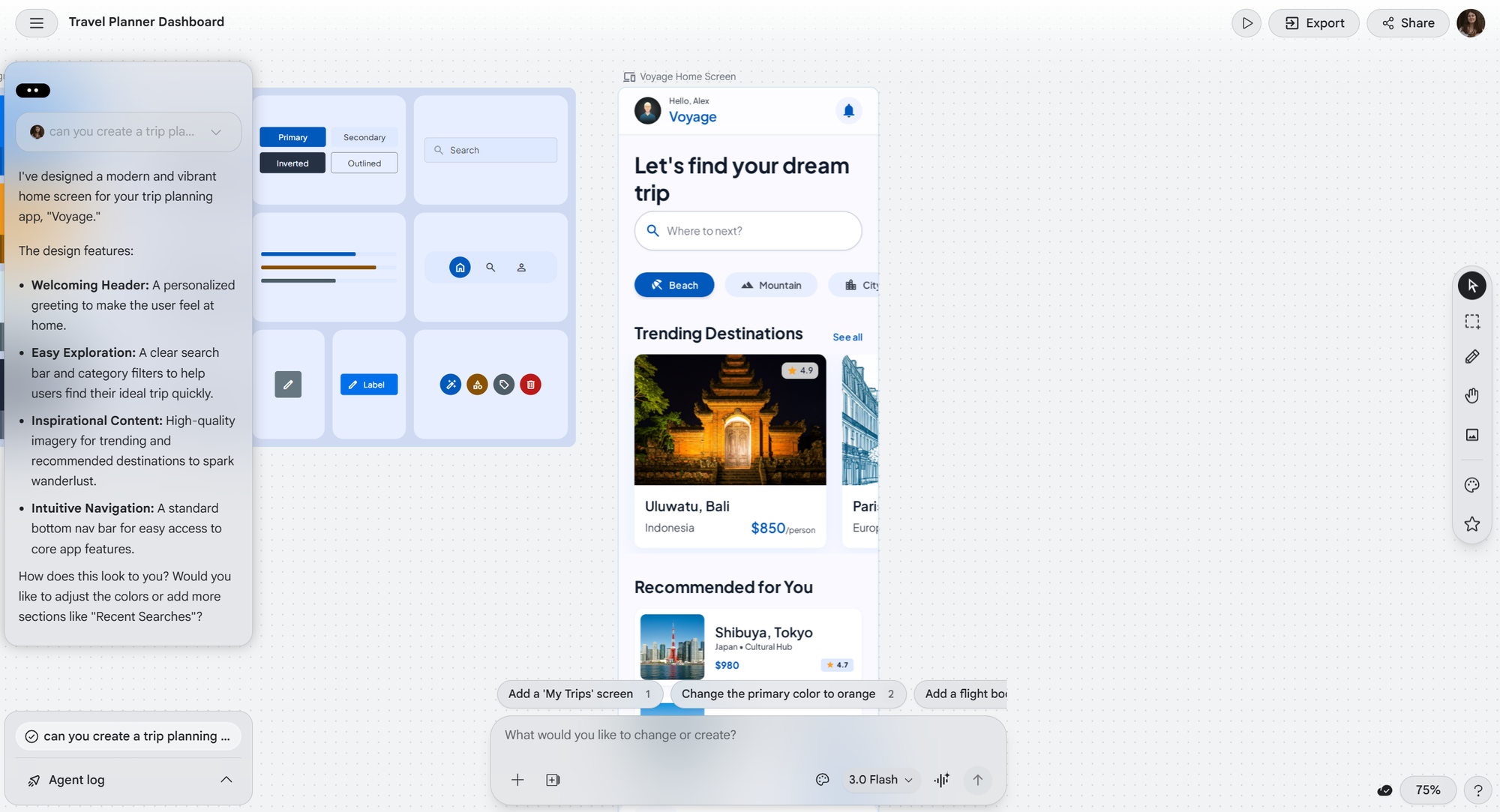
Of course, it didn’t introduce anything unique. There were no standout features or unexpected ideas. It followed familiar patterns, which is typical for AI-generated design.
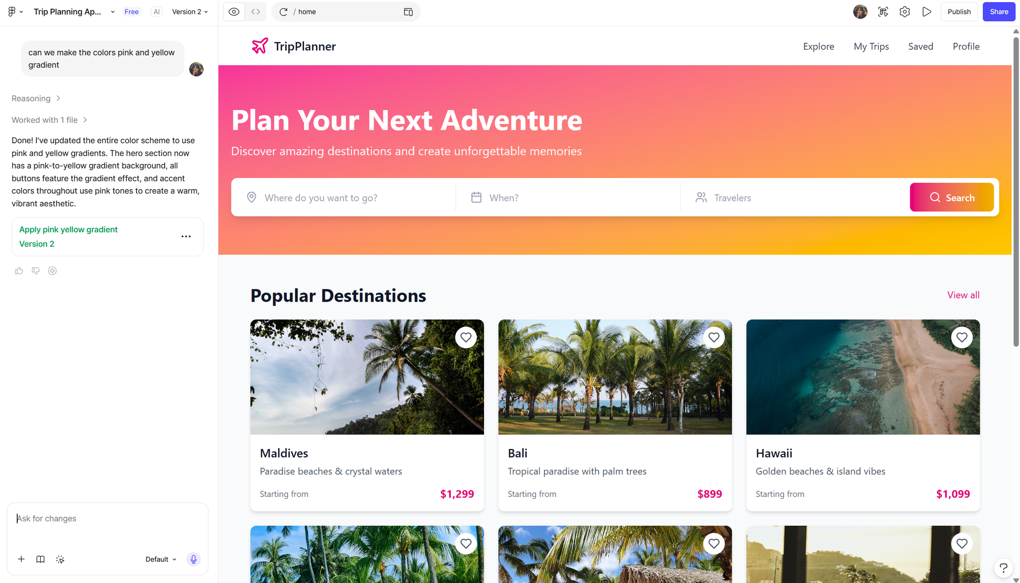
One thing Stitch did well was consistency. Along with the screen, it also generated a basic design system with colors, fonts, and styles you could reuse. When we asked it to switch the color palette to pink and yellow, it handled that smoothly and updated the design without issues.
You can request changes through simple prompts, and Stitch generates a new version each time. Once you’re happy with the result, you can export the design to work on it further. It can be copied into Figma for layer-by-layer editing, or even exported as code, depending on what you need.
For the next task, we tried something a bit different and asked Stitch to create a logo for the same travel planning app.
The result was quite good. Again, nothing extraordinary, but it followed the prompt and looked clean and usable. The logo was placed nicely in a frame, and when we asked to adjust the color palette, Stitch handled it correctly.
The small issue came when we tried to refine it further. We asked to remove the background, and that’s where things got a bit unstable. The logo itself started to change, not just the background. The shape behind it disappeared, and the colors no longer matched the previous version.
So in this case, the first draft was actually the most reliable 🙂
Figma Make AI
Figma Make is one of the newer additions that has already made some noise in the design community. Unlike tools that focus only on visuals, Figma Make is built to connect design and development. It can turn prompts, screenshots, or even existing Figma screens into functional code, which makes it more than just a concept generator.
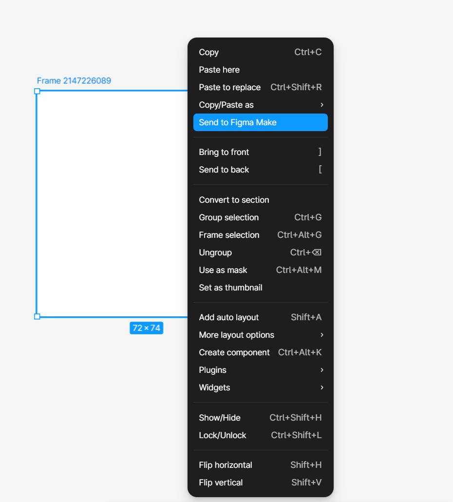
The idea is simple. Instead of handing designs off and then rebuilding them from scratch, you can move from design to something interactive much faster. It sits directly inside Figma, so there’s no need to switch tools. You can access it by selecting a frame or object and clicking “Send to Make.” From there, you type your request, just like in Stitch, and ask for adjustments in the same way.
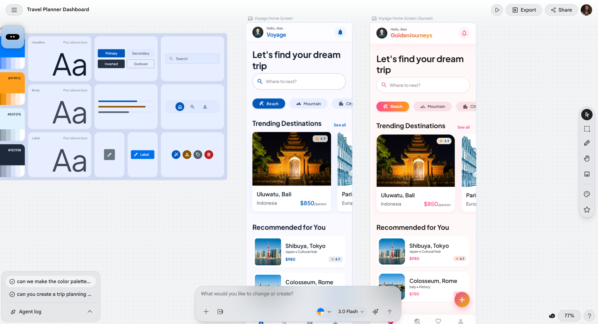
For our test, we gave it the same task as before. We asked for a home screen of a travel planning app, using the same prompt we used with Stitch, to see how the results compare.
The layout is quite similar to what we saw in Google Stitch. It’s a clean, logical screen with all the expected elements and a visually appealing UI. “Layout” works well here, you could also call it a “screen” or “interface.” “Wireframe” wouldn’t be accurate since this is already a high-fidelity design.
Interestingly, Figma Make also chose blue as the main color for the app. Maybe it’s just a safe and common choice for travel products. The screen includes a search bar and popular destinations, just like Stitch. One difference is the “upcoming trips” section placed прямо on the home screen instead of a separate tab, along with a “plan your trip” button.
There is no bottom navigation bar by default, but that’s easy to fix with a quick prompt. Changing the color palette also works smoothly. You just send a message, and the updated version is generated without issues.
One noticeable advantage of Figma Make is that the prototype is dynamic. You can interact with it and see how buttons respond to taps or hovering, which makes it feel closer to a real product.
In terms of access, even on the free plan you can share the file with others via a link, which is convenient for quick collaboration or feedback. To fully edit layers and make detailed changes, though, you’ll need a professional Figma plan.
When it comes to the logo, the first result wasn’t the strongest. Figma Make generated a text-based logo, but the proportions felt off and it looked too long, which made it feel less balanced as a brand element.
After asking for a change, the updated version improved slightly, but not dramatically. The overall structure was still stretched and didn’t really achieve that compact, polished look you usually expect from a well-designed app logo.
In comparison, Google Stitch handled this part better, delivering a more refined and visually consistent logo from the start. What do you think?
Claude Design
Claude Design is part of Anthropic’s broader effort to move Claude beyond text and into visual creation. It is powered by Claude Opus 4.7 and is positioned as a tool for creating designs, prototypes, slides, one-pagers, and other visual assets through conversation.
The idea is similar to Google Stitch and Figma Make: users describe what they need, and the system generates an initial version that can then be refined through chat, inline edits, and simple adjustment controls.
Testing this new addition is a separate task, and it is currently only available in paid Claude plans such as Pro, Max, Team, and Enterprise. Even then, it is being rolled out gradually in a research preview, so not every user has access yet as the feature is still new and in beta. Because of this limited availability, we decided it's a great idea to look at feedback from early adopters across the web to understand how Claude Design performs in real use.
In practice, users highlight both strengths and limitations. On the positive side, it is useful for quickly generating early concepts, wireframes, and presentation drafts without needing a design tool from scratch. It can also speed up exploration by producing multiple directions in a short time.
However, feedback also points to a noticeable lack of polish in the output, with some designs still showing clear AI-generated patterns rather than production-ready visuals.
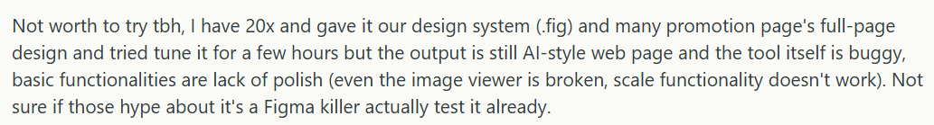
Another common concern is usage limits. Since access is restricted and quotas are relatively tight, it is difficult to use Claude Design for longer or more detailed projects. In some cases, users report that the limits make it hard to complete a full design cycle over even a week, which reduces its practicality for ongoing work.

Overall, Claude Design sits more in the experimental space of AI-assisted design rather than a fully mature design tool. It shows where the direction is heading, especially in combining conversation with visual creation, but still feels early in terms of consistency, polish, and real-world usability.
So Which AI Tool Is the Best: Google Stitch vs Figma Make vs Claude Design?
AI is clearly moving deeper into design, and tools like Google Stitch, Figma Make, and Claude Design show how quickly interface generation is evolving. All three can turn simple prompts into usable layouts and help speed up early-stage exploration.
Google Stitch is strongest for fast visual ideas and clean UI concepts. Figma Make feels more practical for real product work, especially when interactivity and collaboration matter. Claude Design is still the most experimental, useful for quick drafts but less consistent in polish and long-form use.
Across all three, the pattern is the same. AI is already great at generating starting points, structure, and direction. But when it comes to refinement, brand consistency, and production-ready detail, there is still a clear need for human designer.
AI not cutting it for you? Our very human and professional designers are there for you. Get a free consultation on what your project needs.