Do you know what a CJM is? Or an SVG? While these abbreviations might confuse some, design work can’t be done without them.
Designers need to understand exactly what the client is asking for, exchange specific vocabulary with their colleagues during the design process, read professional materials, and so on. You get the point: it’s almost impossible to be a skilled specialist without speaking the design language.
To help you out, our design team collected twenty of the most commonly used terms — those that come up in conversation on a daily basis. Let’s go through them one at a time.
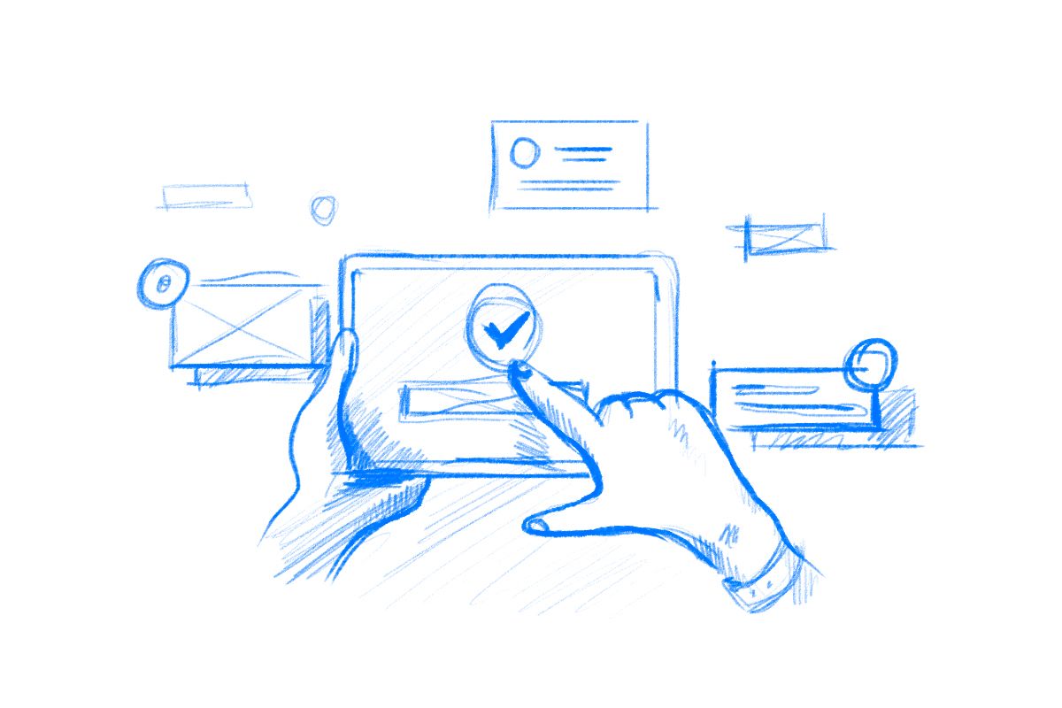
User experience
The first definition on our list is user experience. You might have heard it numerous times before — it’s the well-known UX. But what does the term user experience actually cover?

In the broad sense, user experience is the user’s overall impression of the product, be it a mobile app or company as a whole. It’s basically how the user perceives the product and whether or not they are satisfied with it.
- Is the product easy to use?
- Does the design bring convenience and solve the user’s problem?
- Is it visually pleasing?
These are the questions a designer has in mind when working on the UX.
User interface
Next on the list is the term no less popular — user interface or UI. It is the visual aspect of the design: typography, colors, icons, illustrations, etc.
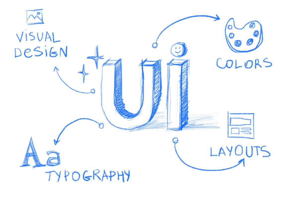
Compared to the UX, UI is not about the logic behind the product’s design but its appearance.
While UX literally refers to the overall experience the user is getting with a particular solution, UI is a visual touchpoint: the screen of an app or the page of a website.
Interaction design
Interaction design or IXD is the practice of designing interactive products. Sounds quite simple but what does it mean?
IXD takes into account the very moment of the interaction only: all of our clicks, taps, navigation, animations, and so on.
Wireframe
A wireframe is the basic scheme of a page or a screen. It shows the arrangement of elements and their relation to each other. Wireframing happens in the early stage of the design process.
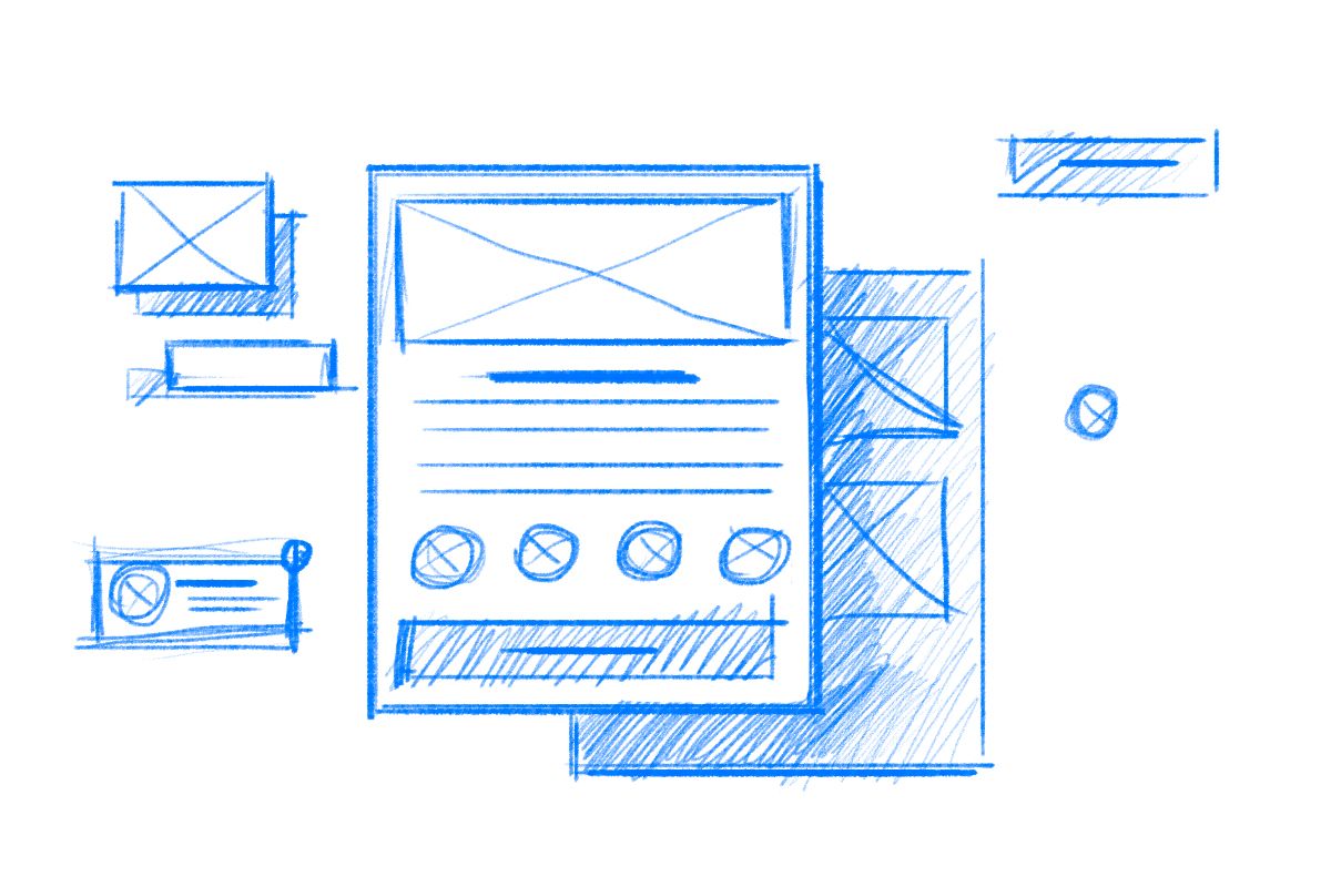
Usually, wireframes do not present much detail. They are mostly black-and-white with no texts or illustrations. Why? To help save time by deciding on the product’s structure and making adjustments before the separate elements are created.
By the way, we talk more about wireframes in our design process guide.
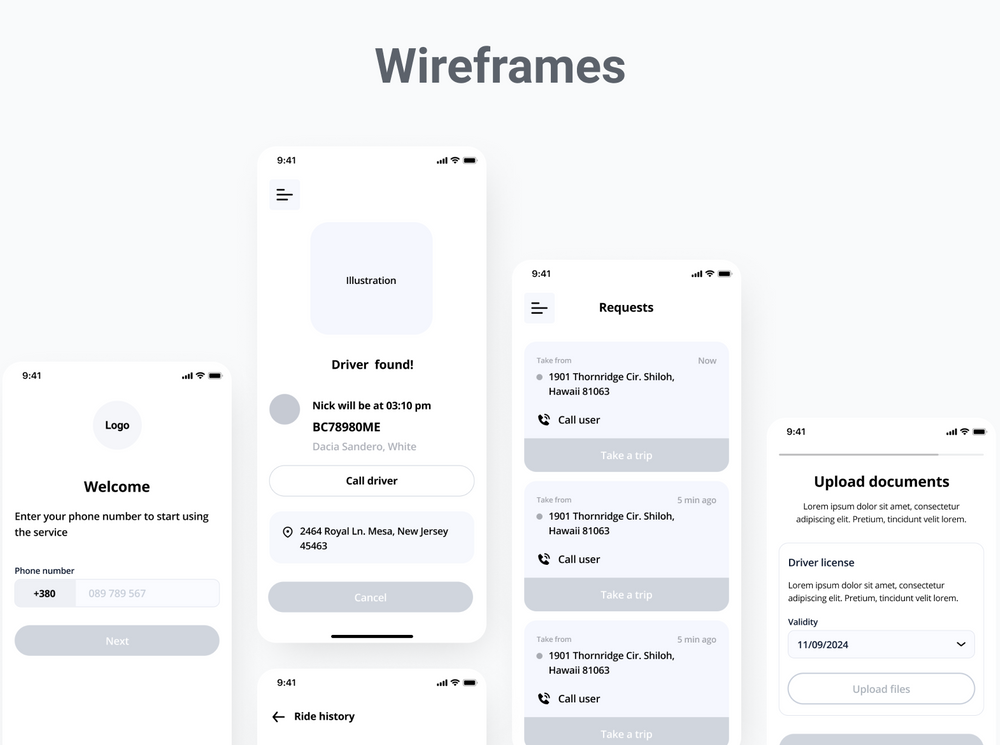
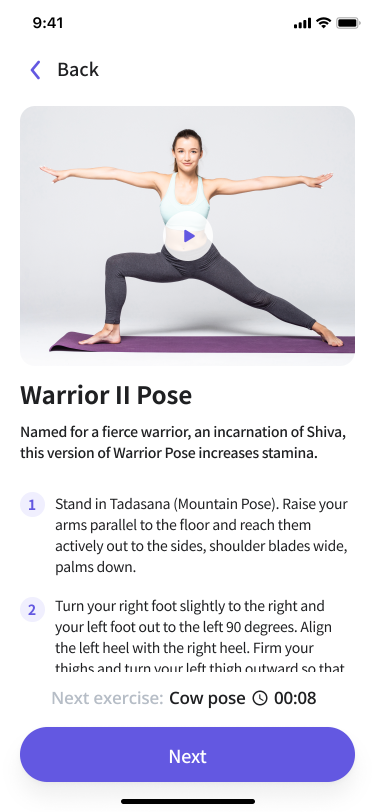
Prototype
Next on our list is a prototype. While a wireframe is normally a low-fidelity model, a prototype is a mid to high-fidelity one.
Usually, prototypes have a more detailed look at the visual attributes of the UI and allow interaction with the design.
Call to action
Call to action or CTA is a design element encouraging users to take a certain action towards the product. These might include buying a product, contacting the company, downloading an app, and others.
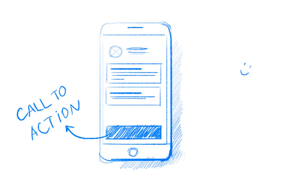
CTAs usually contain a link. To provoke the user to click, calls to action often look like buttons.
Negative space
A negative space, sometimes also called white space, is a part of the design that doesn’t have any elements. In other words, it is an empty area.
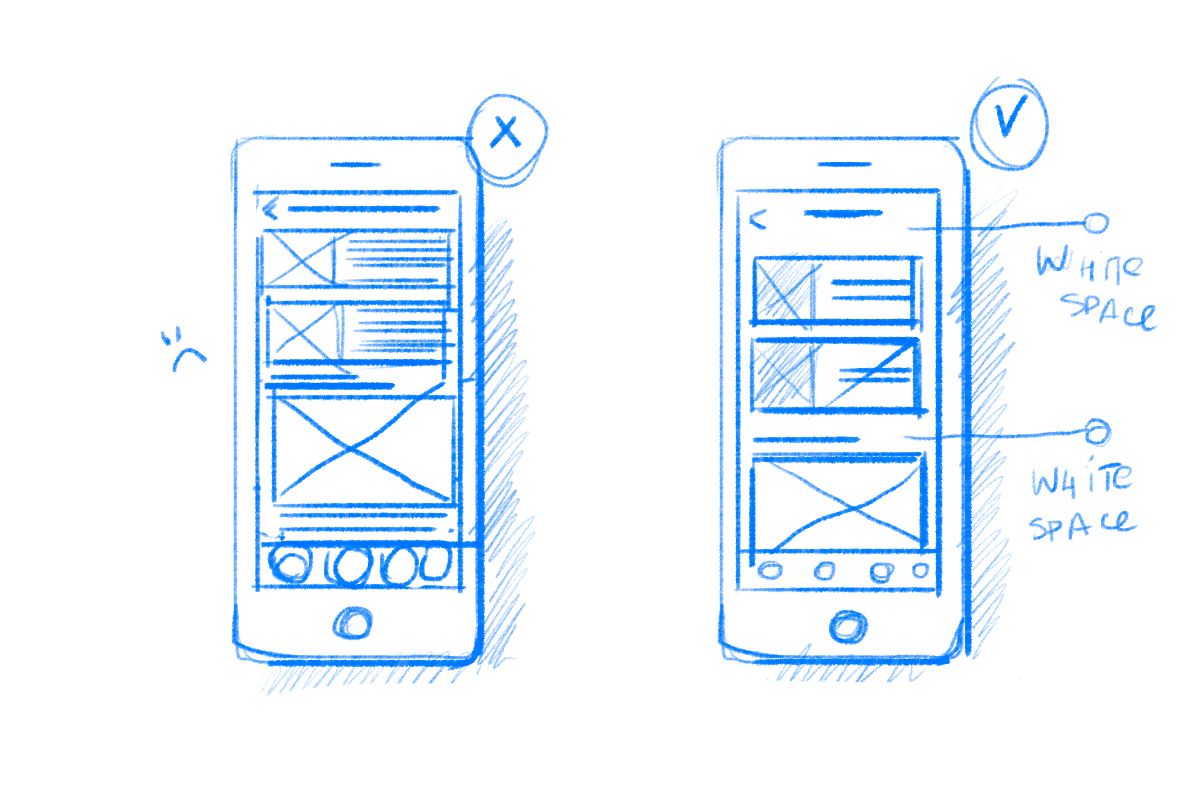
Negative space is necessary for making the navigation easy while improving the usability of a product overall. A design that is too loaded with elements can be overwhelming for users.
Design system
A design system is a set of style guidelines, elements, and principles that should be used for a particular brand or case.
It helps create unified and consistent designs that meet the client’s requirements. Design systems are especially important when it comes to updating certain elements or working with big teams.
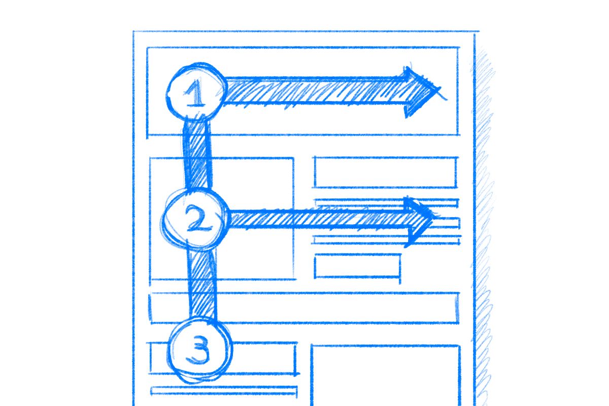
Flowchart
A flowchart is a way to visualize user flows and interactions. It presents the sequence of steps a user will take along with the possible outcomes of each action and their relation to one another.
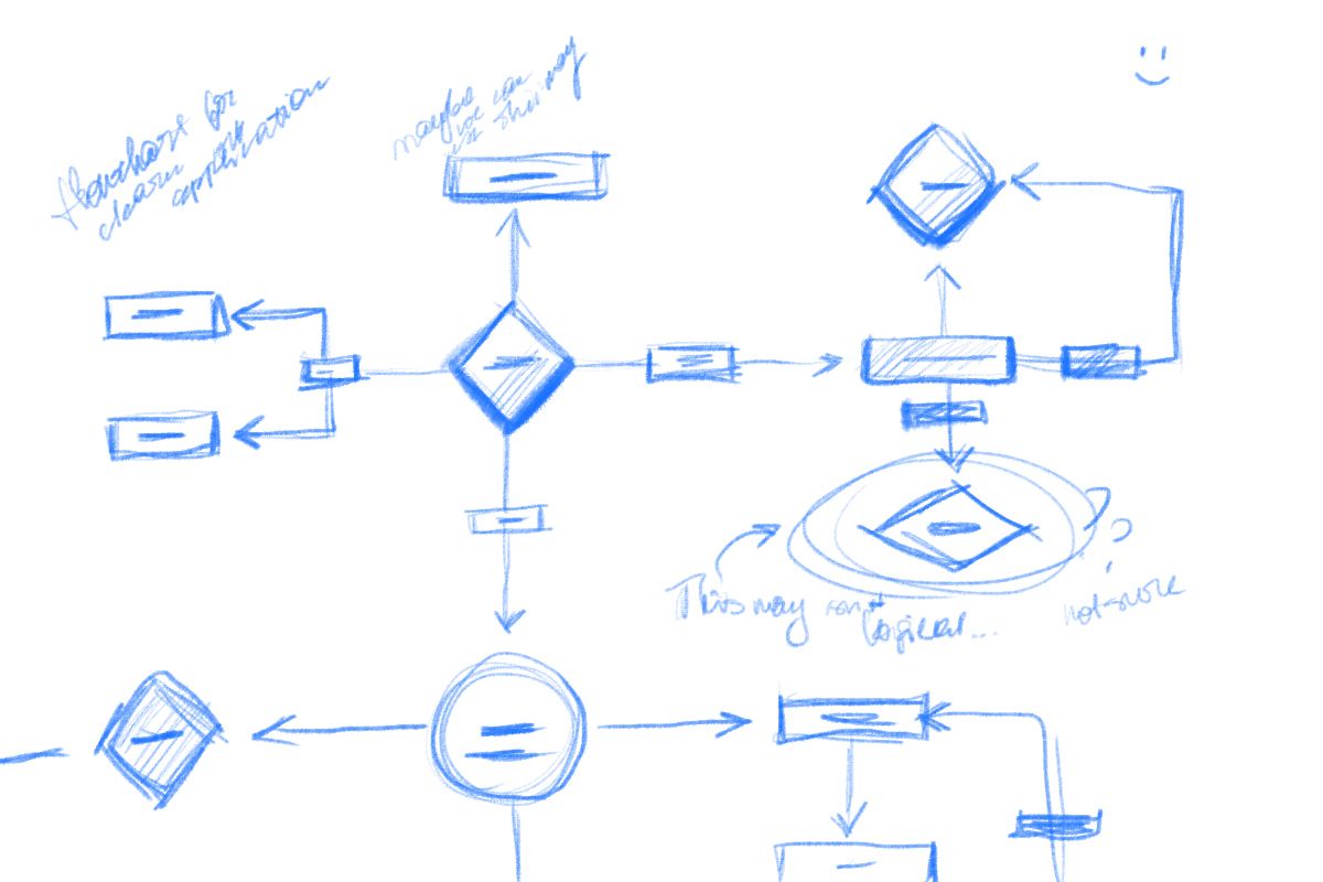
Flowcharts include a system of symbols that help make sense of the scheme. For example, the steps in the boxes with rounded edges are the start and endpoints of the process, while rectangles represent the transitional actions.
Accessibility
Accessibility is one of the main UI design principles. It focuses on making the product available and easy to use for as many people as possible, including those with disabilities or temporary barriers.
What are some common accessibility design practices?
- Not relying on color only for conveying the information
- Ensuring sufficient contrast between text and its background
- Supporting keyboard navigation
- Marking the headlines
Gestalt principles
The Gestalt principles focus on how a user perceives the design elements. People usually don’t see objects on their own but rather make connections between them and observe their patterns.
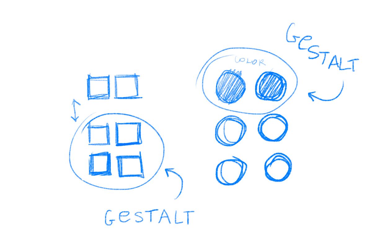
Designers use the Gestalt principles to organize the elements in their UI in such a way that it is visually appealing and, more importantly, easy to understand and navigate.
Some of the Gestalt principles are proximity, which is all about grouping the elements to show they are related, or figure-ground, which says that we perceive objects as either being in the foreground or the background.
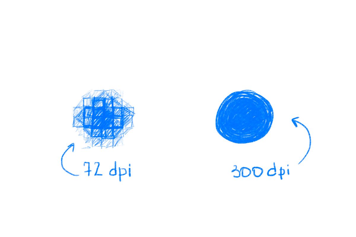
Dots per inch
Dots per inch or DPI is the way to measure the density of an image. This name comes from printing: DPI is the number of ink drops used for one inch of print. The more dots, the better quality.
Scalable vector graphics
Scalable vector graphics or SVG is a vector image format based on the XML language. This format is suitable for 2D images and vector shapes.
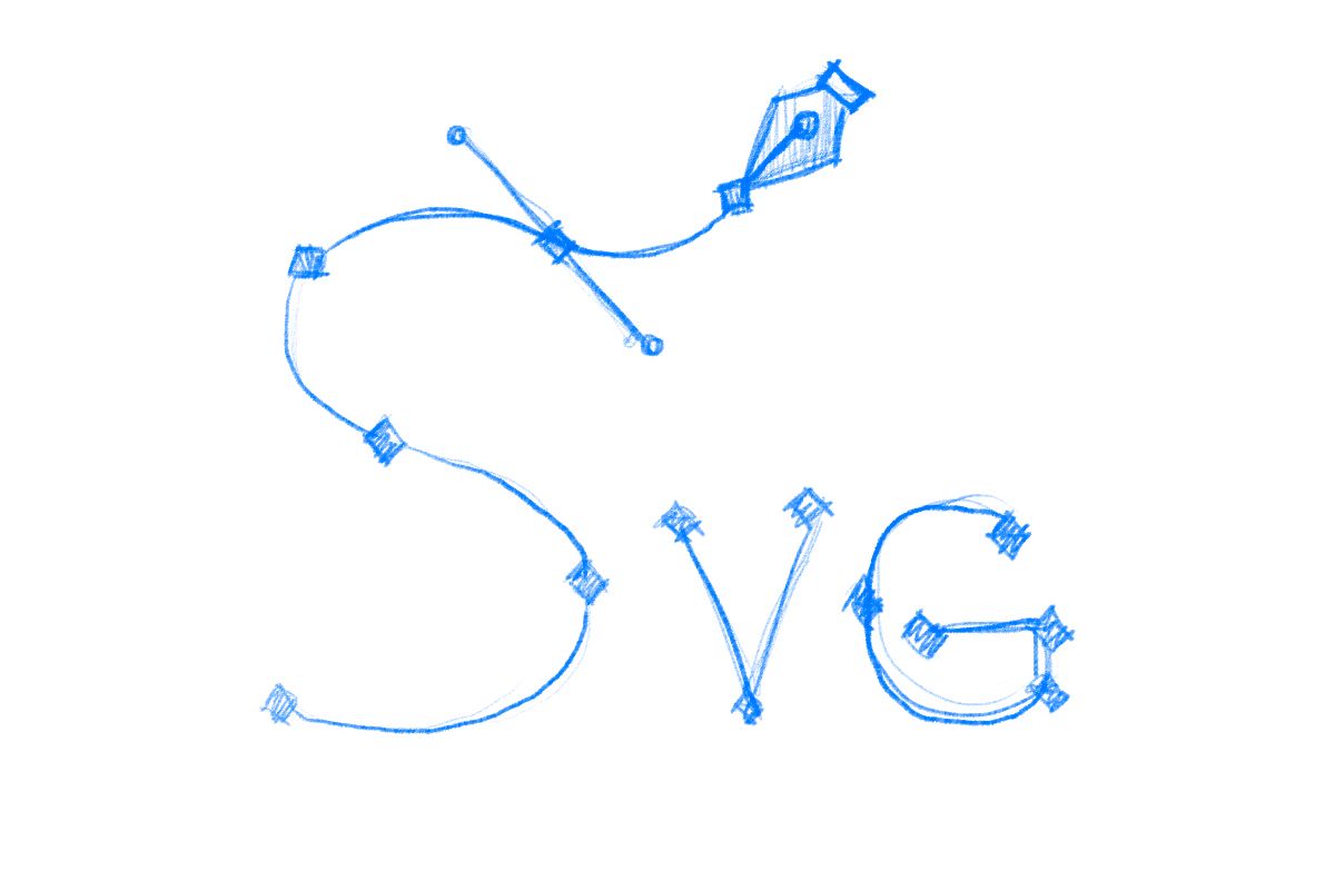
The SVG images are not composed of pixels and, therefore, can be easily resized. Because of this quality, scalable vector graphics are often used for logos.
Minimum viable product
A minimum viable product or MVP is the early version of a product that contains only the minimum set of features that are absolutely necessary for presenting the value to the users.
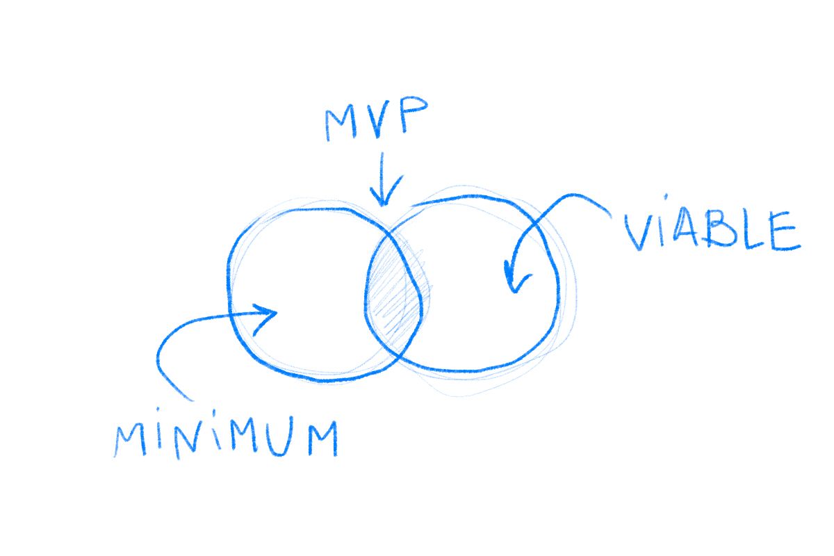
An MVP is commonly used in startups. By using this concept, businesses can try out and validate their idea without too much financial risk.
Once owners and stakeholders study how customers react to the early version of the product, they can decide on further development.
Customer journey map
A customer journey map or CJM is a scheme that demonstrates the steps the customer goes through while interacting with a product.
It includes each touchpoint the customer can have with a brand, from hearing about it on social media to their impressions after using the product.
The main peculiarity of the CJM is that it doesn’t simply depict the user’s interaction with a product but also their feelings, reactions, and goals.
Application programming interface
Two or more applications can communicate with each other using the application programming interface or API.
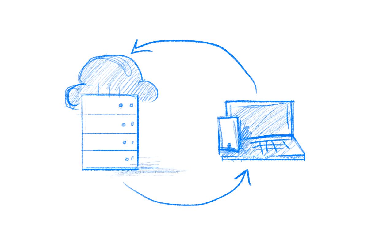
How does it work? The data is sent from one app, received and interpreted by the server, and then sent back to the next app. All of that is done by an API.
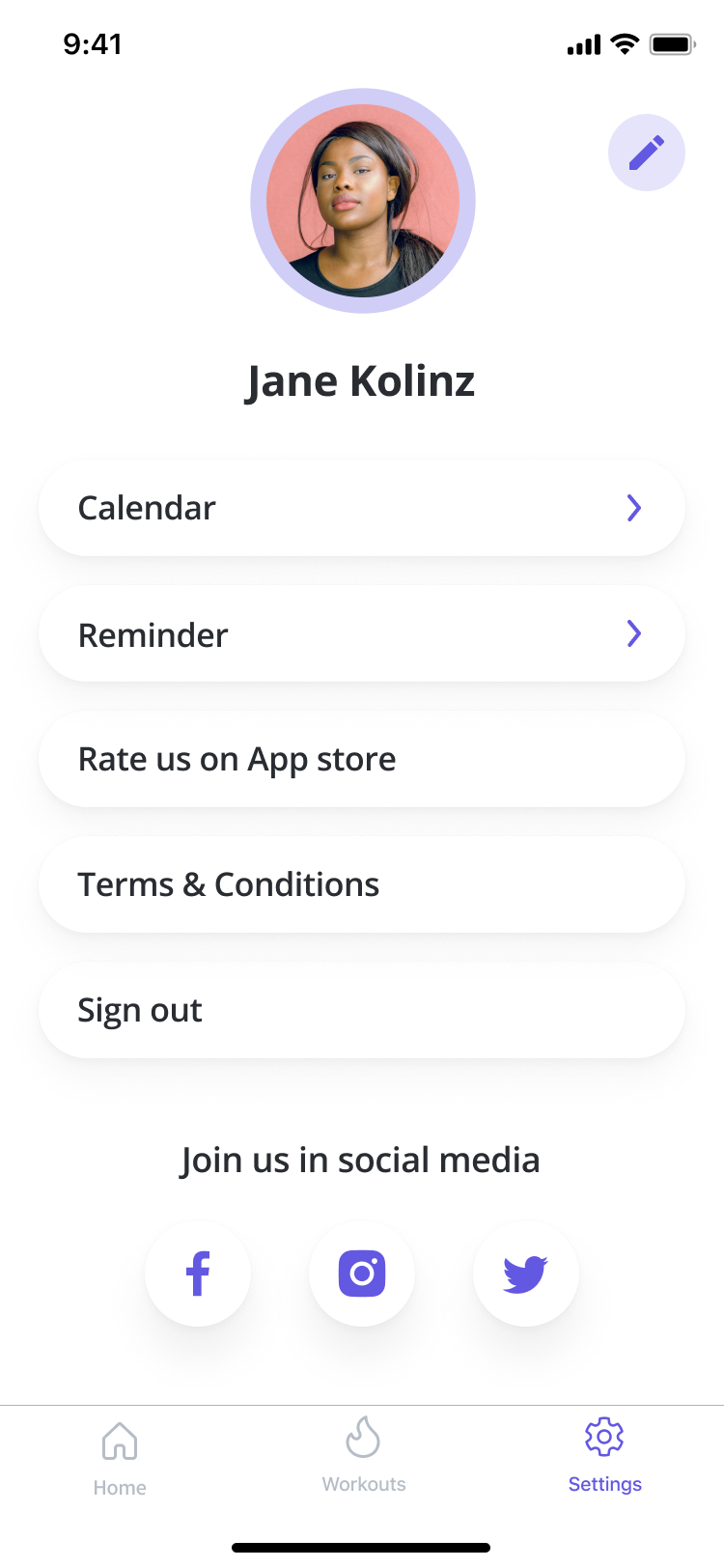
Onboarding
Onboarding is the first interaction a user has with a digital product. This introduction is where the user gets information about the product, learns how to use it, adds their data, and sets up preferences.
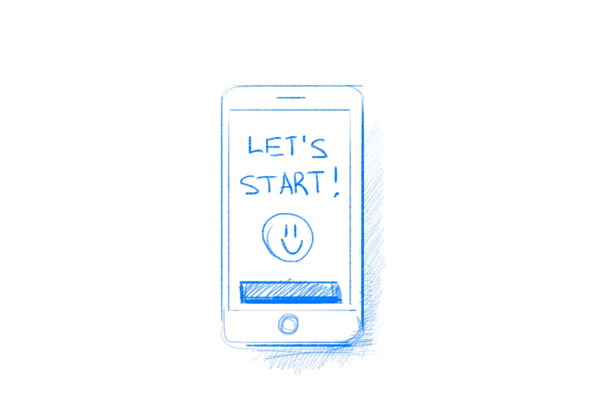
This is how onboarding look in our brand new Fitness app:
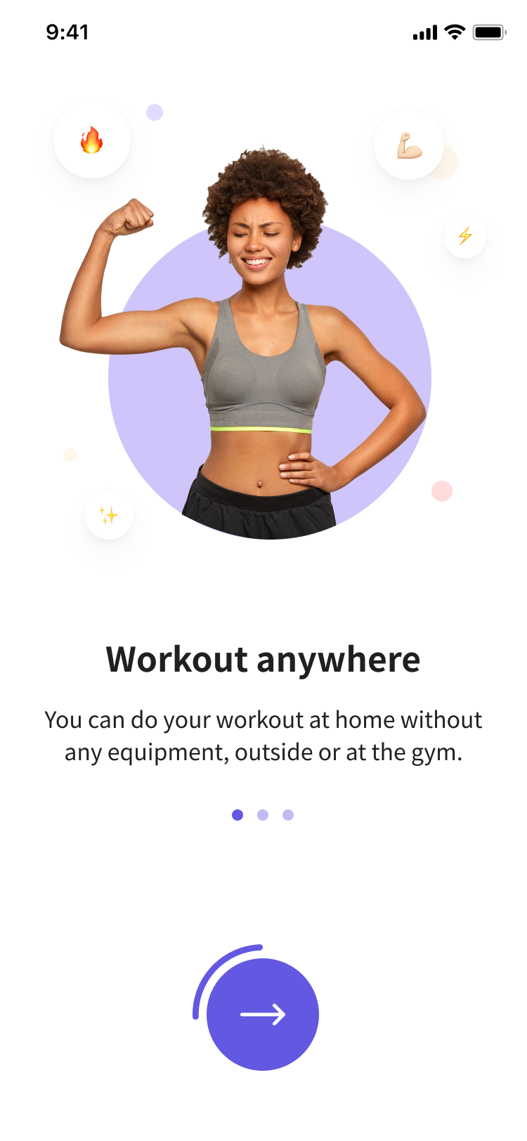
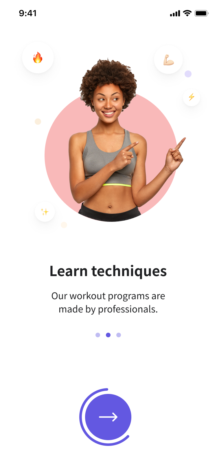
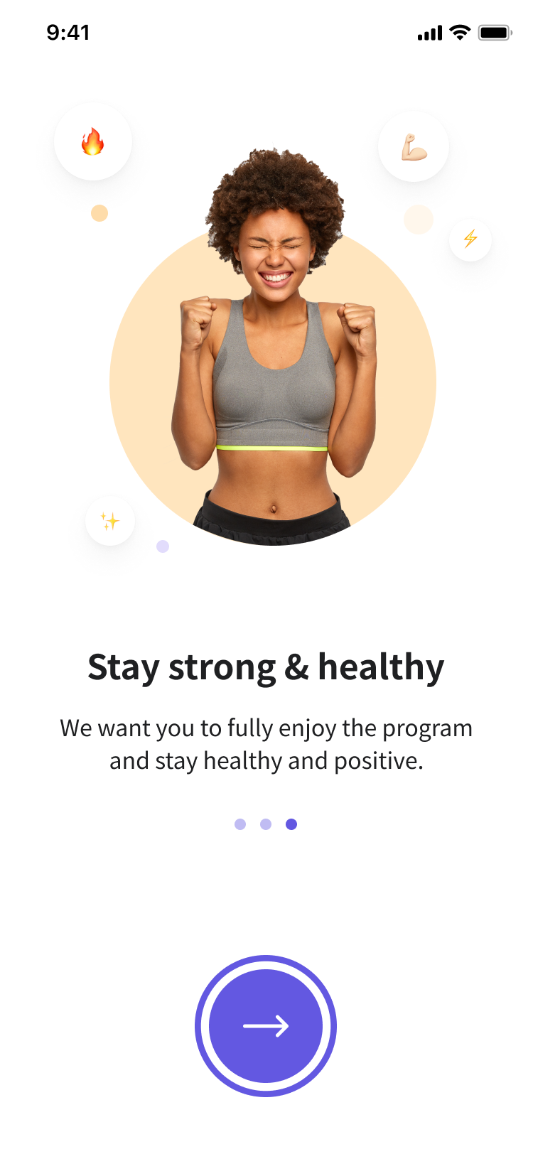
An Onboarding in the Fitness app created by Perpetio team
F-shaped pattern
The F-shaped pattern is a model of how users scan screens and pages.
In the Nielsen Norman Group’s eye-tracking research, it was observed that many people browse the page in the pattern of the letter F — two horizontal stripes followed by a vertical stripe.
What any designer should know is that the F-shaped pattern is not good for users or businesses as it leads to skipping content.
As a result, it’s essential to take this pattern into account: if text is present on the screen, people will likely look on the left side more than the right.
Human-centered design
Human-centered design is an approach that emphasizes human needs and limitations. Basically, it means basing one’s design decisions on human perspective.
The questions a designer can pose to make sure their product is human-centered are:
- Who will use the product? How old are they? What device will they use?
- What is the problem my users want to solve and how will the product help?
- Is my design readable and accessible?
- And others.
Responsive design
The last term for today is responsive design — an approach that allows adapting a webpage or app design to the device screens.
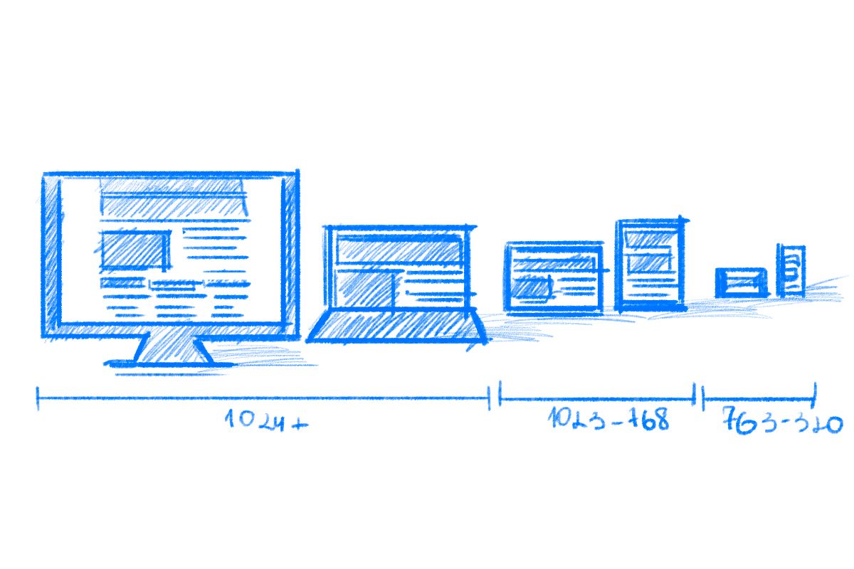
Responsive design practices alter the design elements and layout based on the user’s screen width, rotation, resolution, and so on.
Conclusion
We covered twenty of the most essential design terms. By learning these, you will not only understand a designer’s language but communicate with your colleagues and others more professionally.
Of course, there are more than twenty UI/UX terms to know if you are planning on being a skilled designer. But these will give you a good start when working with others as a developer or even as a client.