I think we can agree – design is a world of its own. And sometimes, this particular world may be a little confusing for those who are not in it. But that's okay; no one can be a jack of all trades. To ensure we are on the same page throughout the process, we are sharing all our secrets on how we create our UI/UX designs.
It’s important to note that no two projects are the same. For this reason, our team is diligent in analyzing each individual situation to produce the best results. Still, there are some main design stages we use consistently that are helpful in most cases.
For starters, let’s imagine you’ve contacted us for design service and we’ve agreed on the estimates and signed the contract. This part of the overall process is described in our blog post about working with clients. So, from here, we will fast forward and focus on the design!
Step 1: Getting acquainted
We kick-off our collaboration with a call together. You might say we’ve already had a few calls. True, but those were mainly with the sales team. Now, you get to speak with our designers and discuss your request in greater detail
To create a design you will love, it’s best to discuss the details face-to-face – you’ll share your vision and show us some references while the designers pose just the right questions to understand your desires more fully.
The more design requirements you have to share with us, the better. Most clients prefer to compile them into a document, listing all the information about their product and any expectations towards the process and results. For instance, you can describe what you would like to see in the initial design, the following versions of the design, your ideas on the structural and visual decisions, and so on. Of course, if you don’t have a document like this ready, we can plan the process together and discuss your expectations before getting to work.
One purpose of the kick-off call is to get to know as much about the project and the desired results as possible. It is also a chance to introduce you to the design team, as you will be contacting them quite a bit later on. We will discuss your preferred communication form, be it calls or messages, how often you would like to receive updates, and the overall agenda of the tasks ahead. The kick-off call is super exciting as it means we are beginning to work on the project!

Step 2: Time to investigate
Now that everyone has gotten acquainted and understands the process ahead, our designers will roll up their sleeves and get to work on the discovery phase. In other words, they will dive into design research. Before working on the UX and UI, it is crucial to know what tasks should be done first and clarify the purpose of the design.
The discovery phase is needed for filling in all the gaps that might stop the team from moving forward. Each design decision should be based on facts, not assumptions, leaving no room for uncertainty in the decision-making. Otherwise, you’ll lose time and, of course, money.
Here are a few important questions you should answer:
- Who are the potential users: how old are they, what do they do for a living, how tech-savvy should they be to use your product?
- Why would people want to use your app? What value will it bring?
- What is the purpose of the app? Should it entertain, bring convenience, or help solve an issue?
- What tasks do the users need to accomplish? What are the app’s basic functions?
- Are there similar solutions on the market? Are they popular? How will ours differ from the others?
To answer these questions and achieve your goals, we will conduct preliminary research. This step helps us understand the needs of your clients and your business – these do not always align, but both must be addressed in any case.
So, before starting the UX and UI design, which research methods will we apply to visualize the full picture?
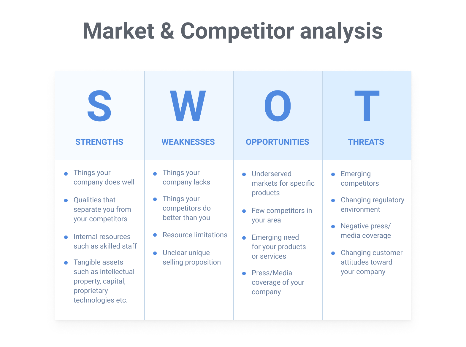
Market and competitor analysis
It's useful to learn some of the market’s best practices, which niche you should take, and set the goals that best fit your business. Understanding who your competitors are and what they offer is also crucial.
Most likely, there will already be many players on the market so your product should have something they don’t – an element that motivates your users to switch. One way you can do this is by analyzing what the others lack to form your competitive advantage. Taking this step helps you know how to stand out while showing your product’s value.
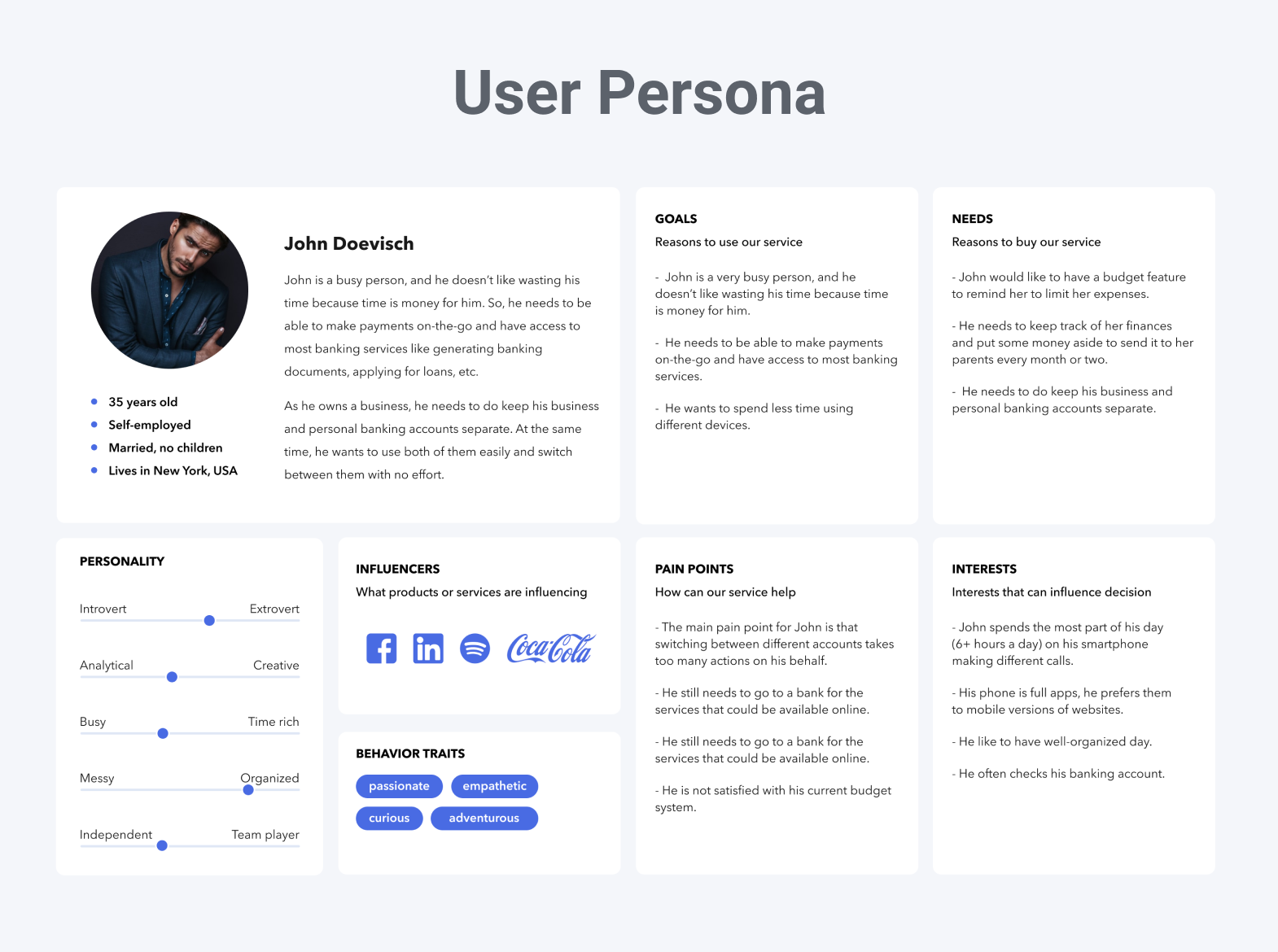
User persona research
The user persona is an archetypical fictional person that helps you describe who you are targeting. For this step, we create a list of hypothetical characteristics to describe someone likely to use your product.
The characteristics are based on your business goals, product specifics, and market analysis. It’s also possible to conduct potential user interviews: there is no one better to ask what the current market lacks or how the app should look than those who will actually use it.
The user persona can include the person’s age, occupation, hobbies, social status, income, and so on. We also consider their worldview, motivation, and what they would likely pay for the product. It’s common to include a quote, as well, that describes the user’s attitude towards our app.
By taking these steps, our design team can prioritize any functional or visual decisions based on these potential users and what they would want to see. This style method also allows us to avoid overly abstract and vague audience targeting. Instead, we highlight our future users most insightful features.
Information architecture
Information architecture is a way to structure all the content in our app so the user can perceive it easily. Let’s agree, any app is not just a set of buttons – there are usually numerous images, screens, texts, and so on. These elements should be arranged properly to make your app user-friendly.
For example, when providing dashboard design services we pay close attention to organizing the dashboard as effectively as possible for users to find it simple and convenient. After all, it should have everything at once but not be too clustered. Quite a task, isn't it?
One way of analyzing information architecture is by creating a sitemap. This step helps with categorizing and prioritizing all the elements we want to include in our solution.
And, to save time during the next steps of the design, analyze the information structure beforehand. This is also a way to ensure the app is easy to navigate because it has a clearly defined logic right away.
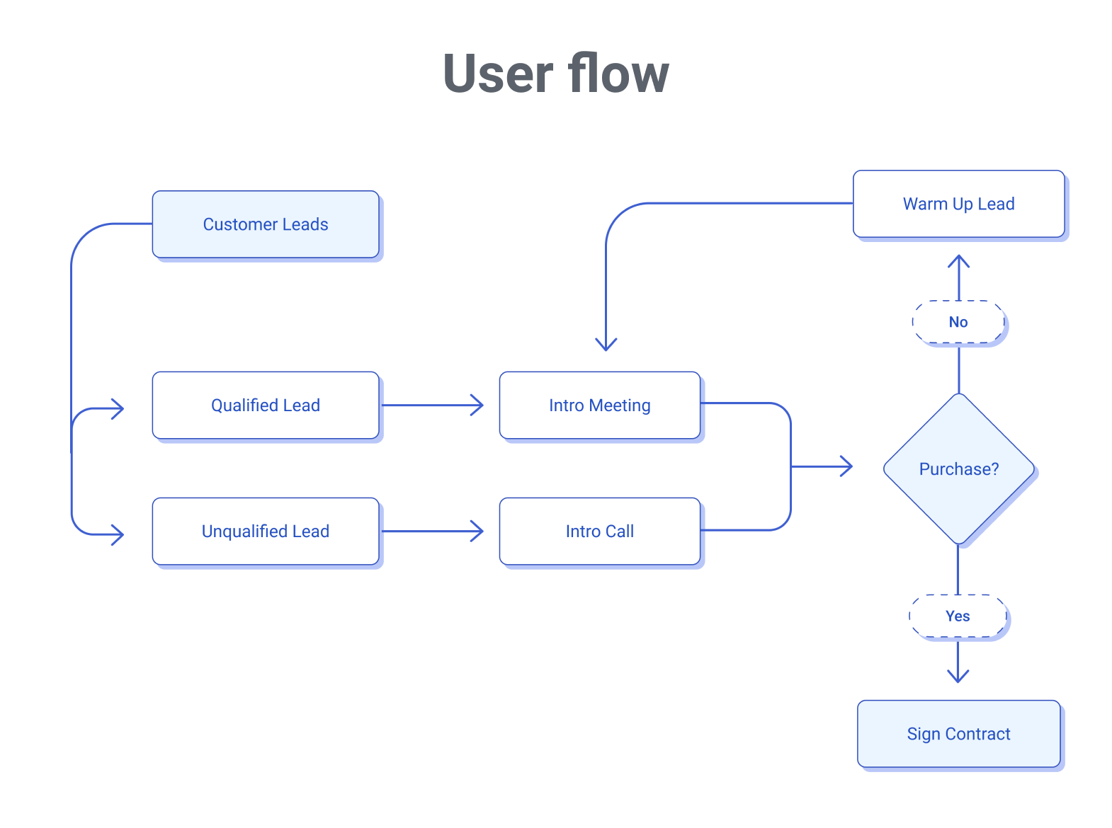
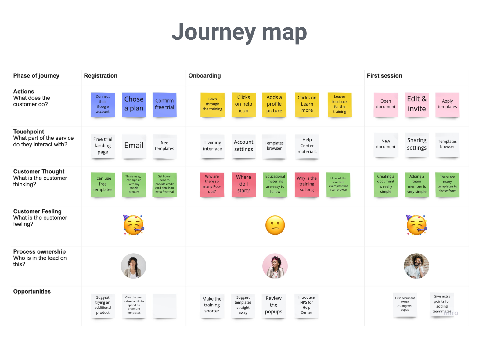
Journey map
A journey map is utilized to draft the app’s purpose and visualize how the user can work through the app step by step, as well as generalizes all the information about the user we collected ahead of time.
How do we do this? We create a scheme of the user’s experience when navigating the app. It can be seen as a timeline or a story that represents concisely how the user’s attention is guided from one point to another. We also add user goals, expectations, and so on to demonstrate the context of the experience. Because of this, it is important to focus on one specific persona and scenario at a time.
While we can think of many possible and useful features to add, when outlining them in the app, there can be too many choices or unnecessary functions that cause distraction. Making a journey map helps avoid these issues.
Step 3: Defining the structure
After completing the initial research stage, we have accumulated a good bit of insight into how the app should look and function. The discovery stage is always finalized with a set of fact-based decisions and a clear project vision.
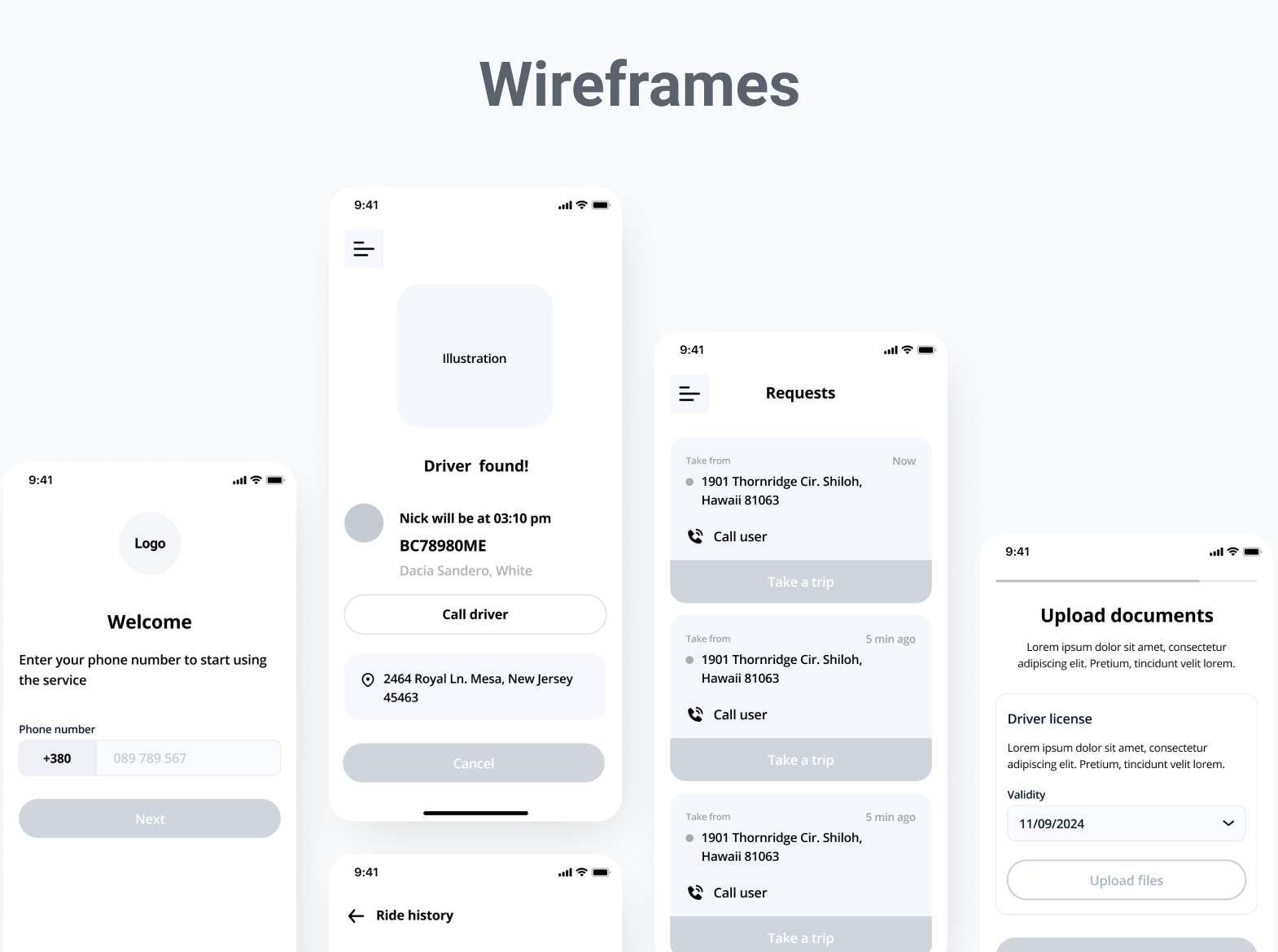
With the initial components in place, it’s time to make our first wireframes – the basic outlines of the app’s screens. Wireframes are created to show the app’s UX structure and the placement of all the elements.
We will first create prototypes that can be modified easily, let you play around with them, then ask you to give us feedback. Only after your approval will we proceed with more detailed designs. Wireframes are a necessary step before moving on to the UI. Why?
Imagine you skip this step and request the completed UI design right away. We’ve spent weeks working on it, carefully choosing the colors and fonts, creating illustrations, and so on. And then, you review the final design and realize you want to add more buttons or rearrange some of the screens.
If this happens, all the effort spent on the thoughtfully designed screens has been wasted, and the same amount of time is needed to redo it all. This is why wireframing is crucial.
Wireframes are also used for showing the app’s structure to the developers, making the collaboration between the designers and developers much more effective. They can come as low-fidelity or high-fidelity prototypes, depending on the level of detailing required. We can also create clickable prototypes, so you can try navigating your way through the app to understand its dynamics better.
The type of wireframes we create depends on the time restrictions and goals you have in place. In some cases, a simple low-fidelity prototype might be enough to understand the basic structure. But, in others, it would make sense to draft it in more detail. Each project requires an individual approach.
Creating wireframes is perfect for exploring the kind of functionality you want to see in the app. You can make change requests and discuss the adjustments you want via comments, messages, calls, or workshops. To help direct the work, we always encourage our clients to give their feedback. This approach is the most effective way to achieve the results they desire.
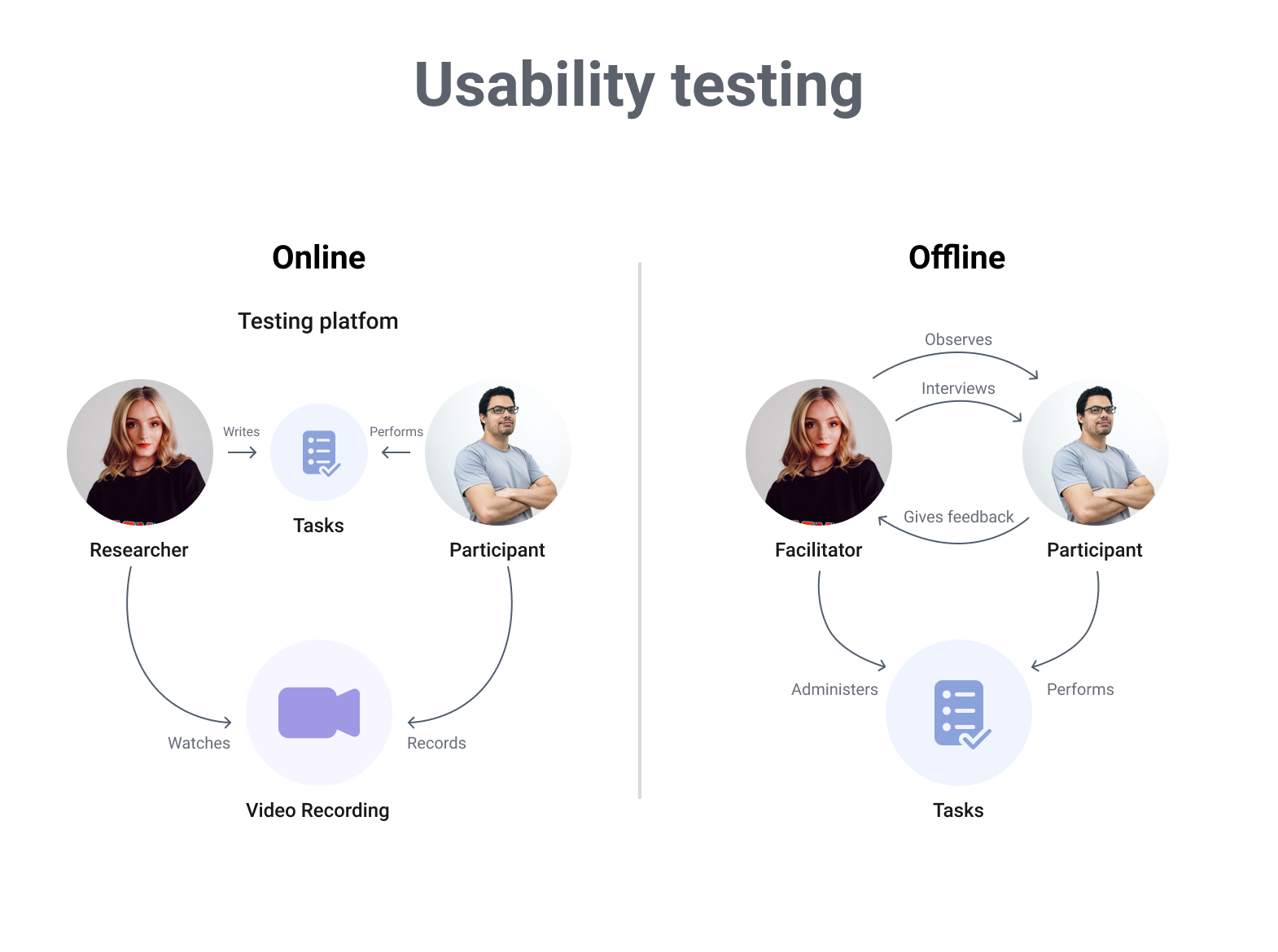
Step 4: Putting the UX to the test
Now, after we’ve agreed on the app’s functionality, it is time to try it out on real users. Why is this step important? User testing helps us uncover possible issues with the design. Perhaps the number of functions we added can be a little overwhelming for a new user, or the navigation is not as obvious as it seemed.
User testing can be conducted both in-person and online. Nowadays, online testing is more popular as it is super convenient and easy to organize. After the testing process is complete, users will answer questions concerning their experience with the platform.
Step 5: Adding style
The app’s structure has been finalized, all buttons are in place, and the user experience is looking seamless. What’s next?
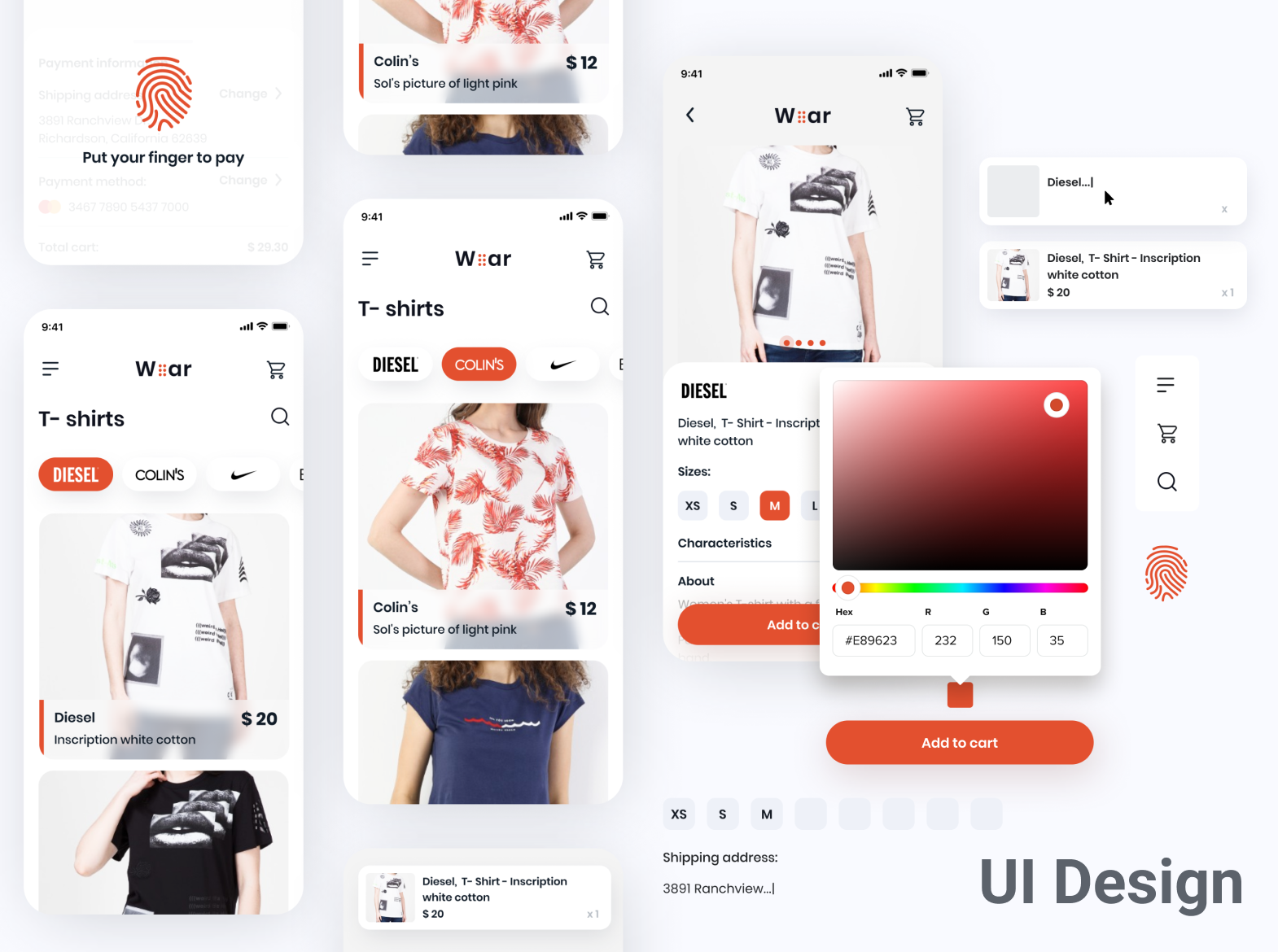
It’s time to add style! We carefully choose fonts, colors, illustrations, and other elements to make your app not only functional but also visually appealing.
To get started on the UI design, we typically create mood boards where we gather all the references and ideas for inspiration – but they don’t have to be too detailed. Mood boards are simply a set of images that represent the style and feel the app should convey.
Next, we start crafting our UI design. It’s best to make a screen or two first, then ask for feedback. For example, are we moving in the right direction? Is this style exactly what you wanted to see? We usually offer two or more options of the same screen, and let you choose which you like most.
Remember, on the UI stage, the structure of your app is already completed. This is why we compiled our research and made the wireframes beforehand. At this point, any changes concerning the app’s logic require a lot of work, which affects the estimated budget. Each design step is here for a reason and it’s best to make prompt decisions.
Step 6: Gathering feedback
After finishing the UI and the general design, it’s time to test it. Testing allows us to observe a user's overall reaction to the design and how they tend to interact with it. This is an effective way to see how well the visuals work before presenting them to your audience.
Clients and designers often know the interface too well, so it might look fine to them. But a new user could find the design difficult to follow. Also, it is important to remember that some users are more tech-savvy than others, so it is valuable to see how different people interact with the interface. This style of testing offers us qualitative data on how users perceive the design.
Making the right decisions
That’s it – after following all these steps, you’ll receive your very own app design!
At Perpetio, we feel designing any product is always a mixture of creativity and carefully made decisions. We hope this guide helped clarify how designers make the right choices and how to ensure they fit your goals.
Our teams focus on being flexible with our processes, and desire to tailor all steps to match your project’s specific needs. And, remember, each design phase is there for a reason – to create a final product that meets each and every one of your goals. Our mindful approach towards the process helps avoid unnecessary iterations and manage the resources more effectively.
Finalizing the design doesn’t mean the work is finished. The app still has to be developed and tested. As these steps unfold, the designer closely collaborates with the developers and testers to ensure the final product matches the original design and the results are exactly what you intended.
If you feel the time has come to implement your idea, reach out to us and let us turn it into a great design – you won’t be disappointed!