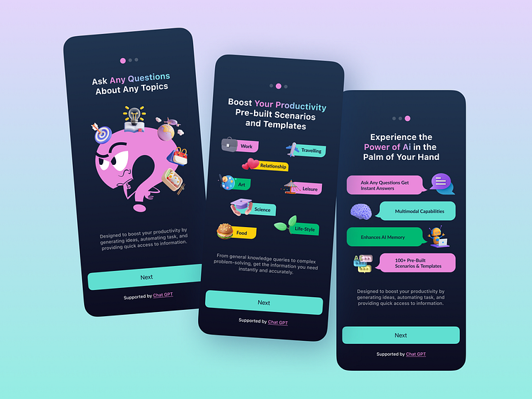
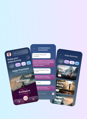
When it comes to UI/UX design, UI (user interface) is all about good color choices, eye-catching visual elements, and attractive fonts. But is it so? The newest trend, invisible UI, is the opposite of what we think of as a successful user interface design. Now, designers are working hard to make their jobs go unnoticed. Why so?
What Is the Invisible UI?
The invisible UI, sometimes called invisible design or zero UI, is the concept when the user interface of a digital product is so intuitive and effortless that it becomes “invisible” to a user. In other words, the UI elements are not made to catch the user’s attention but, on the contrary, minimize the interaction with the interface.
The basic principles of the invisible UI are
- Context awareness: The UI adapts to the current environment and takes the user's needs, saved data, and interaction history into account
- Intuitiveness: The interface is intuitive and understandable, a user doesn't have to guess the navigation or the meaning of certain icons
- Frictionless: A user can perform the minimum required number of actions to reach their goal
- Naturalness: The interface uses and recognizes typical language, gestures, and interactions. A user doesn't have to learn specific ways to use the product
- Accessibility: Users of different levels of experience with technology, cultural backgrounds, and abilities can navigate the UI with no problem
Do not fall into thinking that invisible UI means removing all possible functionality and visuals from the interface. Invisible UI is all about being ever-present and available per user request. It’s like the UI elements are always there, just waiting to be summoned.
What Are the Main Elements of the Invisible UI?
The invisible UI is more of a design philosophy than an established practice with its set of rules. However, some elements UI/UX designers can incorporate to make their interfaces more intuitive and seamless.
Personalization and contextual interface
Thanks to AI and data-driven design, users can receive personalized experiences tailored specifically to their needs and interests. For example, social media-like feeds are often based on the content with which the user has previously interacted.
So-called anticipatory design involves elements that appear as the user walks through the interface. Instead of overloading the UI with every possible menu and icon, those can be accessed only through scrolling or when navigating through a specific part of the interface as pop-up menus.
UI takes the user’s context into account and offers relevant information only. Such contextual awareness allows creating the experience a user needs here and now. For example, mobile apps and websites can rely on a user's location to offer relevant services and information.
Artificial intelligence
The AI technology is a big part of assisting the invisible UI integration. The use of AI promotes the invisible UI in several ways
- Customizing content, giving personalized recommendations, and communicating with a user through chatbots. All changing the UI in real time and making the experience smoother
- Using data about users and their preferences to predict actions and offer more relevant content and actions

AI has become the main aid for the zero UI approach as it allows crafting a more seamless user experience by making it individual and context-sensitive for every unique user.
Microinteractions
Microinteractions have been the next big thing in UI/UX design for a while now. Microinteractions are the actions targeted at one single task or, speaking the design language, use case.
Examples of microinteractions include
- Tapping the heart button turns it from gray to red
- Sending an emoji in a chat creates a full-screen animation
- Swiping an email archives it
Source: MESS WITH D ~ VISUAL STUDIO
Microinteractions perform several functions in the interface, including helping users navigate, providing feedback about their actions, or simply entertaining them.
Source: Dev venkat sai
How do microinteractions promote the invisible design? It’s all about making the interface more responsive and intuitive. As we mentioned above, the role of UI is to be ever-present and reactive to user’s actions. That’s exactly what microinteractions can help achieve.
Microinteractions react to what a user does, like clicking a button, hovering over an icon, or swiping a page. All these actions take users further in the UI and, additionally, delight users with entertaining animations.
Hardware integration
Integrating hardware is another way to achieve zero UI. Take an example of voice control in a digital product. Not only does it make your product more accessible, but it also extends the UI outside the screen and welcomes users to interact with the product in a different way.
Technology like voice assistant erases the UI in its traditional sense: users can reach the mobile app or other product without even taking a look at the interface itself. It’s high time designers integrate voice-user interfaces into their products.
Other technologies that promote the invisible design are augmented and virtual reality. AR and VR are erasing the strict border between the user and interface and letting the product seamlessly blend into the environment.
For example, an AR-based mobile app works as an enhancement of the natural environment of the user. Users can scan objects for extra information or get navigation suggestions without the need to tap any buttons.
How to Make Your Product’s UI More Invisible
A shift towards the invisible UI means that UI/UX designers need to reconsider their usual approaches and workflows. If, in the past, UI meant a lot of work on the product’s aesthetic value, now the focus is shifting to making the visuals less emphasized and instead moving towards intuitive navigation, delightful microinteractions, and slightly noticeable interface elements — just enough to keep users engaged but not overload them with excessive visuals.
Summing Up
UI/UX design is an area that is constantly in motion, so adjusting to new hardware and software requirements, visual approaches, and industry trends is a must. The invisible UI is a new design philosophy, with its purpose of making digital products more intuitive and user-friendly by introducing AI, micro-interactions, and hardware integration.
Ready to enhance your digital product with user-centric UI/UX design? Let’s discuss your project.


