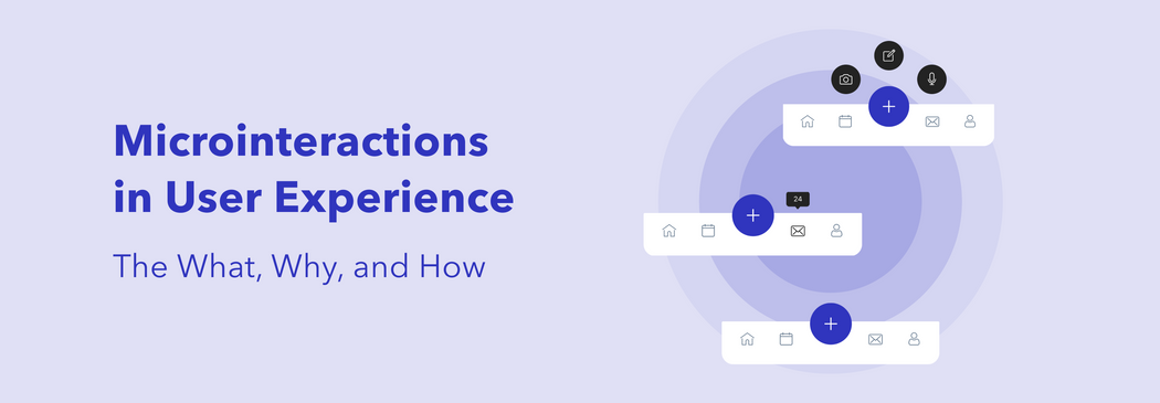
Tapping the heart button turns it from grey to red. Sending an emoji in a chat creates a full-screen animation. Swiping an email archives it. All of these are examples of microinteractions.
We might not pay too much attention to these little details, but we will surely notice when something is missing. Why? Because microinteractions are there not only to entertain us (even though it is one of their functions too) but to guide and make our experience more intuitive.
Let’s discover what microinteractions are, how they help create a better user experience, and when to use them. All backed up with some good examples.
What are microinteractions?
We will start with the basics: the definition of microinteractions. Microinteractions are the actions targeted at one single task or, speaking the design language, use case. Remember the examples we used in the intro of this article? These are small actions aimed at making our journey through the product easier and more fun.
The term “microinteractions” was first coined by designer Dan Saffer in his book “Microinteractions. Designing with Detail” in 2013. In this work, he highlights that any product can be considered as a series of microinteractions.
He also described four main parts of any microinteraction:
Trigger
First of all, a trigger initiates a microinteraction. There are two types of triggers: user-initiated and system-initiated.
Clicking a button, getting a pop-up, swiping, or just seeing an animation — those are the beginnings of the user’s experience with a microinteration.
Rules
For anything to work, a set of rules is a must. When it comes to microinteractions, we need to define what happens and in which order when a user performs a trigger action. Will they be redirected to the next page after clicking a button? Or does starting typing a message mean that the “send” icon will change its color?
Feedback
While rules stand behind the process and simply define the order, users can’t see them as it is; rules have to be invisible and intuitive. Instead, your users see the result of the rules being applied — feedback. Feedback is the response the user is getting, like actually seeing the “send” button change its color from grey to blue, for example.
Loops and modes
Rules define the order inside the microinteraction. Loops and modes regulate the relation between different microinteractions and their place in the product in general. How long does the microinteraction last? What happens after it? What if the user presses the same button five times? Loops and modes are especially important when the condition of the microinteraction changes, for instance, if used repeatedly.
Why are microinteractions important?
Now, when you know what microinteractions are and how they function, you might be wondering what role do they play in a digital product? Can, let’s say, a mobile app, exist without microinteractions?
No. Those, at the first sight, minor details are what hold a product together. Just like an application can’t be useful without any features, it can’t be convenient without microinteractions. Microinteractions are the foundation of user-centered and intuitive design. Thanks to them the user knows where to tap and what comes next.
Microinteractions help achieve several objectives:
- Navigating users through the app or website. For example, swiping left takes the user to the next page in many apps.
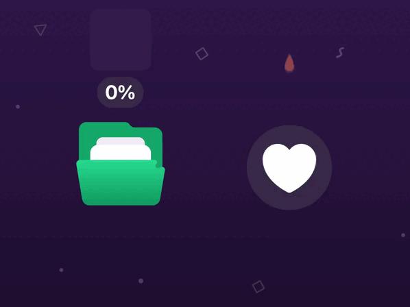
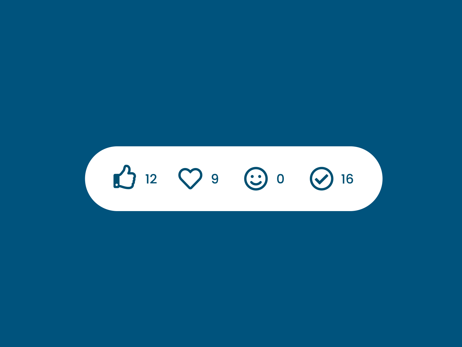
- Providing users feedback about their actions. Let’s recall our example with a like button. When the heart turns red, the user learns the result of their action: they liked a post.
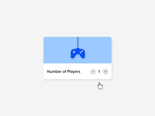
- Giving users control over the processes. They can change the audio volume, zoom in and out, or rewind a video.
- Offering users recommendations and promoting your services. Pop-ups with suggestions are also micro contact points.
- Communicating your brand. Design is always about representing your values and vision as a brand. And microinteractions are one more way to highlight your brand character and add a human touch to the experience. For example, animation when loading a screen makes waiting a little bit less frustrating, doesn’t it?
- Entertaining users and creating a more friendly environment for them. Fun animated points are always a good idea for giving your digital product a bit of a personality.
How to use microinteractions in your product?
So, now, when the what and why of microinteractions are crossed out, let’s explore how you can use microinteractions in your product. As we have previously mentioned, microinteractions come down to clicks and scrolls focused on one single task. What is more, microinteractions also include passive actions, like getting a notification or seeing a call to action.
Our design team took some time to find some good use cases to give you a clearer idea of how microinteractions can enhance all types of apps. Let’s review them:
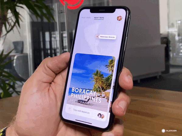
- Swiping between the products is probably one of the most common microinteractions.
- Reflecting a status bar is also a popular one.
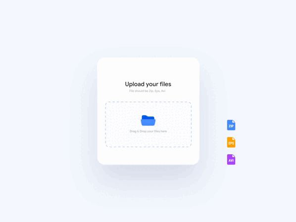
- You can update your users on the download status with a microinteraction.
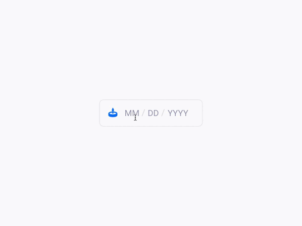
- Here, the birthday input field shows your zodiac sign. A fun and personalized touch, isn’t it?
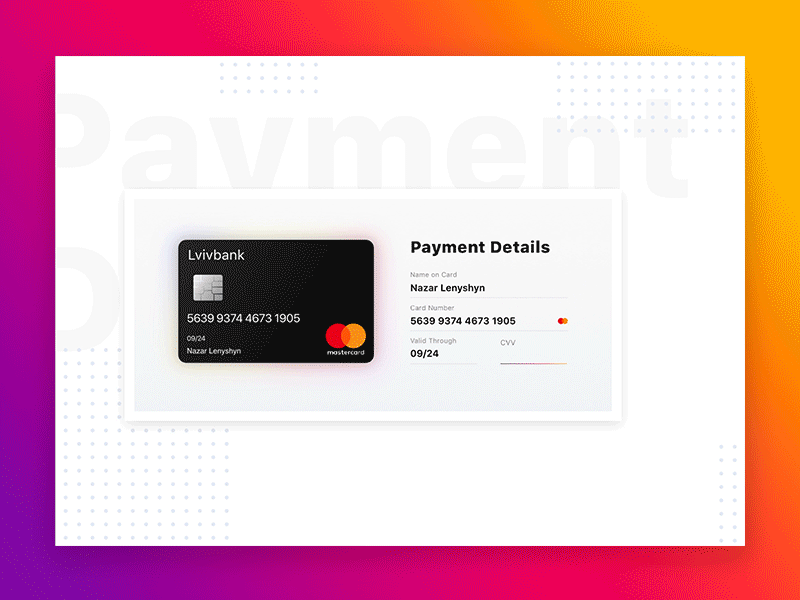
- The banking information input is visualized by a card turning to give a user a hint as to where they can find this data.
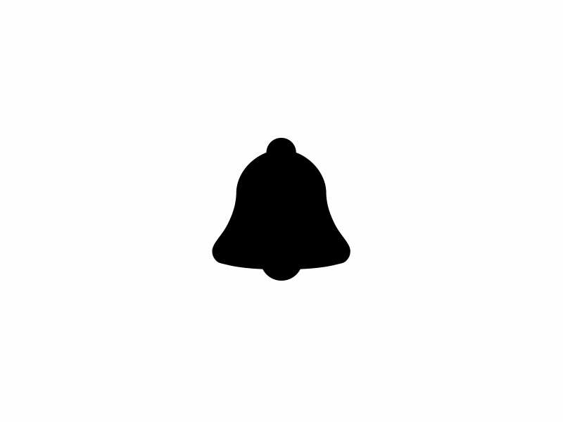
- The bell is moving when a user gets a new notification.
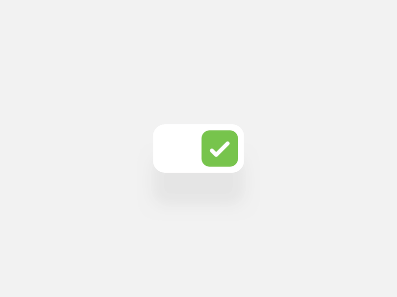
- Instead of just being a boring checkbox, here, it became a microinteraction and is represented as an on/off switcher.
- When pulling to refresh, a user will see a fun animation; waiting for the page to load might be way less frustrating.
These are just several examples of how to apply microinteractions in a digital product. As you can see, they are both functional in terms of design usability and represent the brand’s positioning.
Tools for designing microinteractions

So how are microinteractions actually designed and which tools do the designers need? Apart from the usual prototyping software, such as Figma or Adobe XD, animation tools are needed to complete a microinteraction design.
These might be:
- After Effects
- Principle
- Flinto
- Invision Studio
Each of these tools has its pros and cons and it’s up to a designer which one to prefer and master. After Effects remains the most popular animation software among UI/UX designers.
Summing up
The devil is in the details — the same can be said about good design. Microinteractions are often invisible at the first sight, and that’s how they should be. They are not created to drag the attention but to leave the user with no questions. Microinteractions are here to solve the problems that can occur while using the product. And, of course, add a fun twist to the product.