Before even starting to enjoy the perks of cutting-edge technologies and noticing the range of useful features, most people will pay attention to the interface.
That’s why most applications don’t even retain more than 10% of their users for over a month. It is the sad truth: many users quit the app if it doesn’t look good right away or if they need to spend too much time figuring out the in-app navigation.
How can you fix this? By making your app better. Yes, as simple as that. If your product is marketed to the right audience, has an eye-catching visual style, is convenient, and fully satisfies the users’ requests, why would anyone delete it? You can transform your already-existing mobile solution into one that won’t be abandoned (or will be actually discovered on App Store and Play Market) by redesigning it.
Reasons for the App Redesign
Before we spill the beans on how to redesign an app, let’s talk about the reasons that push a stakeholder to sit and say, “Yes, this app isn't working properly”. In fact, there are several reasons why a mobile application requires a redesign, some of them not so obvious.
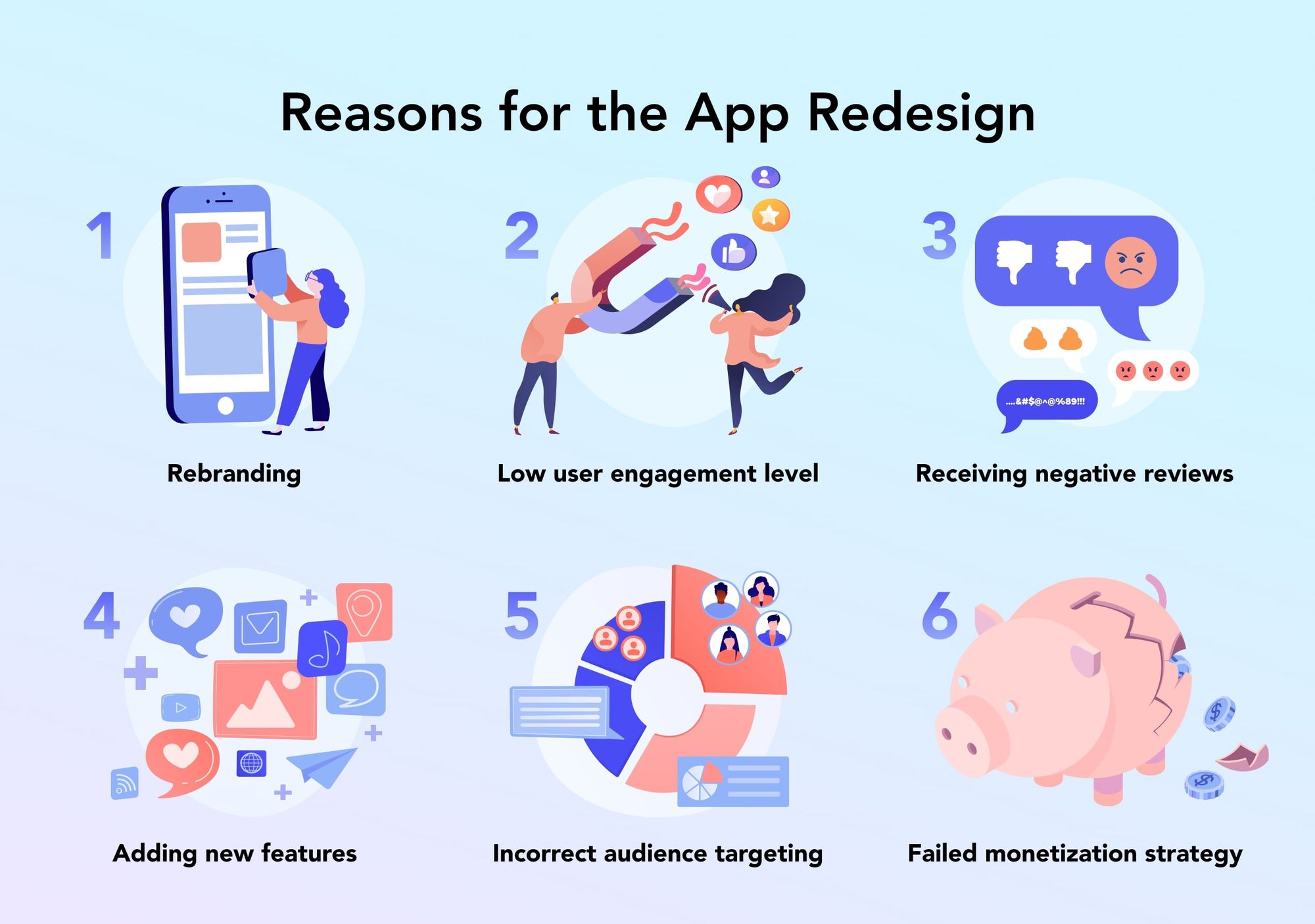
Rebranding
The color palette doesn’t look so appealing anymore. The icons and menu bars are old-fashioned. The logo doesn’t represent the company in the right way and doesn’t attract the target audience. The current branding feels off all in all. All these factors are little signs that it’s time to redesign an app.
Low user engagement level
Suppose your marketing strategy and brand positions are all good, so your download rates don’t look too bad. The only problem is that after a while users eventually open the app less and less or just abandon it. As a result, your engagement and retention rates drop. Seems like there is a problem with the app’s UX: something about the feature set or user journey is off.
Maybe the application is plainly unintuitive or doesn’t resolve the user’s problem. Or perhaps the onboarding doesn’t highlight the perks of the product and is not a clear guide through the application. The only way to fix it is by redesigning your application. Take a look at the use case of UI/UX design for Meest: a delivery service app the Perpetio team worked on. The onboarding screens clearly state the app’s functionality and its advantages. As a result, users get to understand why and how to interact with the application.
Receiving negative reviews
What’s the easier way to learn about your product’s pros and cons? Reading your users’ reviews on Google Play, App Store, and social media. Skimming through reviews online will give you insights into the most critical points of your application. Is there something to complain about? If there is a problem with an app, most likely, users won’t keep it to themselves and share their opinions online.
Adding new features
If you started out with an MVP product, there might be a point when you feel ready to scale up and extend the functionality. Or maybe you are seeing your competitors leveraging AI chatbots and understand that you need to use those too. Introducing new features might mean a changed user journey, which can bring inconsistencies, even though your app is becoming better. That’s why redesigning an app can be a necessity to keep your app logical and intuitive with new screens.
Incorrect audience targeting
If you made a little mistake at the product discovery stage, your audience might not quite be the one you hoped for. Suppose you made a language learning app for people who need to improve their business vocabulary. But your positioning on the market includes more playful, “fun” branding, like an animal mascot and vivid colors of the UI. The result of such inconsistency is that your target audience is not even looking at your app because they suppose it’s a solution for students or children. What’s more, you are attractive to a younger audience that is not into paying for a premium version of the application, which is your main monetization model. In this case, redesigning your application is the only way out.
Failed monetization strategy
Talking about monetization, if your revenue model is not bringing you as much as you expected, the fault might be in your app’s UX design. Maybe the users don’t have a chance to experience the advantages of the premium model through a free trial? Or perhaps the regular features are more than enough and users don’t have a reason to make any in-app purchases? One way or another, fixing the UX and adapting the user journey to open opportunities for revenue are a must.
Take a use case of UI/UX design for Burn: Perpetio’s work on this fitness app was finalized with a new monetization strategy. Burn now offers users a 7-day free trial with a further paid subscription for a monthly or yearly membership. As a result, potential members can try out the perks of the solution and get the motivation to purchase a subscription.
All of the above reasons can lead you to make a decision to introduce changes in the current product and make it more competitive in the market.
How to Redesign an App: Step-By-Step
Redesigning an application is not an easy task because it includes some additional work on reviewing the existing design solution and pinpointing the problems in the UX and UI. Let’s discuss how to redesign an application step by step.
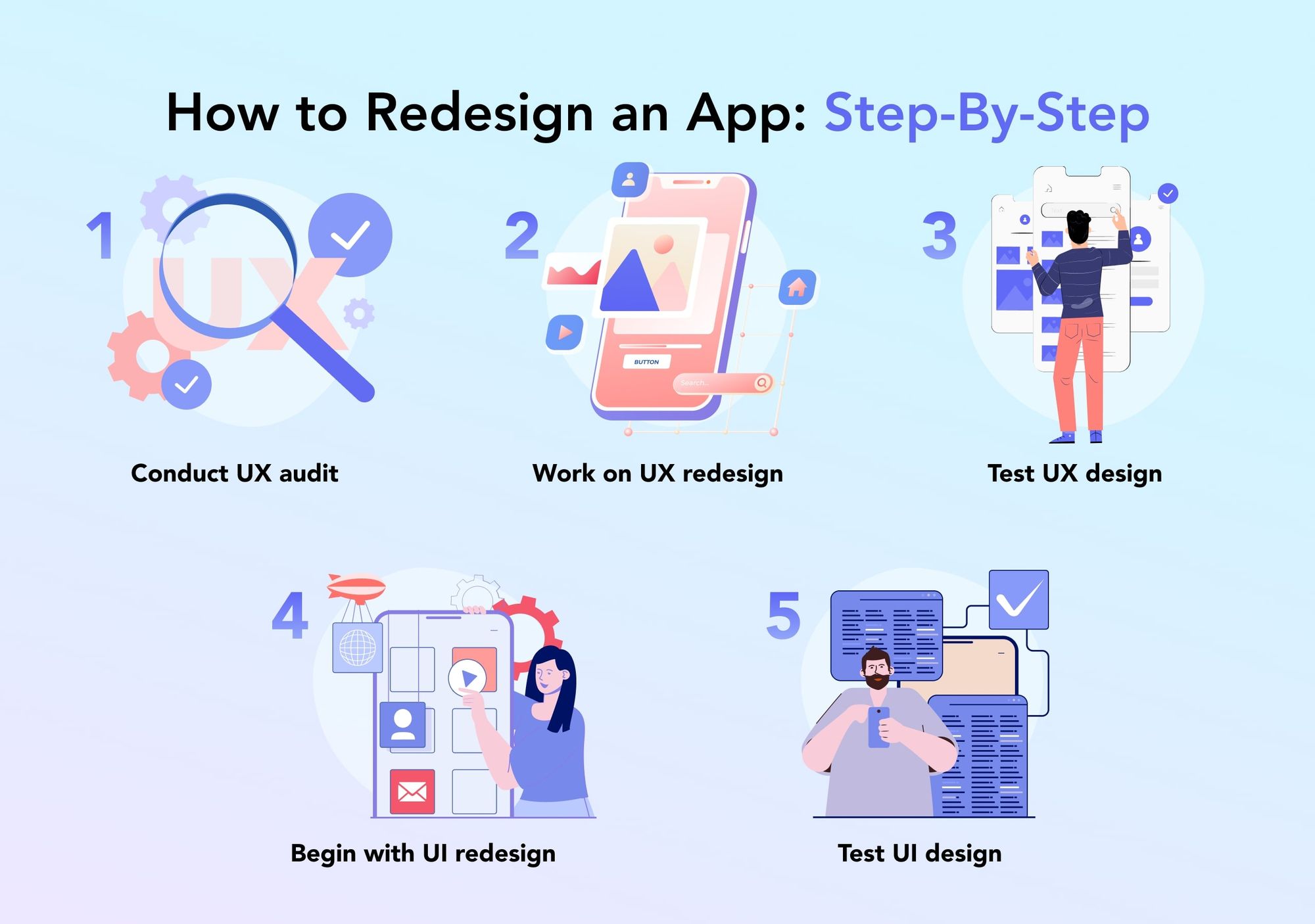
Conduct UX audit
Before getting to do anything about the new UI/UX design, one big job for a designer is to understand what went wrong with the existing app. The process of analyzing the app’s UI/UX design is called a UX audit. A specialist reviews the application's structure and user journey, as well as its general appearance and UI elements. At this stage, a designer is basically testing the app’s usability and searching for blocks that prevent users from getting an excellent experience. Unintuitive navigation, complex onboarding, feature overcrowding, or even badly working forms due to bugs — all of these might be spoiling the user experience. Not to mention old-fashioned UI.
Apart from exploring the ins and outs of the solution, a designer takes a look at the analytics (e.g. through Apple Analytics, Google Analytics, or Firebase Analytics) to understand at which point of a user journey a bottleneck occurs. Popular app success metrics include download rate, user conversion rate, and user retention rate.
Work on UX redesign
When all the faulty points of the app are determined and a designer understands well what should be changed to improve the user experience, the app UX redesign process begins. How to conduct a UX redesign? Similarly to the regular UX design as a part of mobile app design services, a specialist does market research to identify the competitors and their strengths and weaknesses. Sometimes, user persona research might be beneficial for identifying potential users’ pain points and desires.
Based on the research along with the UX audit results and an interview with the company owner, a designer starts creating the app’s new information architecture and journey map to improve the user experience and navigation inside the app.
One more step in how to redesign an app UX design is to create wireframes: a black-and-white sketch of an app that outlines all the screens and navigation between them.
Test UX design
Before splashing some colors and working on the app’s distinctive visuals, it’s a good idea to test the application’s usability and make sure that the users perceive the solution the way intended. Of course, the first group to review the app’s structure are the stakeholders: business owners, CTO, project managers, other designers, and so on. Additionally, user interviews and A/B testing can be carried out to note how users would interact with the product and how the updated UX brings more value than the old version.
Begin with UI redesign
After the UX app redesign is finished, a designer can refresh the UI and redesign the visual solutions. Ui is no less important than UX when it comes to how users perceive your application and whether or not they choose to continue using it. Based on your requests, references, and desired product branding, a UI designer selects typography, decides on icon stylings, and adds graphic elements, such as animations and illustrations.
Test UI design
The last one among the steps for the app redesign is to test the completed UI design. The stakeholders will review the UI/UX project and approve it for development. A good practice for UI testing is A/B testing, just like for UX testing. Potential users will be choosing between two options of the UI design, for example, in two different color palettes or with different styles of icons.
Ather completing this final task of the app redesign process, the UI/UX design will be submitted to the developers who are to work on the application’s code. Now that you know how to do a UX redesign and UI redesign, let’s take a look at some examples of successful app redesigns.
Real Examples of App Redesign
eargym is a mobile application for assessing and improving one’s hearing. The application offers a set of hearing tests along with exercises for improving one’s hearing health. The eargym team contacted Perpetio with a Flutter cross-platform development request.
The task ahead of Perpetio was to enrich the app with more Unity engine-based hearing games and improve the overall user journey and app performance. During the collaboration, Perpetio team suggested changing the app’s structure to introduce an effective monetization model: a premium version of an app with a free trial. Previously, a premium mode was available without a free trial, so the users weren’t motivated enough to purchase the paid version of the app. Through A/B testing, we learned that a 14-day free trial increased the number of active users by 40%.
One more improvement is a Daily System of goals to keep the users interested in taking hearing tests, completing games, and reading materials every day. Such a gamified system improves user engagement rates and overall user experience.
Additionally, in collaboration with Perpetio, eargym added a new feature to the application: a Discover Tab with various reading materials on hearing health and a Listen Tab with ambient background sounds.
Wrapping Up
Redesigning your application might not always be a desired choice but a necessity. Nevertheless, getting an update in most cases is a way out of low app success metrics and unsatisfactory performance. The reasons businesses decide to redesign their apps include rebranding, adding new features, low user engagement rates, and others. As to how to redesign an app UX and UI design, there are several steps to follow starting with UX audit and metrics analytics and finishing with a UI testing process.
FAQ
When do you need to redesign your app?
There are several reasons to redesign an application, including rebranding, low user engagement rates, receiving negative reviews, adding new features, incorrect audience targeting, and failed monetization strategy.
How long does it take to redesign an application?
Overall, an app redesigning process can take 100-150 hours.
What are the steps for redesign an app?
Redesigning an app consists of several steps, such as UX audit, UX design, UX testing, UI design, and UI testing.
What experts will I need for an application redesign process?
To redesign a mobile application, you will need to work with a UI/UX designer and a business analyst.
