Like any other digital area, design is changing constantly as numerous UI and UX trends are surfacing each month. A mobile app that was trendy two years ago is likely considered outdated and not so user-friendly now. So what does this mean? This tells us that following design trends is about creating relevant and stylish solutions, not copying someone else’s work mindlessly.
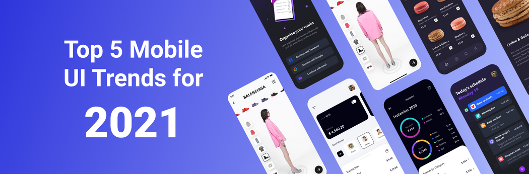
2021 is only beginning, but has set its UI design trends already. Let’s look at several amazing mobile UI trends that our designers love at Perpetio, along with examples from our recent work.
#1: Real-life pictures tell a story
“Let’s get real” — a quote from designers who are using photos actively in their work. Illustrations are still popular and used widely in mobile UI design, however, adding an image can depict the right mood more accurately. Photos make the design less abstract and easier to visualize in real life – the product or experience feels closer to the users.
Adding real-life pictures can be seen as a way of storytelling: a simple photo can often say much more than several lines of text. The task of any image is to guide users, so each shot should be placed in your design for a reason while supporting the idea you want to convey.
Remember to use high-quality photos as these become the design’s main accent. If you choose to use stocks, which is a good option for fair-priced or free images, try to avoid those with people in suits. The point of using real-life pictures is to make your design more distinctive, not more generic.
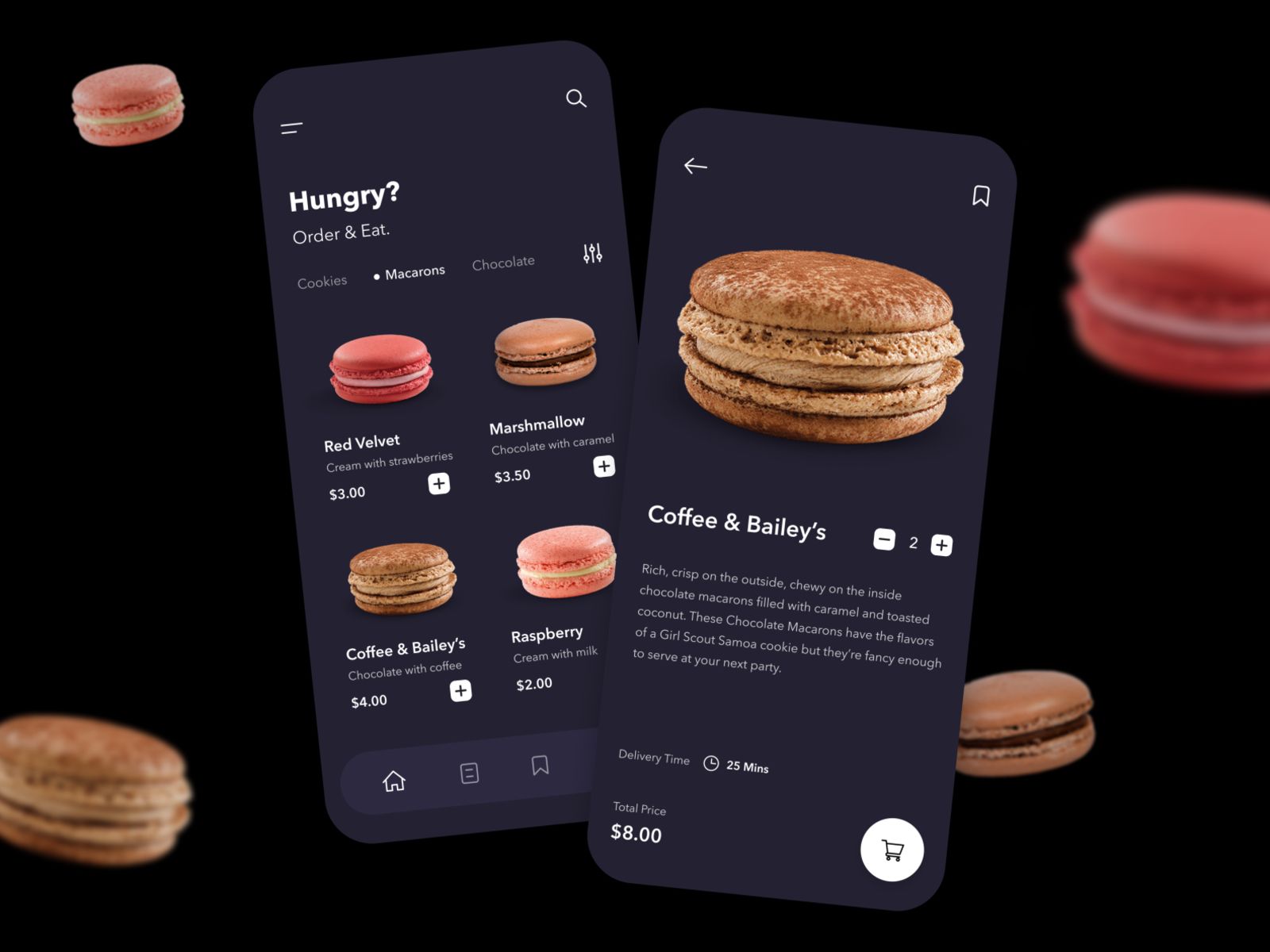
For example, at Perpetio, we used realistic images in our UI design for a food delivery app. While ordering food, users like to see what they are getting, so using real photos was necessary for setting the right expectations.
#2: Vivid colors brighten moods
Adding vivid colors is another trend we will likely see a lot this year. Perhaps the chaos in 2020 might have influenced this, but it seems people want a little bit of color around now. A radiant, eye-catching UI is a sure way to make an app stand out. It’s easier to remember a product associated with a specific color. For instance, most of us know Facebook is blue and Whatsapp is green.
While bold colors are making their way quickly on the UI scene, it is essential to maintain balance when using them. You can do this by combining bold typography with both black or white backgrounds to keep the design readable and coherent.
Let’s remember this color theory: each color communicates a certain mood and compliments a particular palette. So use your colors wisely, and don’t transform your app into a rainbow unless it’s on purpose.
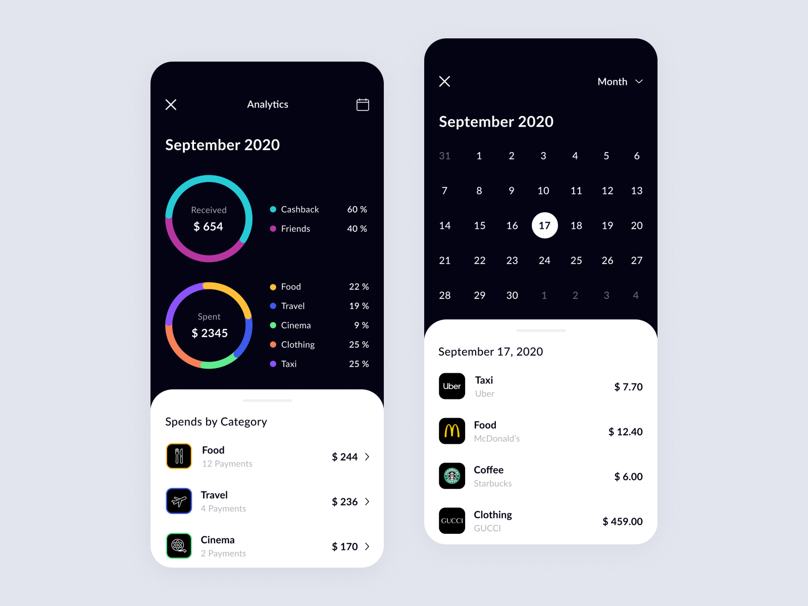
Here, at Perpetio, we’ve always loved a good combination of vivid colors. Take a look at our recent design of a finance management app. We used a set of bright colors to organize the category system, then added a dark background (which is one more trend that we will discuss a bit later) to create a combination that catches your eye without being too excessive.
#3: Aesthetic minimalism to highlight what’s most important
If the previous trend’s colorfulness is a bit much for you, we’ve got something else – aesthetic minimalism. Simple, yet aesthetically pleasing. This approach helps create an effective visual hierarchy and highlights the most important elements.
A famous phrase about minimalism says, “less is more,” which is also true for the aesthetic minimalism trend in design. This approach eases the user's journey as all non-functional features are removed.
Information overload is becoming a common roadblock, so minimalistic designs – using essential elements only – is exactly what many people need today. The color palette and visuals of such designs are usually limited and, more importantly, chosen carefully. With this approach, there are limited distractions for users by avoiding numerous illustrations and various colors.
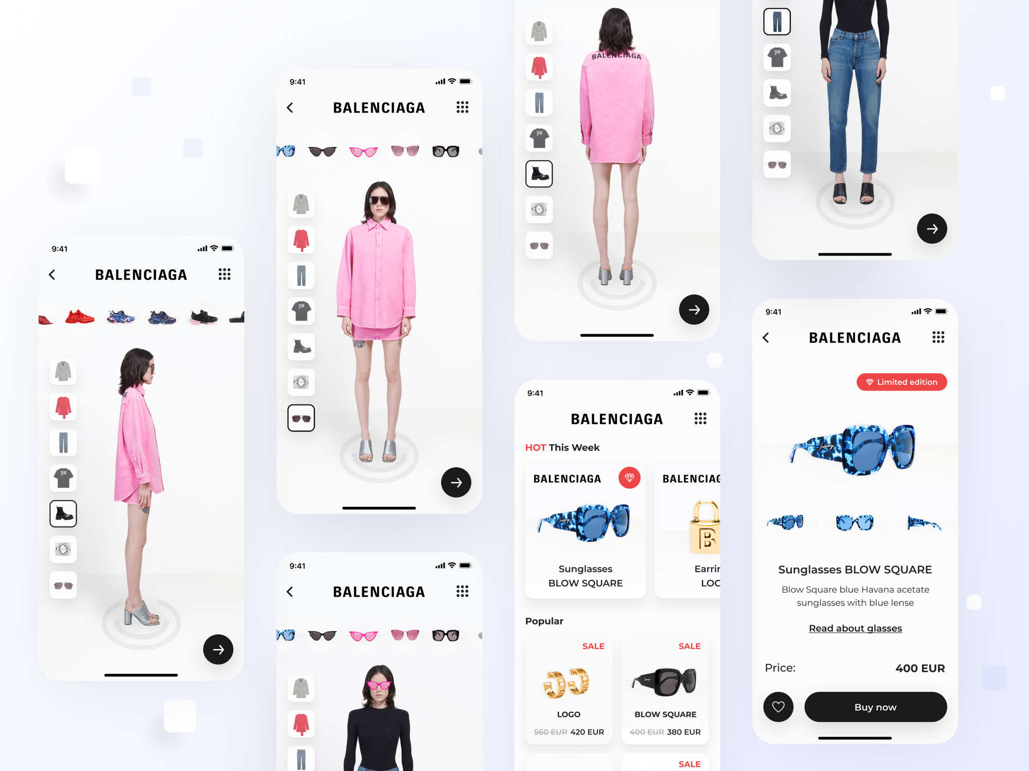
In all honesty, this is probably our favorite trend this year. Aesthetic minimalism is a great approach to creating an app that provides an excellent user experience while looking awesome at the same time. An example of a minimalist UI design we developed is an AR app for Balenciaga – a fashion brand. Using a white background and minimum details per screen, we made it easy to navigate the app and focus on the presented items individually.
#4: Animation adds more dynamics
Animation is popular in any form now, from illustrations to infographics. Dynamics can grab the user’s attention and make their first impression more memorable. Animation also adds the element of unpredictability to each experience as it can be fascinating to see action or dynamic movement among the images.
Motion creates emotion, so it is vital to consider the emotions and associations the animation should evoke. Is it excitement fueled from playful hover effects? Or maybe you want to express a sense of calm through liquid motion? Animation can be suitable for almost any kind of product if used appropriately.
Micro UI animations are especially trendy at the moment. These animations are based on micro-interactions, which are small but fun elements. Micro animations might include progress bars, emojis, loading screens — anything to make the user experience seamless and enjoyable. They also add a nice touch to the overall picture as an attentive user gets a reward.
We used animation recently in our illustration for a task planner app. To us, it was a success as it doesn’t stand out too much or distract users from the main features in any way. It’s simply an additional detail that can entertain users while waiting for the screen to load.
#5: Using dark mode to stand out
The dark mode was a major trend in 2020, and it seems it will stick around for a while. Despite being commonly used among designers, the dark background remains quite modern and somewhat unusual in UI.
Users like to have their choice between white and black modes. When planning your app, it’s ideal to consider how the design will look with both backgrounds. The dark mode has many attractive elements aside from being aesthetically pleasing. It also reduces screen fatigue, is more comfortable for perceiving visual information, and can save the device’s battery – which is a huge plus for most users.
In UI design, applying the dark mode works really well as it can emphasize certain elements when added to the appropriate color scheme. Still, it’s worth noting that dark mode isn’t a simple reverse of the white background. What works well for white might become messy with black.
Black is often associated with negative emotions, so it is important to create a balance. For example, you might consider adding a few bright colors or using elegant black and white solutions.
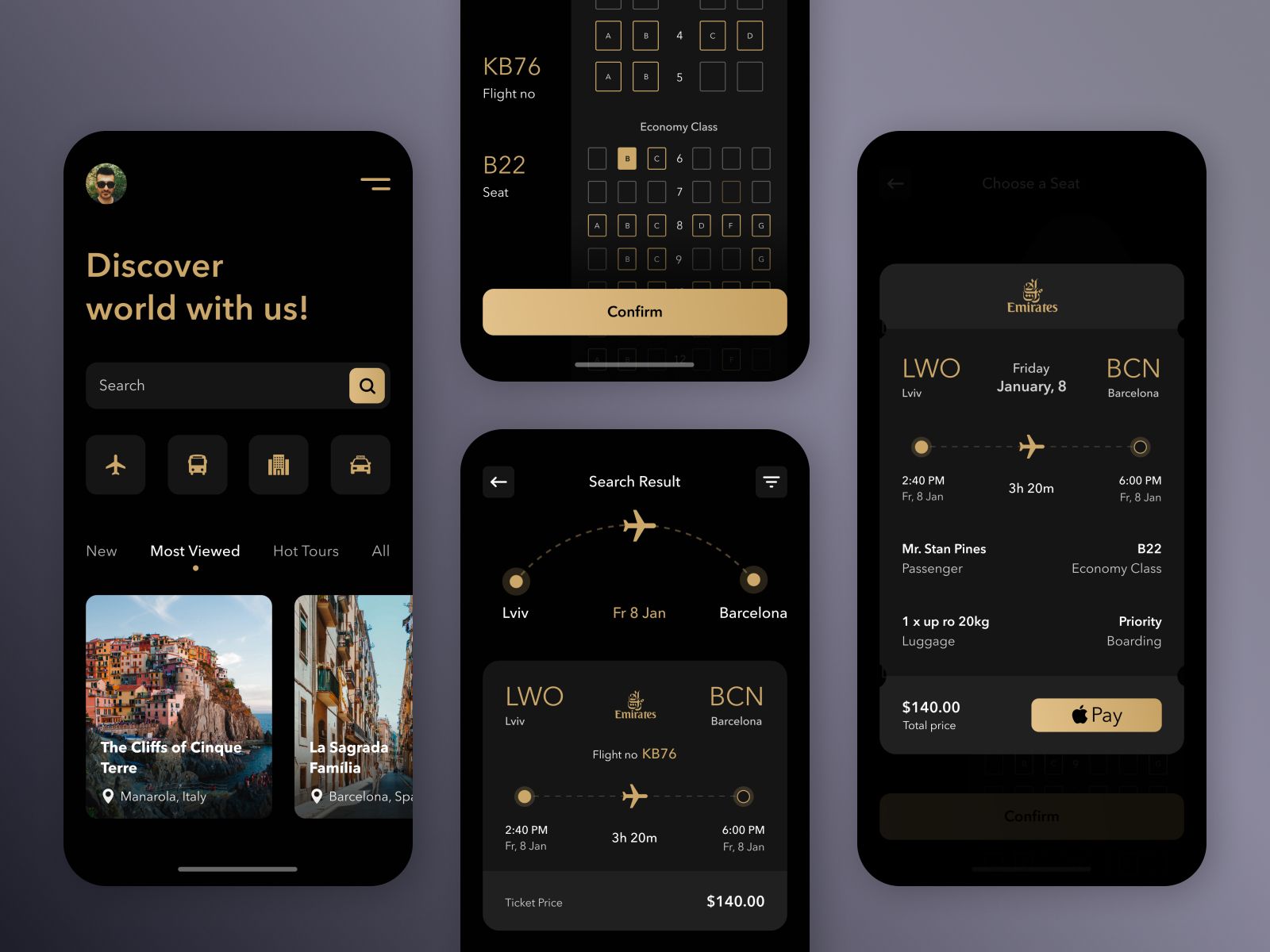
To give you an example, let’s look at the dark version we made for our traveling app design. The dark background compliments the vivid photos, as well as the elegant white and golden typography. It’s also easy on the eyes.
Summing it up: to follow or not to follow?
These aren’t all the trends to look for in 2021, there are just too many to unpack each one here. Still, these five styles are loved and used by our designers at Perpetio, and we feel they can contribute greatly to creating convenient and attractive designs.
As a mobile application design company, we are dedicated to creating relevant solutions. For this reason, our design team peeks at current trends from time to time to see the next craze. But it can be tricky. With trends being quite unpredictable, you never know what might be popular in a few weeks. At the same time, it is hard to foresee which trends will stick around for a while and which will become outdated soon. To err on the side of caution, we always use design trends mindfully and base them on our own tastes and preferences.
Are there any trends you’re loving these days? Or, perhaps, is there something you won’t use under any circumstances?
If you felt inspired to try one of these trends in your next project and need a mobile app design company to help — we will be happy to assist you.
Follow us on: