Alongside development, UI/UX design is a must-have step in creating a mobile app. While development focuses on the tech side — ensuring fast, smooth, and bug-free functionality — UI/UX design shapes the app’s content and user experience, making it easy to navigate, feature-rich, and visually appealing.
Let’s focus on the role of UI/UX design in the success of mobile apps. Our UI/UX designer shares how a good UI and UX contribute to the app’s positive perception and how to establish a design workflow that incorporates the best features and aligns perfectly with your product’s needs.
What is UI/UX Design?
You may be familiar with the notion of the mobile app design. It is everything that concerns the app’s features, navigation, and visual choices. But what about the abbreviations?
UI and UX design are interconnected but represent two different sides of mobile app design or product design all in all. Let’s discuss each one.
UI design stands for User Interface design. UI design focuses on the visual layout of the app: the look, feel, and interactivity that users encounter directly. All the color palettes, icons, illustrations, fonts, animations, and other visual elements are a part of the UI design.
In other words, UI is the aesthetic constituent of the product and makes the first impression on a user with its unique style, colors, and graphics. Plus, the layout of the UI elements on the screen is also a part of UI design.
On the other hand, UX, or User Experience, design is all about functionality and navigation. UX design focuses on crafting the entire journey that users experience when navigating a mobile app. It goes beyond aesthetics and dives into how intuitive, enjoyable, and effective the app feels to a user.
By analyzing the specific needs and behaviors of potential users, UX designers create a structure that makes the app both easy to navigate and fully aligned with users' expectations.
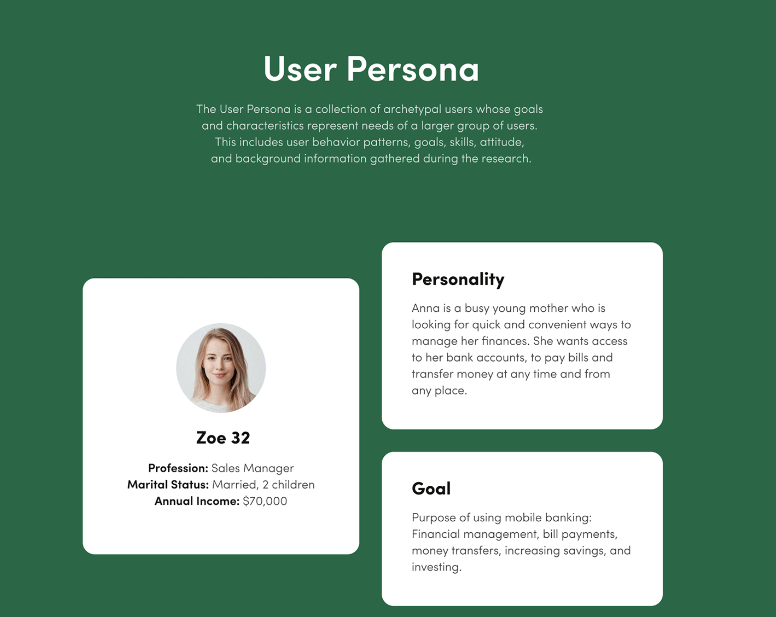
The process begins with user research, which includes creating user personas: fictional representations of target users that capture their age, goals, and motivations. This helps the team to focus on the specific needs of their audience, ensuring that every design decision is guided by the characteristics and habits of real users.
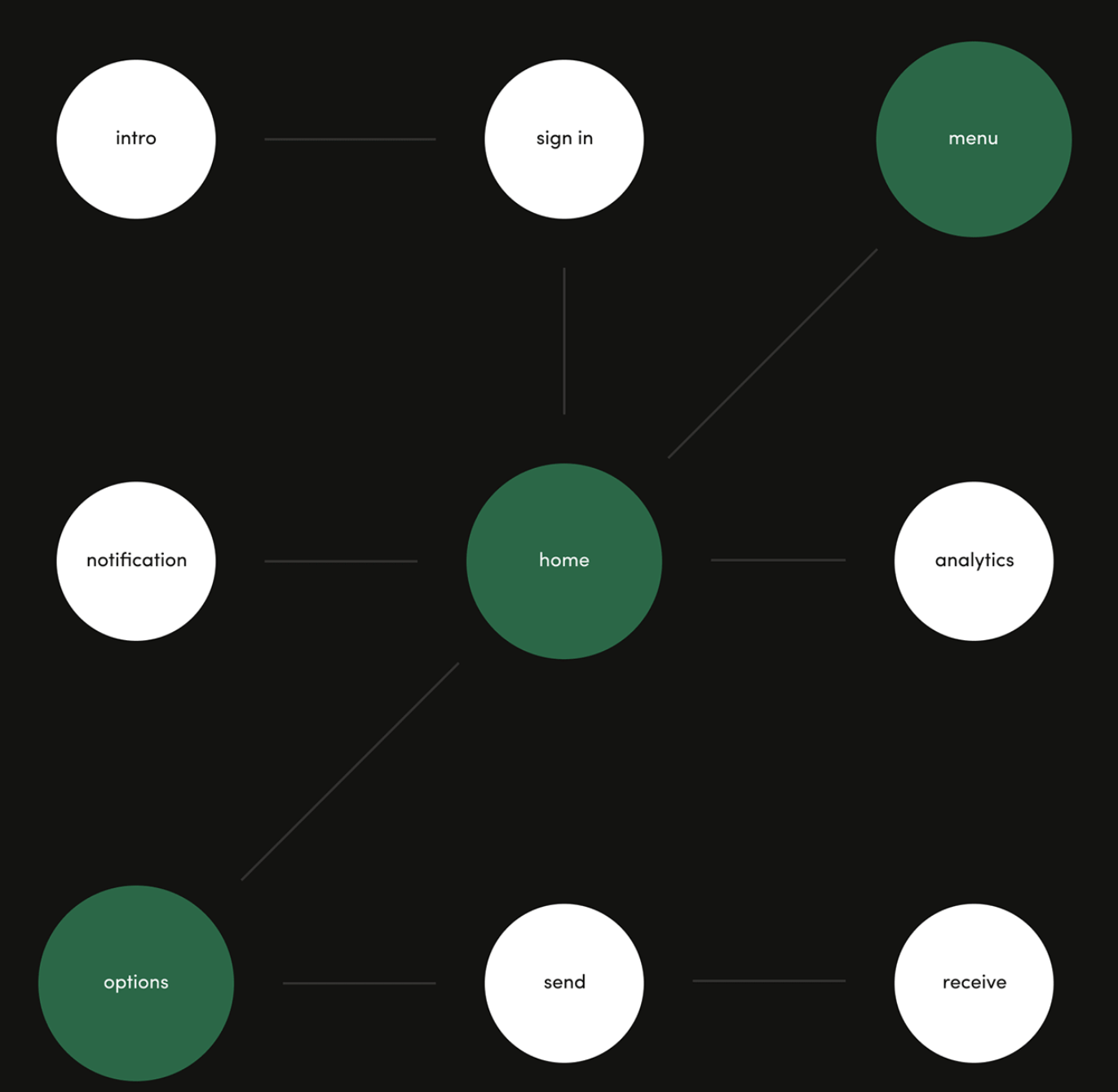
Building on this, information architecture organizes content so that users can find what they need without hassle. By structuring the app’s layout with user flows and clear categorization, designers ensure that users can intuitively navigate through the app, seamlessly moving from one feature to another.
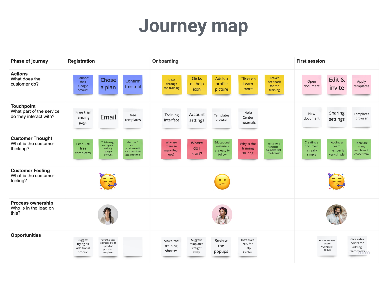
A journey map then visualizes the steps a user might take to achieve their goals within the app, highlighting any potential obstacles. The journey map allows designers to refine user flow and eliminate unnecessary functions that might confuse or distract users. Once the app structure is sketched out, wireframes and prototypes are created, letting stakeholders visualize and test the app’s functionality before the UI (User Interface) details are added.
How to Create A UI/UX Mobile App Design Your Users Will Love? Step-by-Step Instructions
We have briefly touched upon the process of creating a UI/UX design for a mobile application when discussing what is UX design. After all, a big chunk of the designer’s work concerns UX design, and UI design only comes into play at a later stage to add some style to the product.
Let us now walk you through the UI/UX design process step-by-step so you have a clear picture of what to expect when starting to design a mobile app for your business. This flow is based on how we do things in Perpetio and might be different for other companies.
Step 1: Kick-off
Our app design collaboration kicks off with an introductory call. You might think, "We’ve already had a few calls." True, but those were mostly with the sales team. This time, you’ll be speaking directly with our designers, discussing your vision in greater detail.
To create a design you’ll love, it’s essential to talk face-to-face. You’ll share your vision, show us references, and discuss any specifics, while our designers ask the right questions to fully understand your goals. The more design requirements you bring to this conversation, the better.
Many clients find it helpful to compile their ideas into a document, detailing their product, their goals for the design process, and any expectations for the final result. This might include initial design concepts, ideas on structure and visuals, or any particular user experience goals. Don’t worry if you don’t have a document prepared — we’ll go through everything together, setting clear expectations before diving in.
The kick-off call is not only a chance to discuss project details but also to introduce you to the design team. We’ll cover communication preferences (whether you prefer calls, messages, or regular updates), set the frequency of check-ins, and outline the agenda for the tasks ahead. This call marks the start of our creative journey together, and we’re as excited as you are to bring your project to life!
Step 2: Discovery and research
With a clear outline of your goals, our designers start the discovery phase, digging into the research that will guide each design decision. We assess your audience, and the app’s purpose, and analyze the competitive landscape to pinpoint unique value opportunities. This phase includes:
- Market and competitor analysis: Examining market best practices and identifying competitors' strengths and weaknesses to find your app's competitive edge.
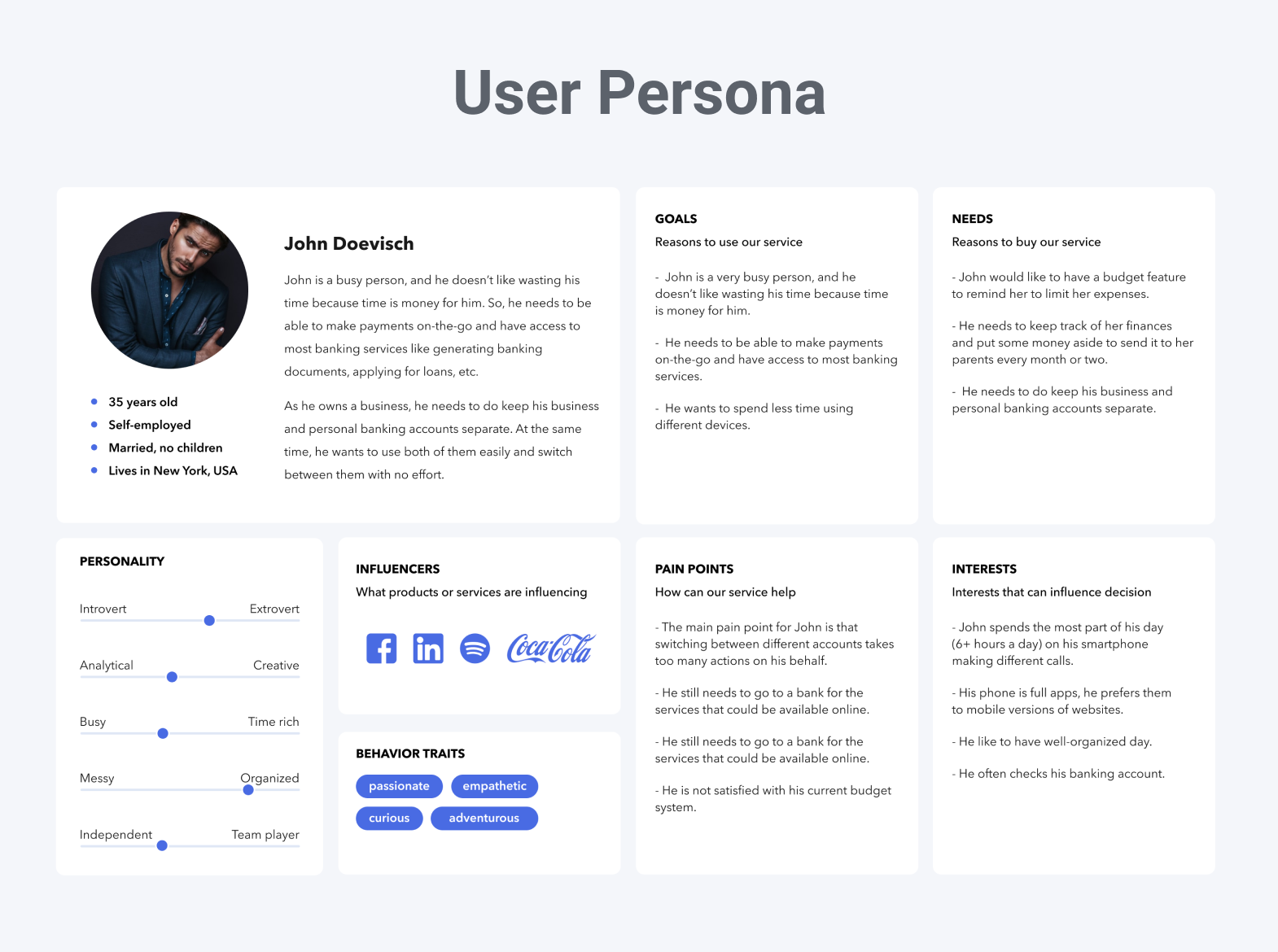
- User persona research: Developing personas based on key characteristics, goals, and motivations that shape what your target users would want from the app.
- Information architecture: Organizing app content logically so users can easily navigate through features, typically starting with a sitemap.
- Journey mapping: Creating a journey map to visualize a user’s experience with the app, ensuring their needs and expectations are met seamlessly.
Proper research forms the foundation of successful UI/UX design. Every design decision we make is grounded in ensuring the app meets users’ needs, making it pleasant, intuitive, and effective to use.
Step 3: Structure and wireframes
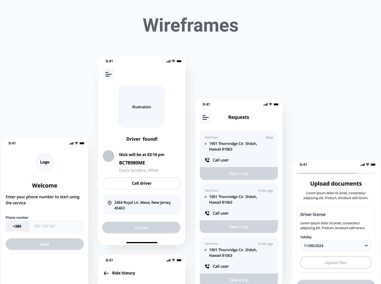
Having insights from the discovery phase, we begin building wireframes — visual outlines of the app’s structure. Wireframes give a quick, modifiable preview of the layout, allowing you to provide feedback before moving into detailed designs. They’re also a guide for developers to align on the structure before diving into UI elements. Depending on your needs, we may use low- or high-fidelity prototypes.
Step 4: Testing the UX
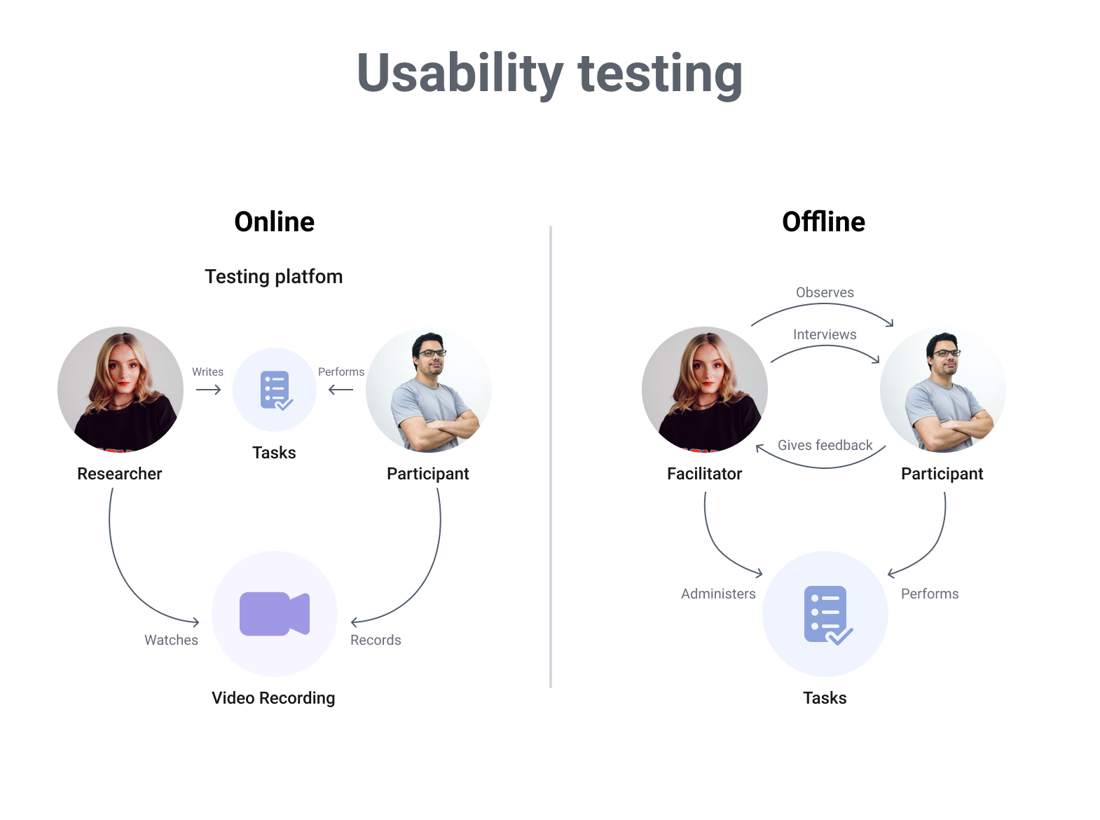
Before finalizing the structure, we test the UX with real users to identify any potential usability issues. User testing, often done online for convenience, highlights navigation or functionality improvements needed for a smooth experience.
Step 5: Adding style with UI design
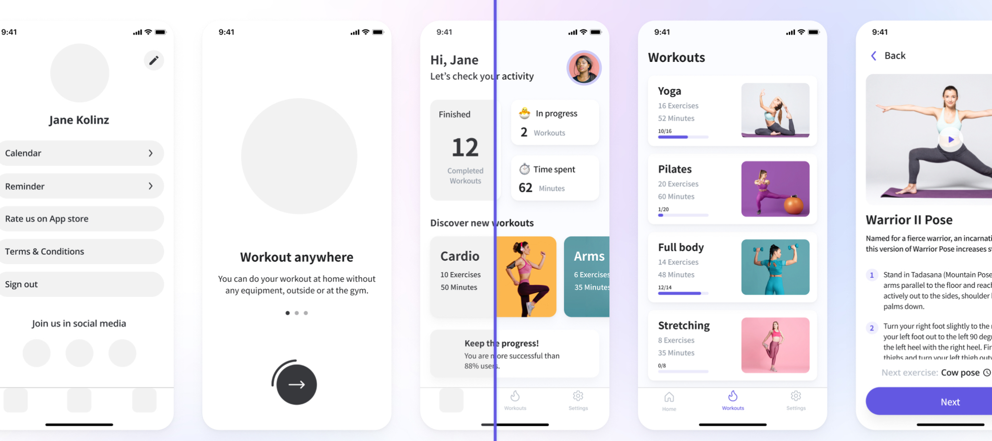
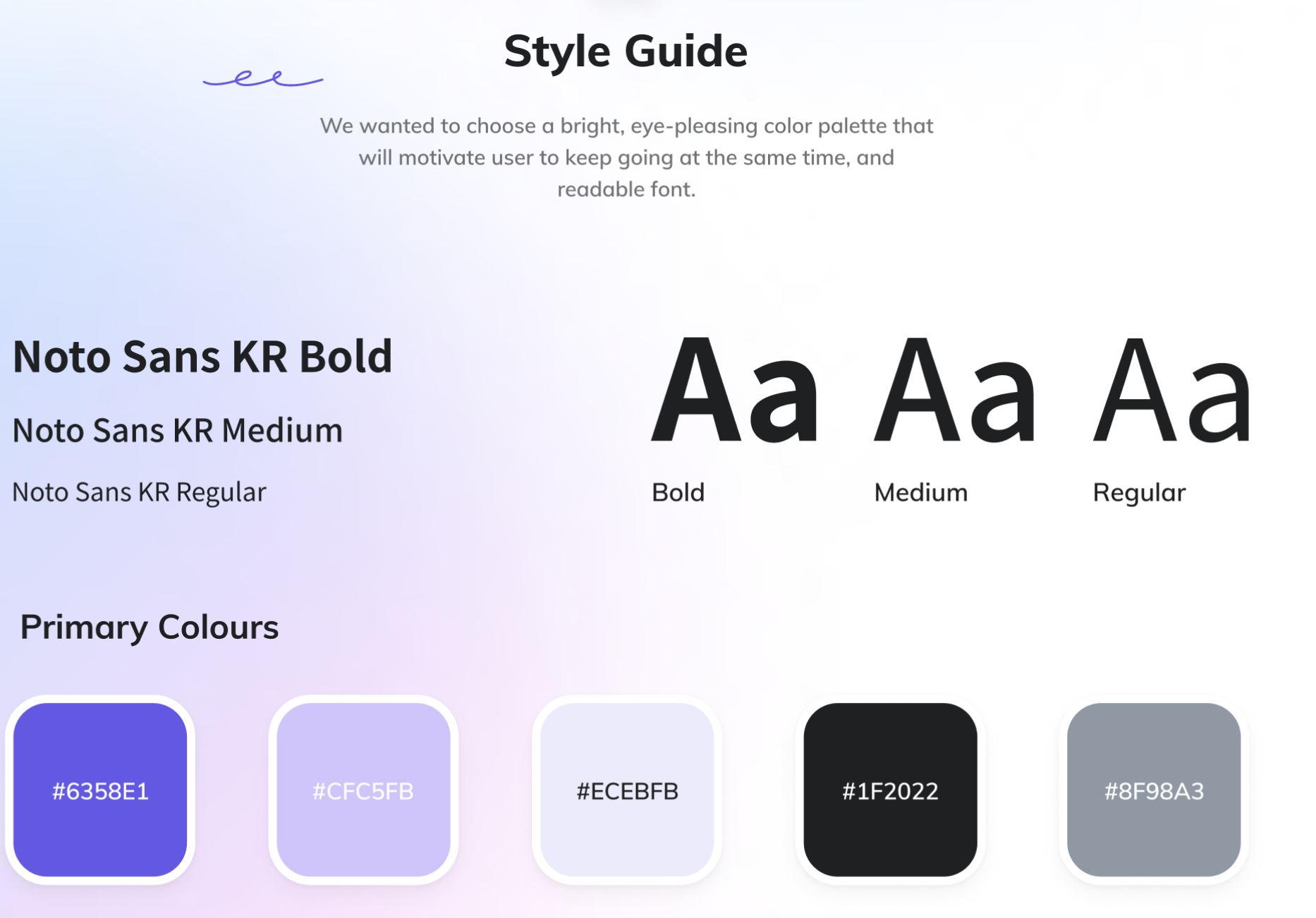
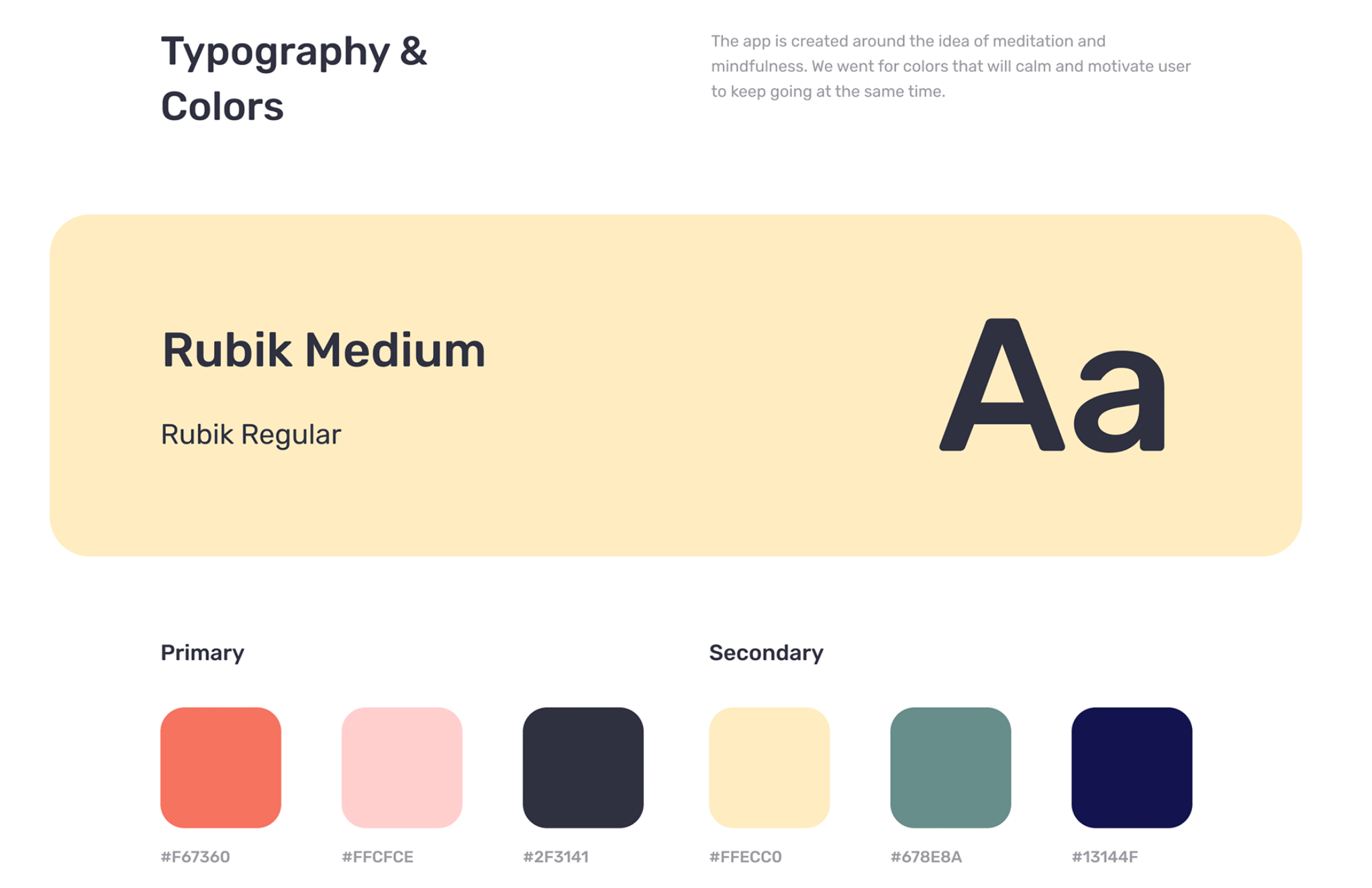
Once the UX is confirmed, we add the visual style to make the app appealing. From colors and fonts to illustrations, our team refines the look. We create mood boards to align on the visual direction, then craft initial screens to get your feedback. We can add little details, like microinteractions, to make your app more engaging and fun. Here, style details come to life, creating a cohesive and attractive user interface.
Step 6: Gathering final feedback
The last step involves testing the final UI to ensure it resonates with users and flows intuitively. External feedback is invaluable here, as fresh perspectives often reveal insights that might be missed by those familiar with the design.
Main Roles of UI/UX Design for a Successful Mobile App from Our Experts
You might have noticed that we pay great attention to the UI/UX design process and make sure our client is engaged at every stage to deliver a product that matches users' requests, even the ones they don’t know about just yet.
In fact, mobile app UI/UX design is much more than appearance. UI/UX design defines whether or not a user will download an app, how quickly they will figure out the navigation, how often they will open the app, how long they will stay on it, and how much they are willing to pay for a subscription.
Our UI/UX designer shares the roles UI/UX design plays in a mobile app's success and how she ensures her designs achieve their goals.
First app introduction: making a positive first impression
Let’s start with what a user sees first. When users open an app for the first time, a smooth onboarding process sets the tone. It introduces key features and highlights benefits, keeping guidance simple and engaging to encourage exploration without overwhelming them. Onboarding not only explains to the user why this app is beneficial and which problem it solves but also shows how to navigate an app.
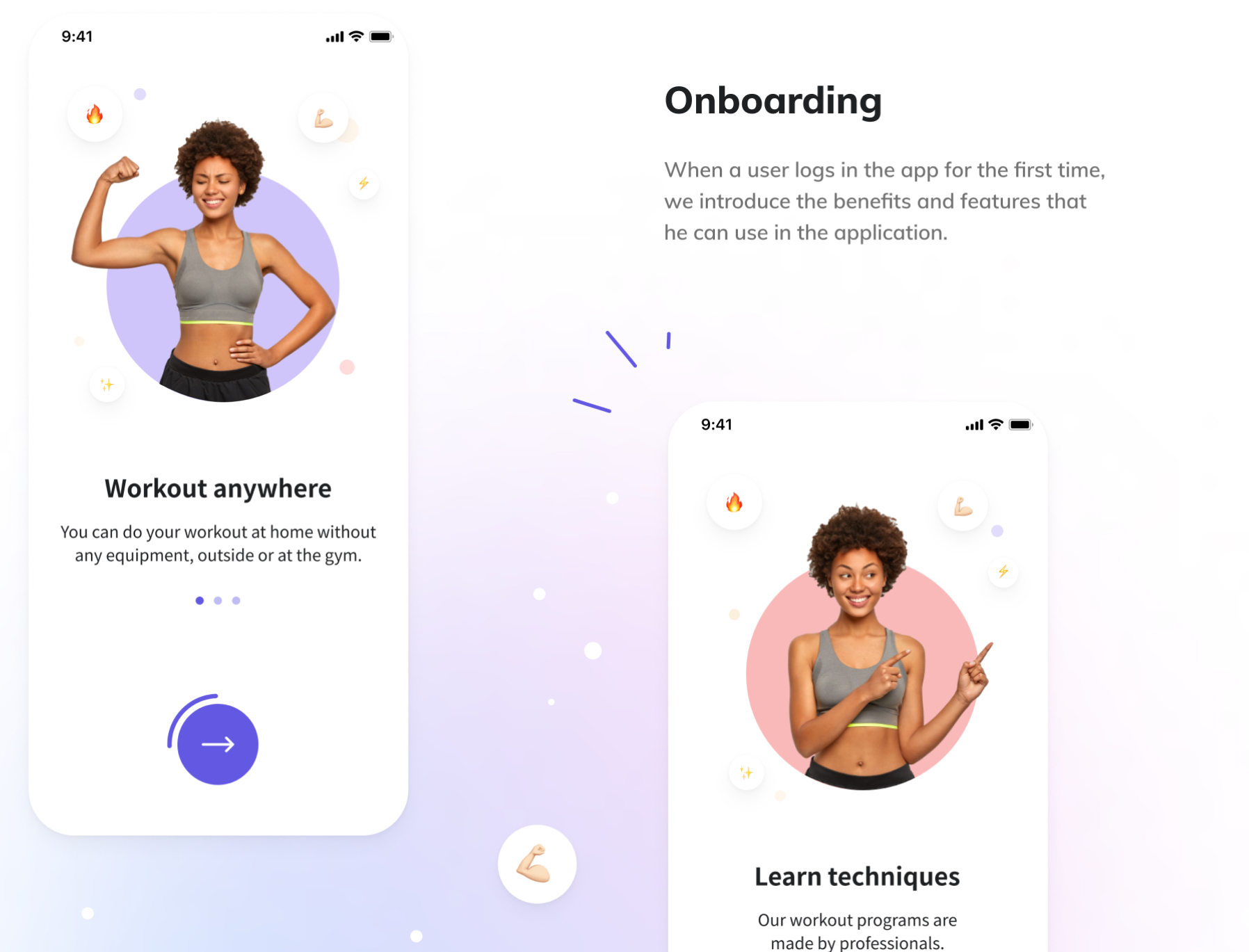
Personalization is another approach to making a memorable first impression. Allowing users to set preferences or tailoring content based on their needs shows we’ve designed the app just for them. This creates a deeper connection and keeps them coming back.
What’s more, it’s a must that your app has a clear, intuitive flow. Users should feel comfortable navigating the app. Key actions should be easy to find, letting users move smoothly from one feature to another with confidence. There shouldn’t be any space for confusion if our goal is a successful and well-received app.
For complex features, quick tutorials or tooltips can help. These small hints provide context when needed, helping new users get the most out of the app without interrupting their experience.
Recognizable branding: making your app memorable
After making a positive first impression, it’s time to focus on the long-term branding. A memorable branding gives your app a unique personality and makes it memorable for users.
A strong, consistent brand helps set your app apart in a competitive market. With dozens of apps constantly fighting for user attention, a stylish, trendy look is what can set your app apart. Users are more likely to prefer a visually appealing, well-designed app rather than one that feels outdated or clunky.
Users will often choose your app over competitors because they recognize your branding as they might have seen it on social media, ads, or their friend recommended them “an app with a bear on its logo”
Consider VPN apps. While most of them use more abstract visuals, TunnelBear has a bear mascot and makes the experience more fun and humane. As a result, they stand out among many similar apps and attract users with unusual design.
Increased user engagement: keeping your users coming back
Creating a satisfying and enjoyable experience is key to ensuring users keep coming back. When users feel engaged and love regularly opening the app, they're more likely to recommend your app to others through word-of-mouth, helping to grow your user base organically.
Plus, personalizing the user experience plays a significant role in building this connection. Isn’t it great when you open an app, and it shows exactly the content you need right now? Such a move definitely does encourage users to come back.
For example, a navigation app that remembers your usual routes and frequently visited places makes your daily commute effortless. Similarly, a shopping app that suggests products based on your past purchases or preferences saves you time and helps you discover new items you’ll love. Fitness apps that track your progress and offer customized workout plans based on your goals make the experience feel tailored just for you.
Stable user retention: making your app a long-term choice
To ensure your app becomes a go-to solution for users over time, focus on delivering value, convenience, and an intuitive experience.
Seamless onboarding sets the foundation for stable retention. A clear, engaging introduction to the app’s features not only helps users get started but also highlights how your app can solve their problems effectively.
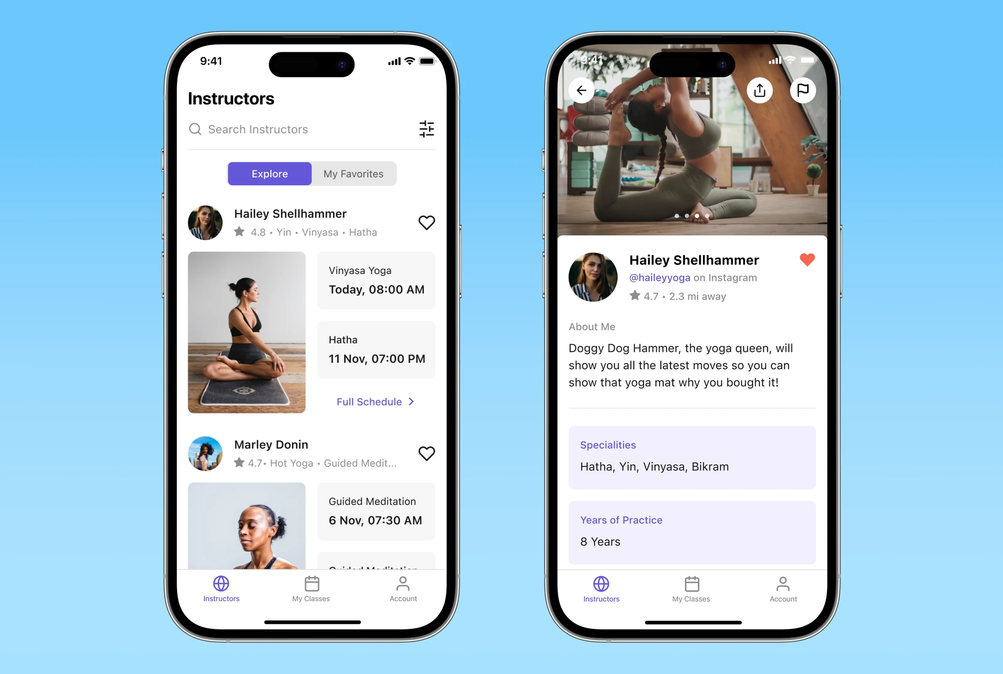
Problem-solving is at the heart of user satisfaction. Your app should address a specific need or challenge for the user. Whether it’s simplifying daily tasks, providing tailored recommendations, or enabling smooth communication, solving real-world problems keeps users coming back.
Lastly, a user-friendly and convenient design is non-negotiable. Clear navigation, a clean interface, and thoughtfully placed features make the app enjoyable to use. When users feel comfortable and find value in their interactions, they’re more likely to stay loyal to your app.
Better accessibility: reaching users of all tech levels
Creating an accessible app opens the door to a wider audience, ensuring inclusivity and demonstrating a commitment to equal access for everyone. You don’t want to limit the amount of users enjoying your app and cut off a large chunk of a potential user base, do you?
Catering to users with disabilities is key to this effort. Features like voice commands, screen reader support, and adjustable text sizes allow users with varying abilities to engage with the app seamlessly.
Additionally, consistent design across the app improves accessibility for all users. Your users should know what to expect from the app, and having used one feature means that the user already understands the logic behind the whole app.
Predictable navigation and uniform layouts help everyone, regardless of their tech-savviness, feel confident exploring the app. Consistency builds trust and ensures users know exactly what to do at every step.
Getting the most out of your feature set: choose wisely, avoid overload
When it comes to app features, less is often more. Selecting the right features ensures your app is focused, user-friendly, and efficient.
Base your choices on UX research to identify the features your users truly need. Insights from user surveys, interviews, or analytics help prioritize functionality that solves real problems while avoiding unnecessary clutter.
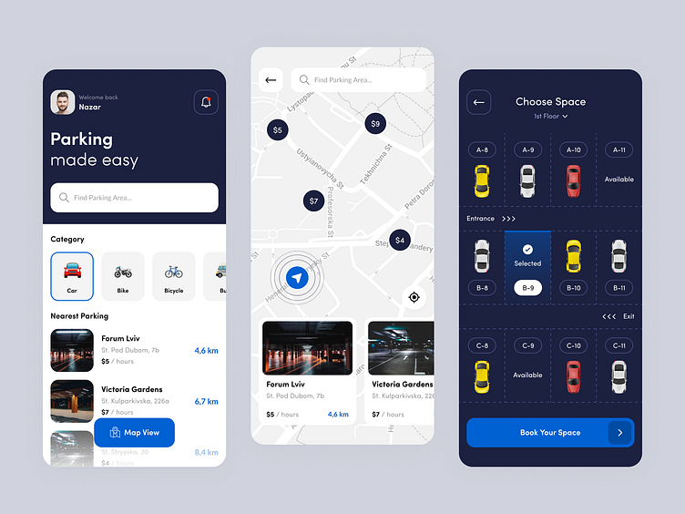
Avoid feature overload to maintain a streamlined experience. An app stuffed with too many options can confuse users, slow performance, and dilute its core value. Instead, focus on delivering features that enhance usability and create a seamless flow.
A carefully curated feature set makes your app more intuitive, reliable, and enjoyable — keeping users engaged without overwhelming them.
Effective monetization: making your design work for you
For most commercial apps, the ultimate goal is to generate profit, and effective UI/UX design plays a subtle yet powerful role in encouraging users to make purchases or subscriptions. A well-designed app naturally guides users towards monetization opportunities without feeling overly insistent or intrusive.
A skilled designer can help businesses identify the best monetization model tailored to the app's type, audience, and feature set. While in-app ads might suit some apps, others may benefit more from a smaller percentage of users opting for a premium version or subscription.
For example, Perpetio introduced a subscription-based model for the eargym app, focusing on forming a new habit. In collaboration with eargym’s research team, Perpetio explored how long it typically takes to establish a new habit, such as daily hearing exercises. The research showed that habit formation occurs in about 14–21 days, inspiring the introduction of a 14-day free trial.
This free trial lets users experience the app while building a daily ritual, making them more likely to subscribe after seeing its benefits. A/B testing of this feature resulted in a 40% increase in active users, proving that thoughtful design and research-backed strategies can drive significant monetization success.
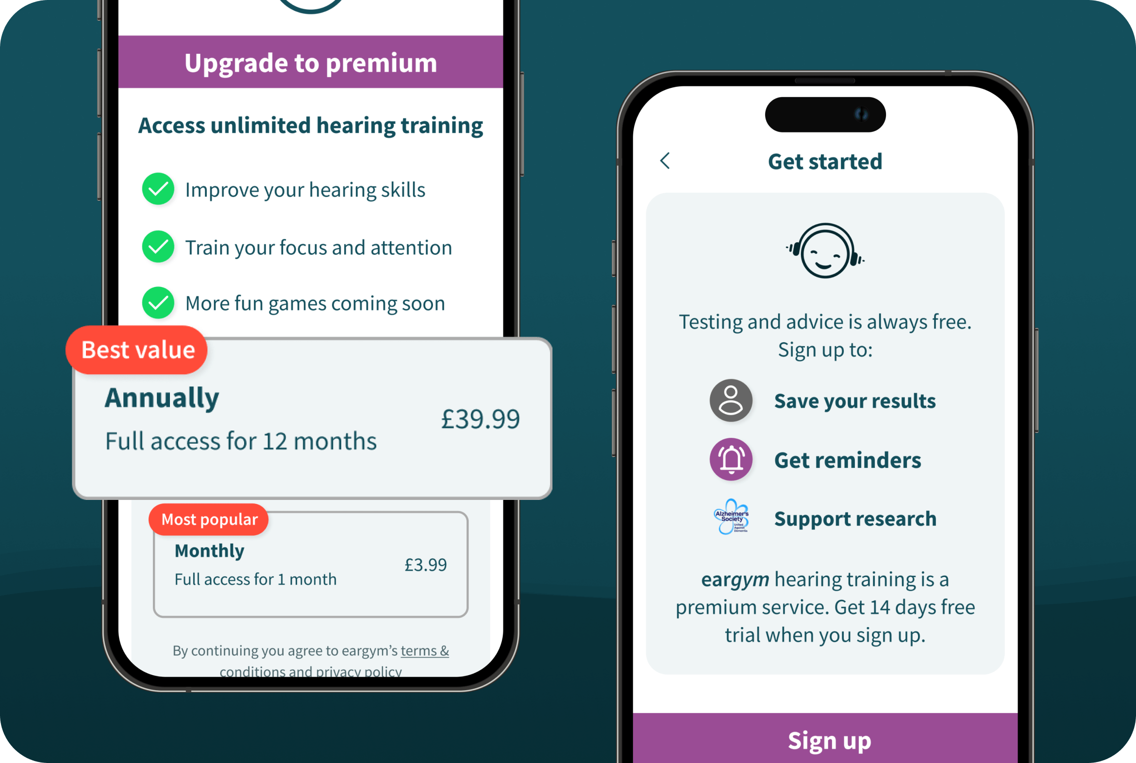
Whether it’s subscriptions, in-app purchases, or ads, a well-chosen model based on user behavior and app type can help you achieve your business goals without compromising the user experience.
High usability: ensuring a smooth and intuitive user flow
Usability is the main keyword and basis of a successful app, and it’s the design team’s responsibility to craft a smooth and intuitive user flow that keeps users satisfied and engaged.
Designers work to eliminate friction by creating clear and predictable navigation paths. Their goal is to ensure users always know how to achieve their objectives without confusion or unnecessary steps.
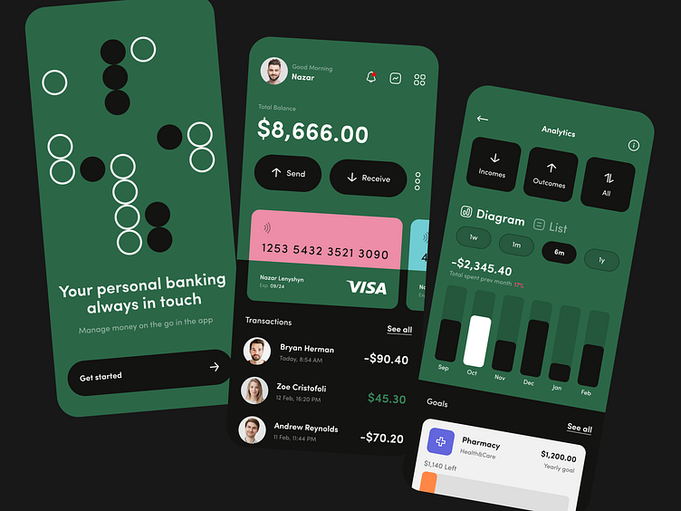
They also focus on smooth transitions between features, making sure that switching screens or completing actions feels seamless and natural, enhancing the overall experience.
By prioritizing simplicity, designers guide users intuitively through the app. Using minimal clicks, clear labels, and well-organized layouts, they help ensure users feel confident and comfortable exploring every corner of the app.
Responsive design and adaptability: mobile-first, always
A mobile-first approach is crucial today, where most users interact with apps via their smartphones. Surely, when designing a mobile app, all the visual and technical decisions are adapted to a mobile device for the optimal experience.
But responsiveness doesn’t stop there. A well-designed app adapts seamlessly to various devices and screen sizes, from tablets to desktops. For some users, having an app that works in a mobile browser is also beneficial, as it provides flexibility without needing a download.
Remember to clarify with your tech team which operating systems and devices the app should support. It’s also important to determine the latest supported OS version and device. For example, you may say that your app can run without trouble all the way back to iOS 15 but won’t support iOS 14. In that case, users would want to have a browser version of the app.
Additionally, many products benefit from having both mobile apps and web platforms. These should be interconnected and interchangeable, offering a cross-platform experience. With features like cloud syncing, users can start a task on their mobile app and pick up right where they left off on the web. Whether it’s updating progress, saving preferences, or tracking activities, ensuring continuity across platforms enhances usability and keeps users engaged.
A responsive and adaptable design isn’t just about aesthetics; it’s about delivering convenience and accessibility, no matter how users choose to interact with your product.
Constant improvement: listen to your users
Releasing your app is just the beginning. Sounds harsh, but that’s the truth. To stay ahead and keep users engaged, it’s essential to adopt a mindset of continuous improvement. User feedback is your best resource for growth: it highlights inconvenient areas and uncovers opportunities you might not have noticed, especially if your app starts as an MVP.
Adopting an MVP (Minimum Viable Product) approach is like real-life testing for your app. That’s what we always recommend for new apps for startups that want to test out their idea.
It allows you to launch quickly and see how users interact with the app in real-world scenarios. By tracking metrics and gathering user feedback, you can evaluate if the navigation is intuitive, identify the most-used features, and pinpoint areas for improvement.
User reviews on platforms like the App Store or Play Market are goldmines for suggestions on new features or insights into what might not be working as expected. This iterative process helps you refine the app based on what users truly want, ensuring it stays relevant and valuable.
By actively listening to user reviews and suggestions, you can address pain points and refine the app to better meet user needs. Regular updates that implement this feedback show users you value their input, which builds trust and loyalty.
Competitive advantage: stand out in an oversaturated market
In today’s crowded app market, delivering a standout user experience is your best strategy to rise above the competition. A unique idea can help you attract attention, but only a well-thought-out, attractive design can retain users. A thoughtfully designed app that prioritizes intuitive navigation, responsiveness, and user needs creates a lasting impression.
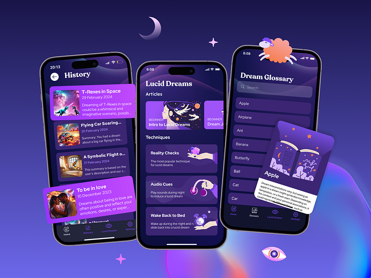
By combining visually appealing design, seamless performance, and solutions that genuinely make users’ lives easier, your app becomes more than just another option; it becomes a preferred choice. With users seeking quality over quantity, a well-executed user experience not only attracts attention but also builds loyalty.
Consider Perpetio Your Trusted Partner
At Perpetio, our holistic approach to UI/UX design ensures your app isn’t just visually appealing but a solution tailored to your business goals. We design experiences that engage users, spark their interest, simplify processes, and solve real user needs.
Our design process goes beyond aesthetics; we discover the business goals and the app’s competitive advantage to secure its success rather than simply make beautiful visuals. Our team always asks the right questions:
- What’s your business about?
- What is the app’s purpose and intended function?
- Who is the target audience?
This allows us to deliver an app that doesn’t just sit on the app store but is actively used and appreciated by its users.
If you’re looking for a team that values both creativity and functionality, Perpetio is open to new partnerships in UI/UX design, app development, and more. Let’s work together to create products that change users' lives.


