Any news from Apple excites its users, especially if it concerns software updates like the release of iOS 15. It is even more thrilling for those who create for this platform, such as designers and developers. And it is not only about new features: Apple also updated its UIKit and SwiftUI, meaning the design process will change also. So, how will working on new mobile apps or websites look with iOS 15’s final release? Let’s discuss it.
Designing for various Focus modes and choosing notification types
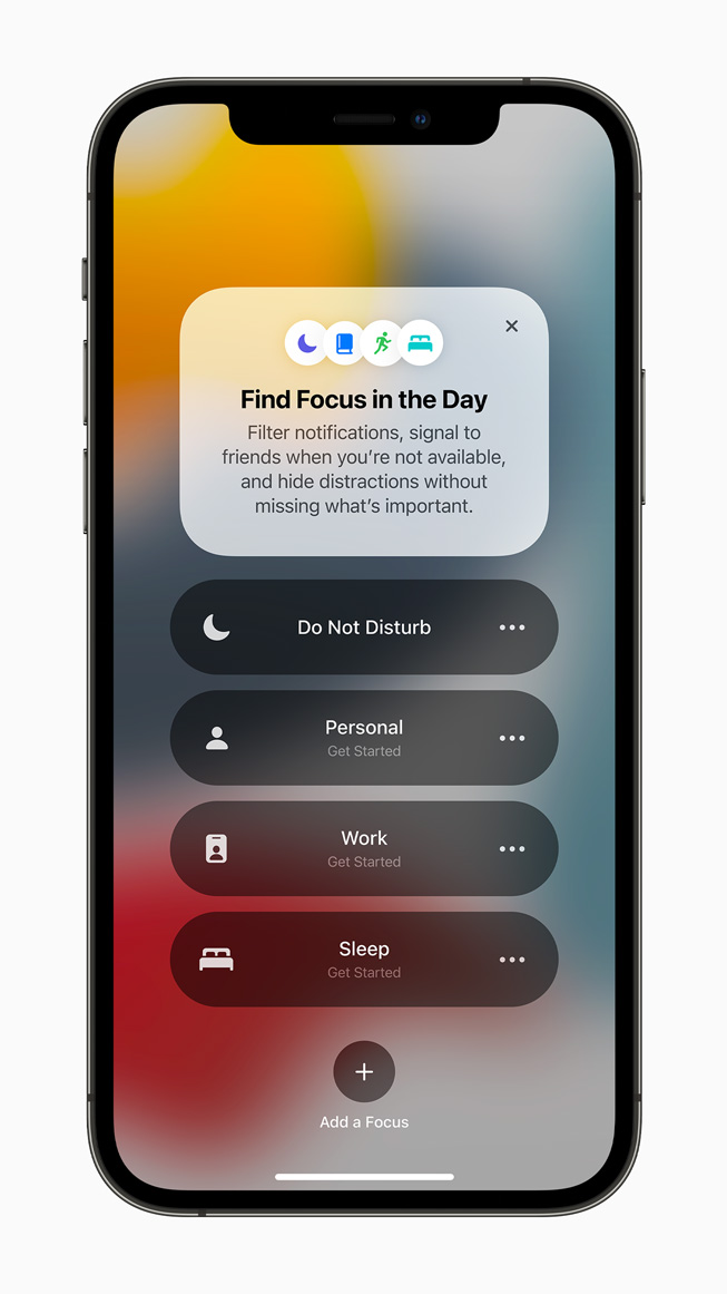
As you may know, in iOS 15, Apple introduced a new way of receiving notifications through the Focus feature. This change allows users to choose which kinds of notifications to get at any given time. For example, if a user selects “Work” status, they will receive notifications from work-related apps only like email, Slack, and so on. Users can also share their current work modes, so others know if sending a message is appropriate at the time.
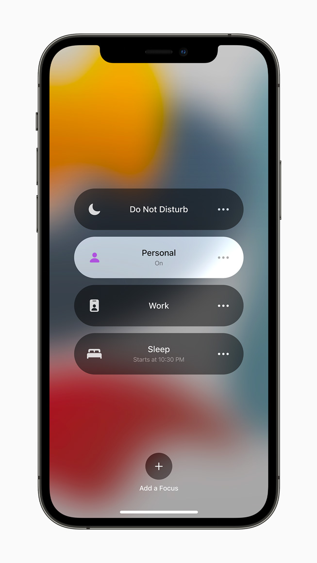
So what does this particular update mean for designers and developers? If you are working on an app that features any kind of messaging, you might want to add features like scheduled delivery, so your users can plan their communication ahead of time.
For other app types, it is important to remember you will not see all notifications right away. Some of them will be blocked through the Focus settings, while others will be displayed in a daily summary later on. Be sure to choose its type wisely to make sure a user sees your notification on time.
From now on, you can select between two types of app notifications: communication and noncommunication. The existing app type that can send communication notifications is messengers: these notifications are for texts and calls only. As for the noncommunication ones, you can choose between several. These include:
- Passive: notifications that do not require any actions from the user. For example, it can be restaurant recommendations.
- Active: this is the default option. It is the information that users would appreciate seeing right away, such as news.
- Time-sensitive: messages that require immediate attention, e.g. notifications from a taxi or delivery service. Users can choose to turn these notifications off if they don’t see them as needed.
- Critical: these are the urgent messages concerning health and safety.
The Focus and scheduled delivery settings will not filter time-sensitive and critical messages. Users will get them anyway. Critical notifications will also override the silent mode. Apple highlights that users should not misuse time-sensitive and critical messages to get someone’s attention, which is understandable as it may cost you their trust and loyalty.
Using SF Symbols 3
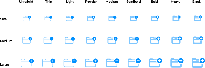
With iOS 15, Apple introduced the beta version of SF Symbols 3, offering users around 600 new icons. There are numerous symbols to choose, from game controllers to those that represent various communication actions. Overall, you will have more than 3 000 symbols to use in your project now.
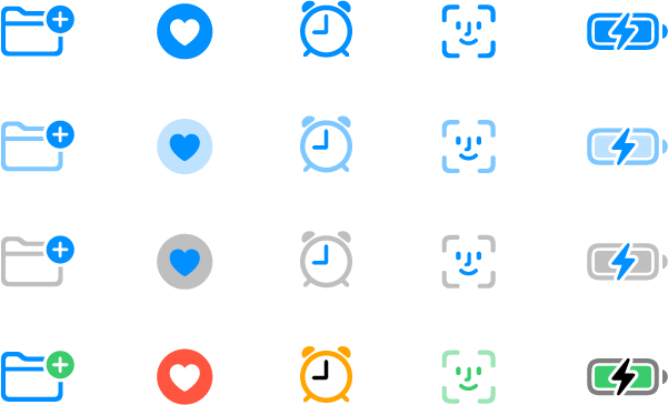
Symbols automatically align with the text labels and come in nine weights and three scales.
Even more, Apple improved the symbols’ color customization by introducing new color rendering models. There are now four to choose from:
- Hierarchical (uses a single tint color with multiple levels of opacity)

- Palette (customizes the symbol with multiple contrasting colors)

- Multicolor (provides fixed, default colors)

- As well as the usual monochrome model.

And that’s not all: Apple did so much to make designing new symbols as easy as possible. This change includes a new inspector offering control so you can preview your symbols and copy them to use in any design tool.
Getting more security with location permissions
We discussed Apple’s efforts to enhance its users’ security in our previous blog post about iOS 15. It is clear that with so many concerns about “apps tracking our data,” people now want to get more control over the information an app can access, including their current location.
With iOS 15, Apple introduced CoreLocationUI – a framework containing a standardized UI that interacts securely with Core Location. How is it done? A new LocationButton (or CLLocationButton in UIKit) allows your users to give the app a one-time authorization to access their current location.

Compared to the current “Allow once-Allow while using the app-Don’t Allow” triangle, it is a new way to ask for location data. Users can permit the app to access their location once and then refresh it and, subsequently, grant new permission by pressing one button only – a button placed conveniently at the bottom of the screen.
Designing for the new Safari app
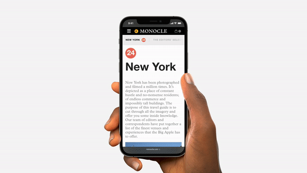
Safari is the app that has the most significant changes to its appearance in iOS 15. As a result, designing websites and web apps will be way different now. What should you pay attention to?
As you may have heard, Safari is now offering more space on the website by making the toolbar appear automatically as needed. This allows the entire interface to take up one line only. And, even more, it blends into the website’s background or header color. But what determines this color? And can you change it? Yes! While Safari will automatically pick the background color for your website, you can also choose your own and code it into HTML.
Light and Dark Modes are both options in Safari. If your color choice is too light for the Dark Mode, the app will automatically adjust it to give the user the best experience. Additionally, Safari won’t let you apply colors that would negatively impact the readability and overall website appearance.
The tab bar is now at the bottom of the screen, so any additional elements placed there will be overcast. But you can use an environment variable to solve this. It provides the browser measurements, identifies the “safe area” for you to place elements, and shows which areas to leave blank. This step is only necessary for vertical positioning; when users rotate their phones to the horizontal position, Safari will automatically adjust the page, taking into account the “safe area.”
Next, since users can group their tabs to declutter the browser’s space now, you need to think about your webpage’s logo and ensure it’s easy to recognize it in the group. The same goes for a website’s name: it should be short and accurate.
There are also several, minor design changes that make the user’s experience with Safari better now, such as
- The ability to copy text from any image or video with Live Text. Be sure any media on your website or web app is not overlaid by banners, pop-ups, and so on.
- Form input elements like date and time, checkbox, search, buttons, and others, have a more convenient design.
- Aspect ratio, which previously worked automatically for images and videos, can be applied to the elements that would otherwise not have it naturally. You can implement any design idea easily without worrying if elements will overflow or deform.
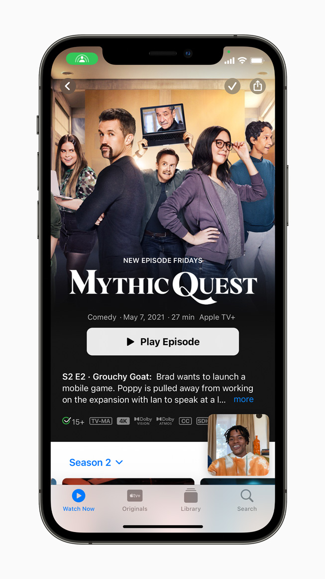
Integrating the SharePlay experience
From now on, the SharePlay function will allow users to consume online content together. You can invite others to watch a TV show or enjoy TikTok videos. However, mobile app designers and developers will need to make sure their apps can share multimedia content via FaceTime.
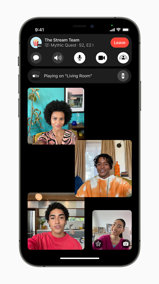
How is content sharing done? Luckily, Apple took care of this already. Group Activities is a framework that basically plugs your app into SharePlay.
First of all, keep in mind that everything from your app is shared by default when it comes to screencasting. So, if you are working on an app containing sensitive or personal information, consider what would be better left behind.
Second, some protected content, such as movies or music, will not be shared automatically because of legal regulations. In this case, you will need to implement shared media playback. It doesn’t work like regular screen-sharing but rather plays the same content simultaneously on each device. For this to happen, each person on the call needs to install your app.
Finally, you can create new ways to share information via SharePlay. Maybe you are making a game app and want users to be able to draw on a virtual board? No problem: Custom UI can help you with this.
Enhancing your user experience with other tools
Drag & Drop across apps
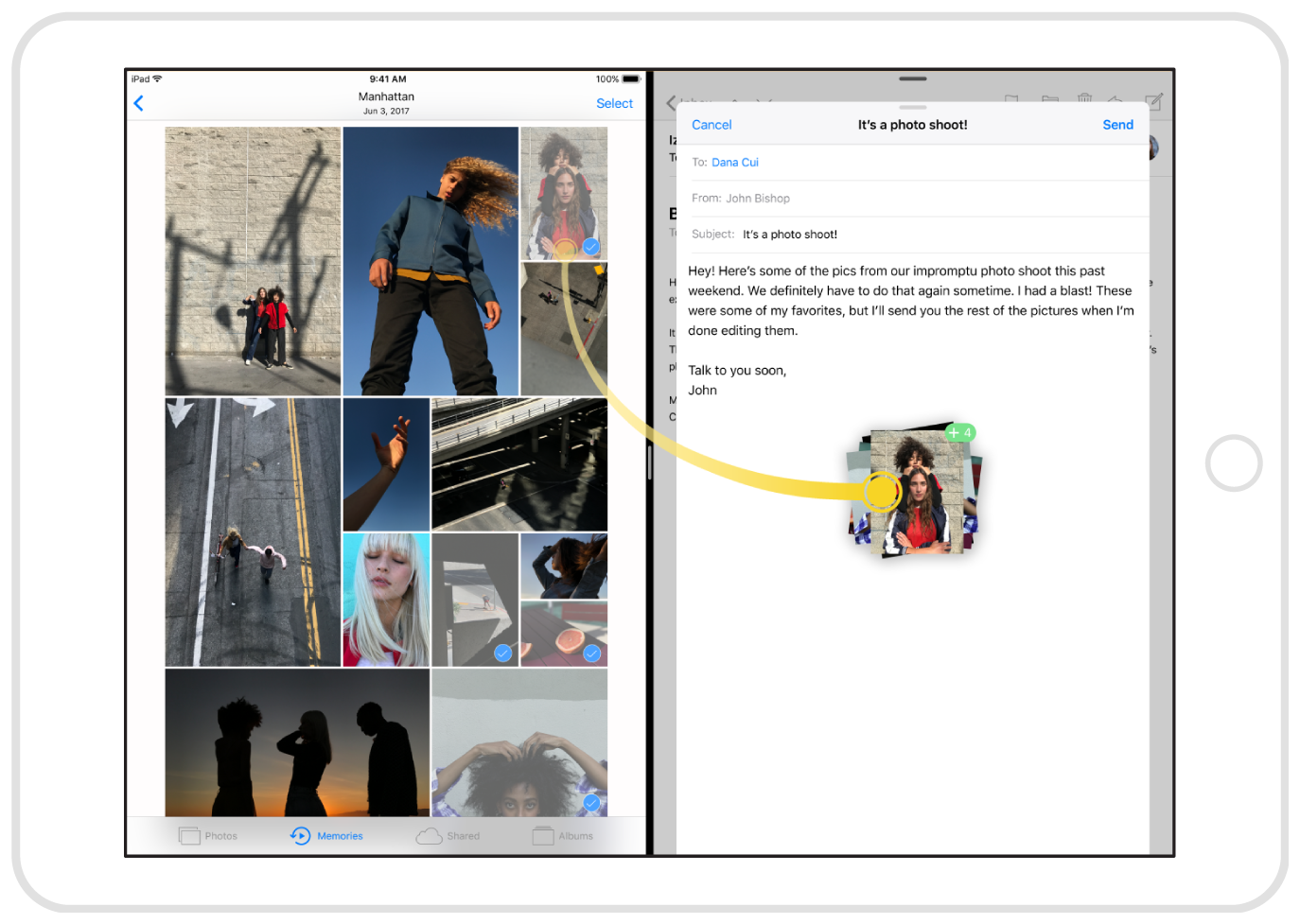
Before the update, you could apply “drag and drop” functionality in one app only. But now you can move elements across different applications.
A brand-new authenticator
Apple introduced a new, time-based iCloud Keychain verification code generator to enhance user security. Compared to SMS, it is a more straightforward and reliable way to receive a code. Requiring just one tap, users no longer have to wait for an SMS. And, even better, the codes are synced between devices.
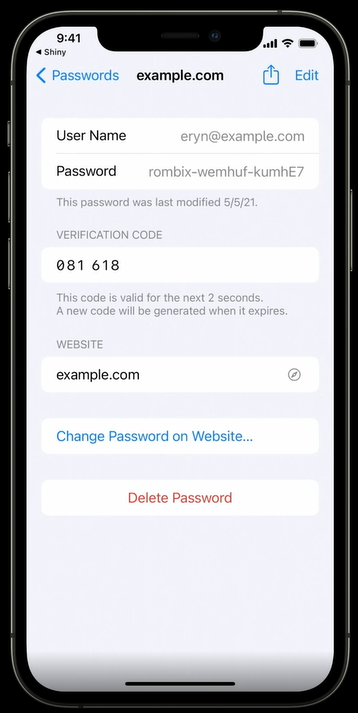
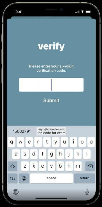
Image credit: Apple
UIKit updates
There is an entire set of updates in UIKit. Some of the most prominent ones are:
- The new UIMenu where you can add collapsible submenus.

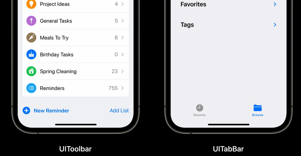
- The UIToolbar & UITabBar, which no longer have a background.
- List headers, which no longer have a background color with the .plain style. Instead, they have extra padding to separate them from the content. There are also two new styles available: .prominentInsetGrouped and .extraProminentInsetGrouped.

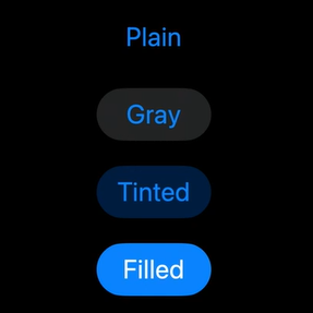
- The UIButton, which will also get new styles. Apart from the usual Plain one, there are now Gray, Tinted, Filled, and Multiple Lines.
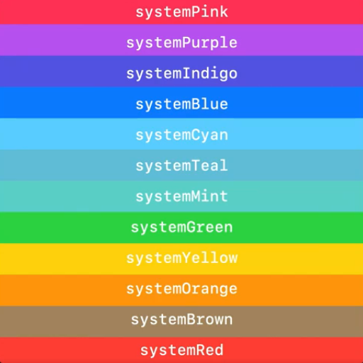
- The new colors that are available. And some of the existing ones changed their tone to look the same across all Apple platforms.
UISheetPresentationController
Have you seen the presentation controller in iOS apps like Maps or Stocks? Basically, it is a tool that makes your controller behave like a sheet. It allows users to resize a sheet, as well as close it. While one edge of the sheet can be moved, another stays in place, making navigation easier.
SwiftUI updates
Similarly to UIKit, there are several improvements in SwiftUI. Among the most important are:
- Built-in support for loading images asynchronously.
- Running and canceling an asynchronous task when the view is shown and deleted respectively.
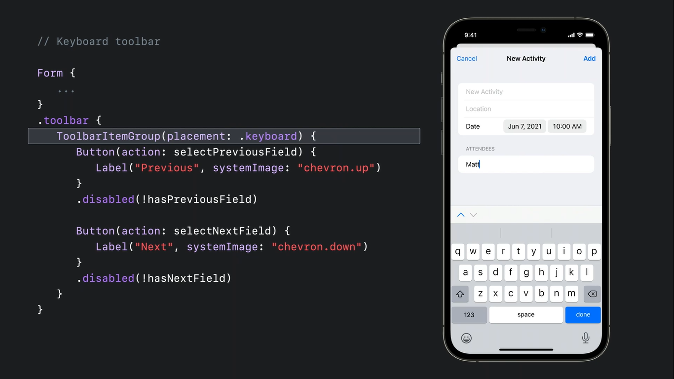
- The ability to add a toolbar to the keyboard and, as a result, make custom buttons.
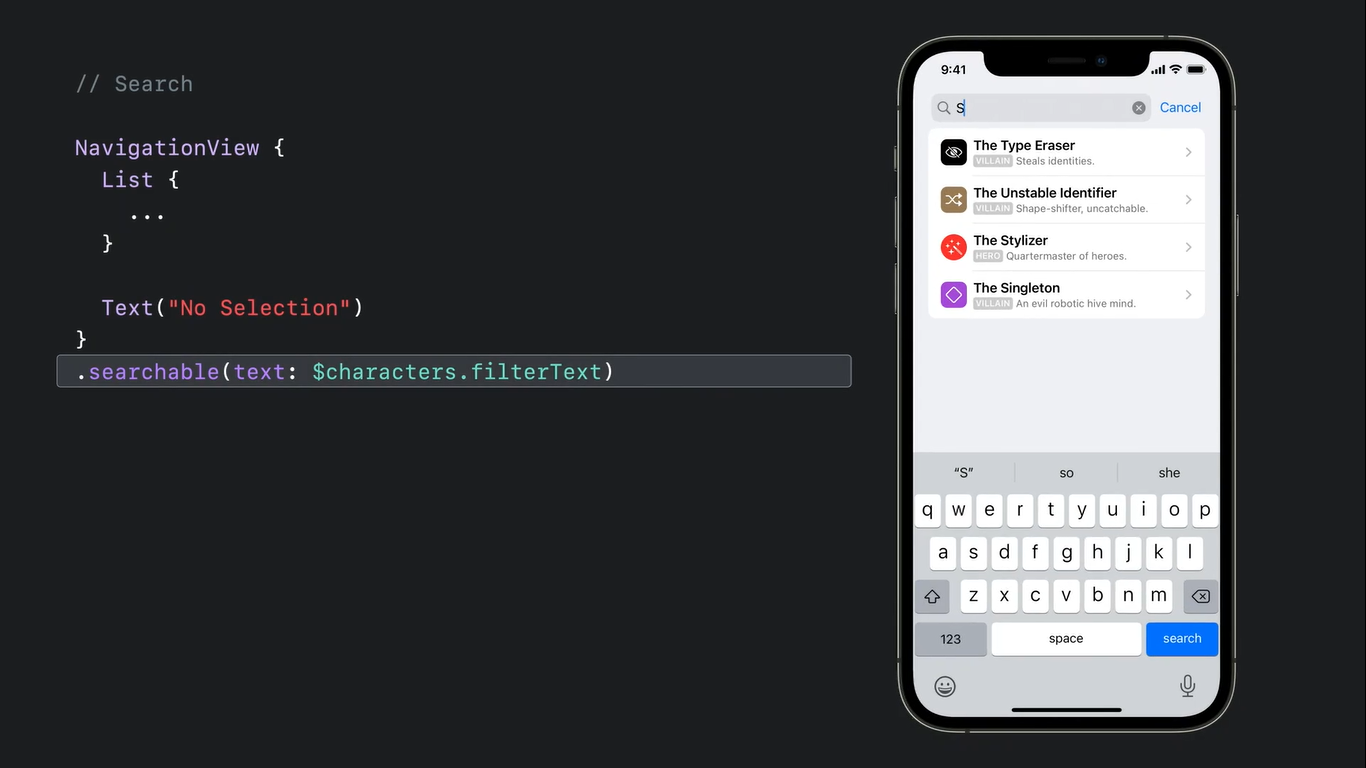
- Adding a search bar to your app can now be done with the .searchable modifier in NavigationView only.
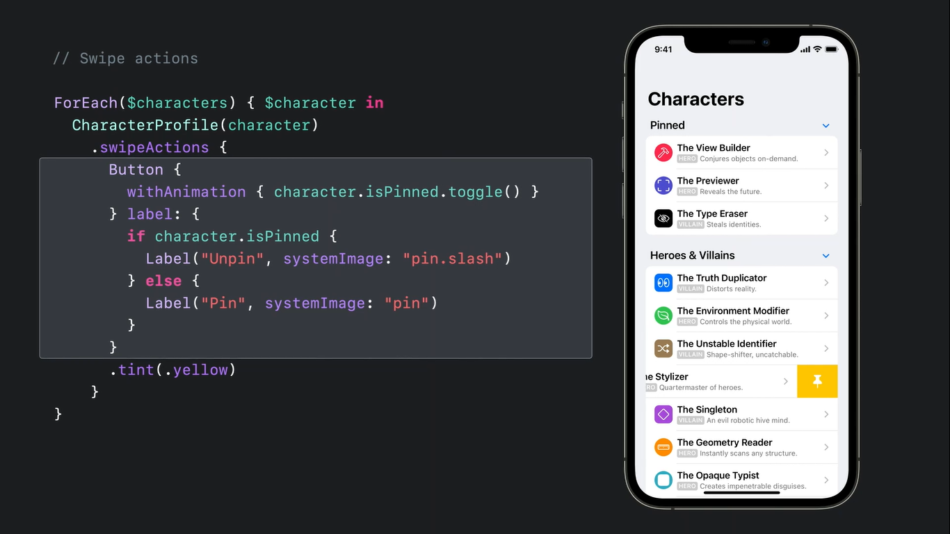
- Adding custom swipe action buttons to a List row with the swipeActions modifier.
Final thoughts
Of course, it is impossible to discuss every change or function Apple introduced during this year’s WWDC. Many are quite specific and touch upon certain types of apps only. For instance, there is a new Screen Time API to create better parental control customization or in-app event management features. So long story short, there is a lot to explore.
In this article, we tried to focus on the changes that will influence most designers and developers more or less; those that everyone should know about. These are also the updates that directly influence our work here at Perpetio and to which we, first of all, are adapting our processes.
We hope this piece helped you explore the most significant innovations in designing and developing for iOS 15, so you can give your users the best experience possible.