Intuitive, simple, eye-catching, user-friendly. These are the adjectives our clients often use to describe the desired UI/UX design of their products. There is one more adjective that is sometimes overlooked yet crucial for the app’s success: engaging.
Why does user engagement matter in mobile app UI/UX design? An engaging app means several things:
- Your users will not abandon the app after several uses but keep it as an app they use daily, reducing churn rates and boosting long-term retention.
- Your users are willing to pay a subscription fee or buy a premium version to keep using your app.
- You can place ads that don’t interrupt the experience, as users will stay engaged.
- Engaged users are more likely to recommend the app to friends and family and spread the word online, helping you attract new users through organic growth.
- A well-designed, engaging app builds trust and loyalty, encouraging users to stick with your brand over competitors.
Quite a good list of reasons to make sure your app is, above all, engaging, isn’t it?
Our mobile app design team shares their tips on creating engaging apps that keep users hooked and coming back for more.
Use Interactive Features
To truly engage users, apps should offer more than just functionality — they should provide a dynamic and interactive experience. This is where animations and interactive elements come into play. These features don’t just make apps look visually appealing; they improve usability and help guide users smoothly through the app.
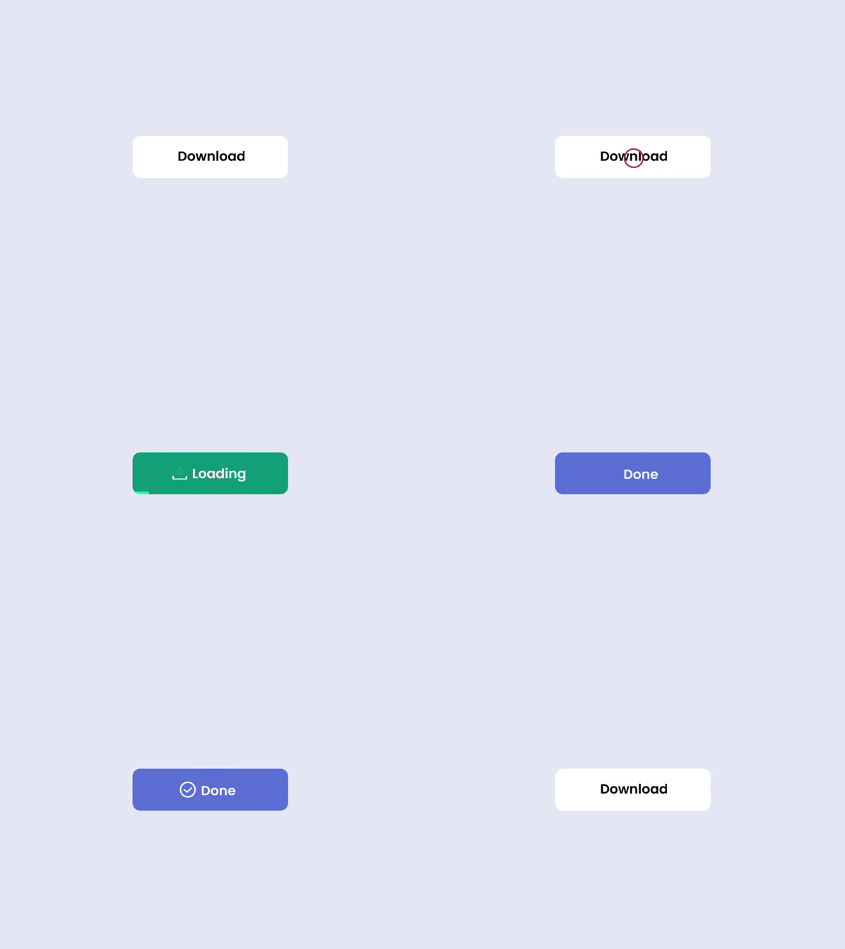
Animations are subtle movements or visual changes that respond to user actions. For instance, a button that changes color or size when clicked makes it clear that the action has been acknowledged. Interactive elements provide feedback, make the app feel more responsive, and create a sense of fluidity that encourages users to continue interacting.
Here are some key interactive features that can enhance user experience:
- Microinteractions: Small, momentary animations or responses that happen when users complete an action, like toggling a switch or filling out a form. For example, a heart icon pops when you like a post.

- Loading animations: These animations keep users engaged while content loads. For example, a spinning icon or progress bar showing the app is working.
- Interactive graphics: Graphics that users can manipulate or tap for additional information.For example, a map that zooms in and highlights points of interest.
- Gesture-based navigation: Allow users to swipe, pinch, or tap for actions.
Animations and interactive features improve the overall user experience, making the app more engaging and user-friendly.
But if there is anything that screams engagement, it’s definitely gamification. Gamification is one of the most straightforward ways to boost engagement in an app.
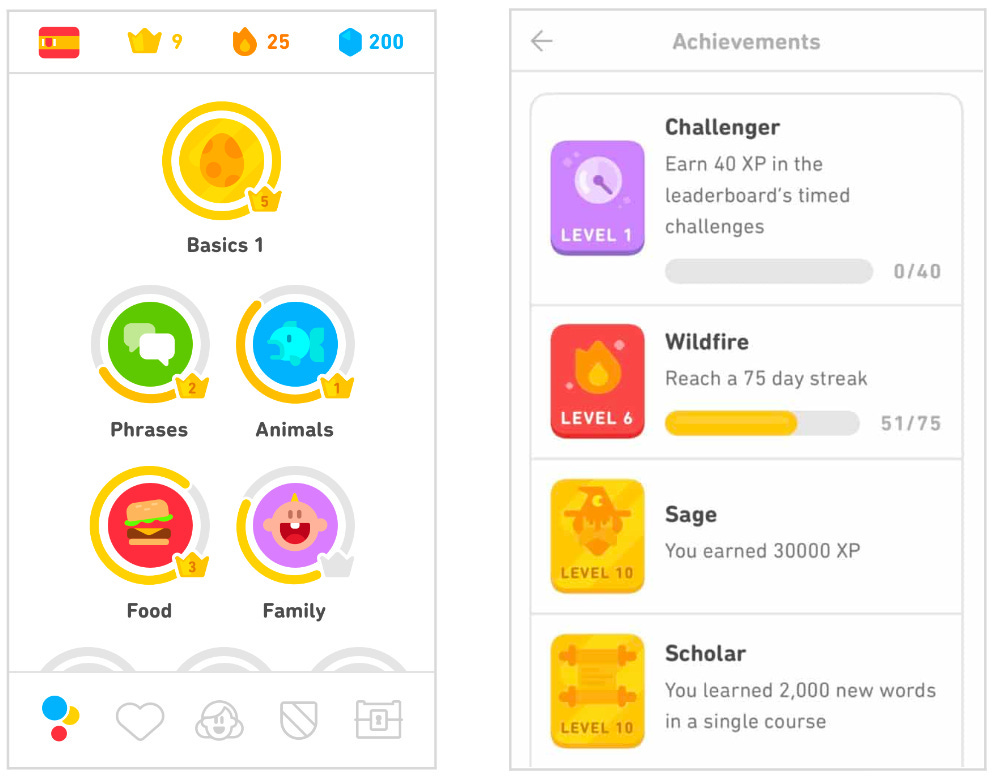
So, what is gamification? Gamification is the use of game-like elements, such as points, levels, rewards, and challenges, to make a non-game activity more fun and engaging. It encourages users to interact with an app regularly by tapping into their sense of achievement and competition.
Gamification elements can include
- Points (Rewarding users for completing tasks)
- Levels (Unlocking new stages or features)
- Badges or rewards (Visual recognition of achievements)
- Challenges (Encouraging users to complete tasks or milestones)
- Leaderboards (Showing user rankings to foster competition)
- Progress bars (Providing a visual representation of accomplishments)
You can choose one or several gamification strategies to introduce in your app, depending on the app’s type and goals.
Think of a language learning app, Duolingo. Since 2018, Duolingo has grown its Daily Active Users (DAU) 4x! One of the success keys is gamification. Users do everything to keep their learning streak, not missing a single day of lessons so that they do not lose their progress. Such dedication has even become a meme and is definitely an example of successful gamification for high engagement rates.
Remember some important rules of gamification in mobile apps:
- Keep it simple: Don’t overwhelm users with too many game-like elements.
- Always reward users: Ensure users feel appreciated for their efforts.
- Establish clear rules and goals: Make sure users understand what they need to do to progress.
- Balance fun with functionality: Ensure gamification elements don’t distract from the app’s main features.
Let’s take a look at an example of gamification in a real app. Perpetio has developed a breathing app. We offered users the opportunity to set their own daily goals, making them personalized and allowing users to adjust their efforts to their capabilities. Users can view the daily goals along with the stats of how successfully they achieved overtime on the home screen. We purposefully placed the daily goal on a home screen so it’s the first thing a user sees when opening the app to keep the motivation up and serve as a reminder.
Send Notifications
Talking about reminders, the most effective way to encourage users to open your app is to remind them that it exists on their phone. That's another trick for increasing user engagement.
Many things lead to users abandoning their apps: they forget, get overwhelmed with their daily lives, prioritize other activities, or simply do not feel motivated enough.
So why not invite them to open your app? Sending a push notification is the simplest and most effective way to do that. A push notification is a message that pops up on a user's device, prompting them to engage with the app again.
When it comes to keeping users engaged, there are several call-to-actions (CTAs) you can include in these notifications to inspire action. Here are a few examples of what they might look like:
- Perform a specific action: "Don't lose your streak!" or "Book your next workout session."
- Complete an unfinished action: "Complete your booking/lesson/workout now."
- Explore new features: "Find a new meditation session to unwind today."
Some tips for maximizing the effectiveness of notifications in engaging your users:
- Tailor notifications to user activity: Base notifications on what users were doing before they left the app or their most frequent actions. For example, if they abandon a workout, remind them to finish it.
- Time your notifications: Consider sending reminders at optimal times, such as mornings, evenings, or weekends. For example, "Time to shop for Christmas gifts! Don’t leave your loved ones without a present," or "Unwind after a long week with a quick yoga session."
- Be creative with your wording: Since notifications are short, they need to grab attention quickly while conveying the desired action. Don’t hesitate to play with words and have a little fun. You can rely on your copywriter, communications team, or even AI to write catchy, engaging push notifications.
By keeping notifications relevant, timely, and original, you can boost user engagement and keep your app at the forefront of their minds.
Don’t Forget about Onboarding
Onboarding is like the first impression your app makes on users. It’s the introduction where users learn about the app’s features, how to navigate, and what they can do with it. If you want to keep your app's user engagement rates high, onboarding is a must.
According to reports from Localytics and Statista, the global average user abandonment rate for mobile apps within the first three months is 71%. A well-designed onboarding process can help prevent this, as users are less likely to abandon your app if they feel confident navigating it and see its value right from the start.
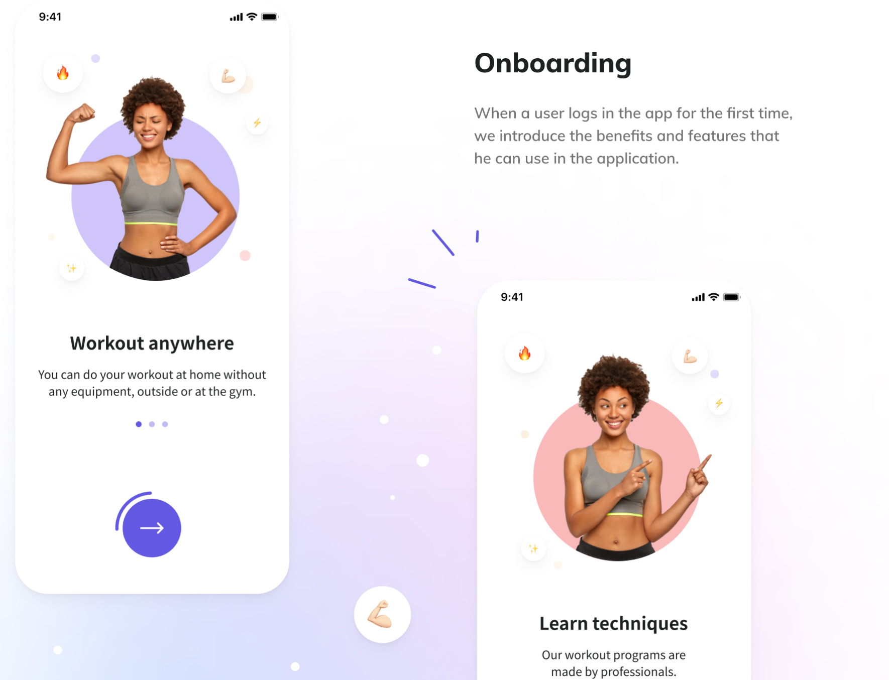
Here are a few recommendations for effective onboarding design:
- Keep it short: Don’t overwhelm users with too much information. Stick to the essentials.
- One function per screen: Introduce features one at a time to avoid confusion.
- Use simple language: Keep the wording clear and concise.
- Show, don’t tell: Use visuals and animations to demonstrate features rather than relying on text.
- Display progress and navigation: Show users how far they've come and what's next, so they can understand how many onboarding screens are left.
- Start with simpler actions: Begin with easy tasks not to overwhelm or discourage users and lead them to abandon the app during onboarding.
- Explain permissions clearly: Let users know why you need access to certain features or data.
- Highlight the app’s value early: Onboarding is high time to show the app’s key benefits to encourage registration or input of personal data. Users should be motivated to put effort into registering and filling in their data.
- Offer win-win moments: Where possible, provide rewards or incentives to boost engagement during onboarding. These can be subscription discounts, free features, and more.
By making onboarding intuitive and straightforward, users are more likely to stick around and get into the habit of using your app regularly.
Test Your App and Gather Metrics
Even after your app is released, there's always room for improvement. Monitoring key metrics helps you make the app more engaging and user-friendly.
Real users are the best source of information about how engaging your app is and how they perceive it.
By tracking key metrics, you can learn valuable insights like how much time users spend in the app, whether they abandon it, or how intuitive the user interface is.
Metrics such as user retention rates, stickiness ratio, and churn rate provide a clear picture of user behavior.
For example, if users tend to abandon your app quickly or aren’t returning, this could signal that the design isn’t holding their attention. You can then adjust the UI/UX design based on this feedback to improve engagement and keep users coming back.
Here are some of the most relevant metrics to track for improving user engagement:
- Number of downloads: This metric shows how well your marketing efforts are working. A high number of downloads indicates strong visibility, while fewer downloads suggest room for improvement in marketing.
- Conversion rates: Track how many users are taking desired actions, like signing up or making a purchase. For example, you can measure how many users downloaded the app after seeing an ad, helping you adjust your strategy.
- User retention rate: It's not enough to get users to download your app—they need to keep using it. The user retention rate tells you how many users return after their first visit. A low retention rate suggests the need for better engagement strategies or app improvements.
- Stickiness ratio: This metric tells you how frequently users interact with your app. It's calculated by dividing daily active users by monthly active users. A low stickiness ratio indicates that users aren’t engaging enough with your app.
- App load time and crash rates: Performance is critical to user experience. Track how quickly your app loads and whether it crashes frequently. If load times exceed 2-3 seconds or crash rates exceed 1-2%, users may abandon your app.
- Churn rate: This metric shows how many users have stopped using your app or uninstalled it. A high churn rate signals that your engagement strategy may need tweaking.
Burn is a fitness app we developed for influencer Rebecca Louise. Our team built the solution from scratch for both iOS and Android, and naturally, we also assisted with the launch and post-launch phases. To ensure the app performed as expected and met its business objectives, we tracked key metrics such as:
- App load time
- Crash rate
- Number of downloads
- Daily active users
- Monthly active users
By focusing on these straightforward metrics, which didn’t require complex software or calculations, we were able to monitor the app's technical performance and user growth during its launch.
Since the client already had a large follower base, metrics like user acquisition cost and conversion rates weren’t needed. As the app grows, additional metrics like retention rates can be introduced.
Testing also plays a critical role in optimizing the app. Before and after launch, you can invite beta testers and run trials to gather real-world feedback. Methods like A/B testing let you experiment with different layouts, colors, or features to see what works best in terms of user interaction and attention retention.
By observing how users interact with your app in these tests, you can determine whether the design is intuitive and engaging enough. Then, you can fine-tune it further based on what resonates with your audience.
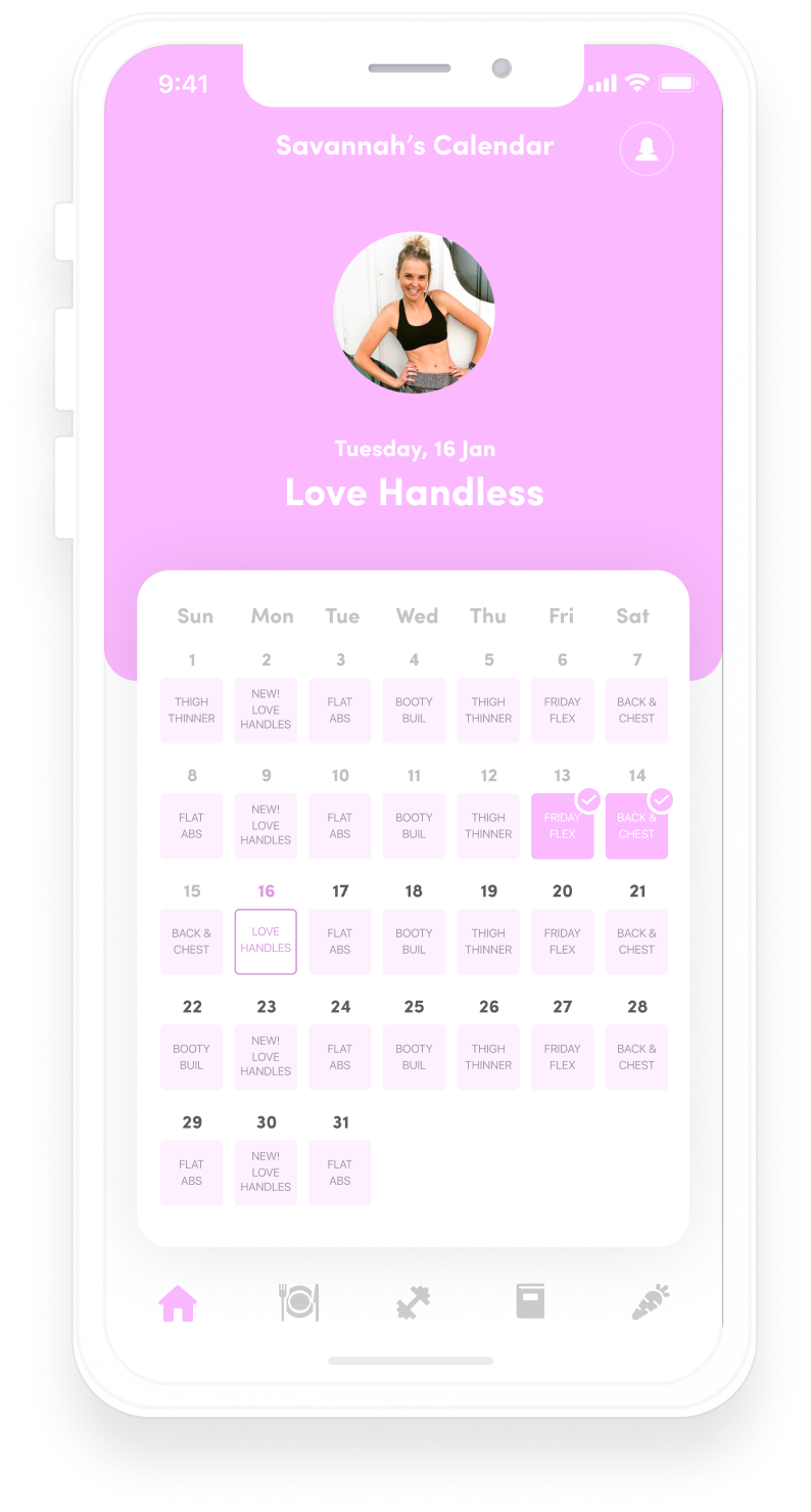
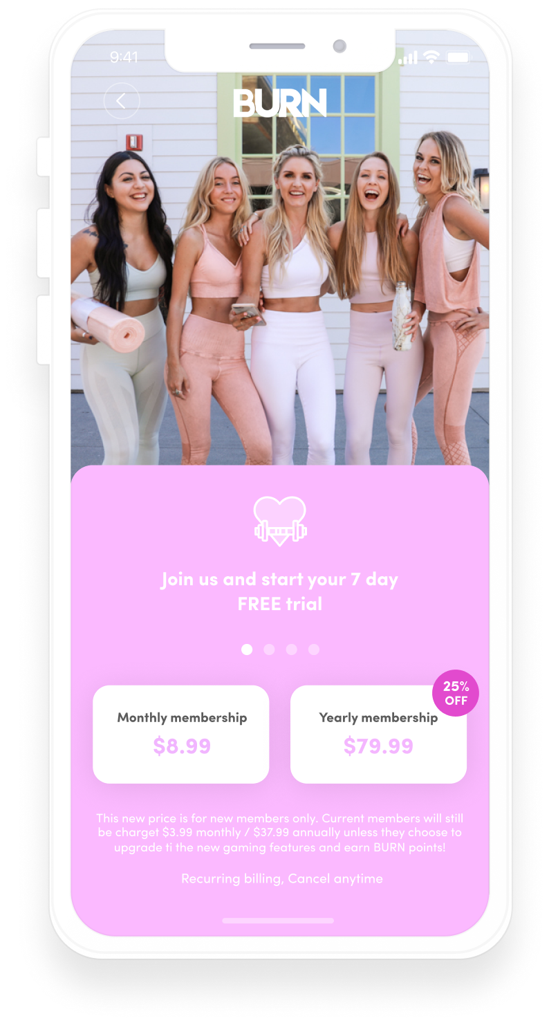
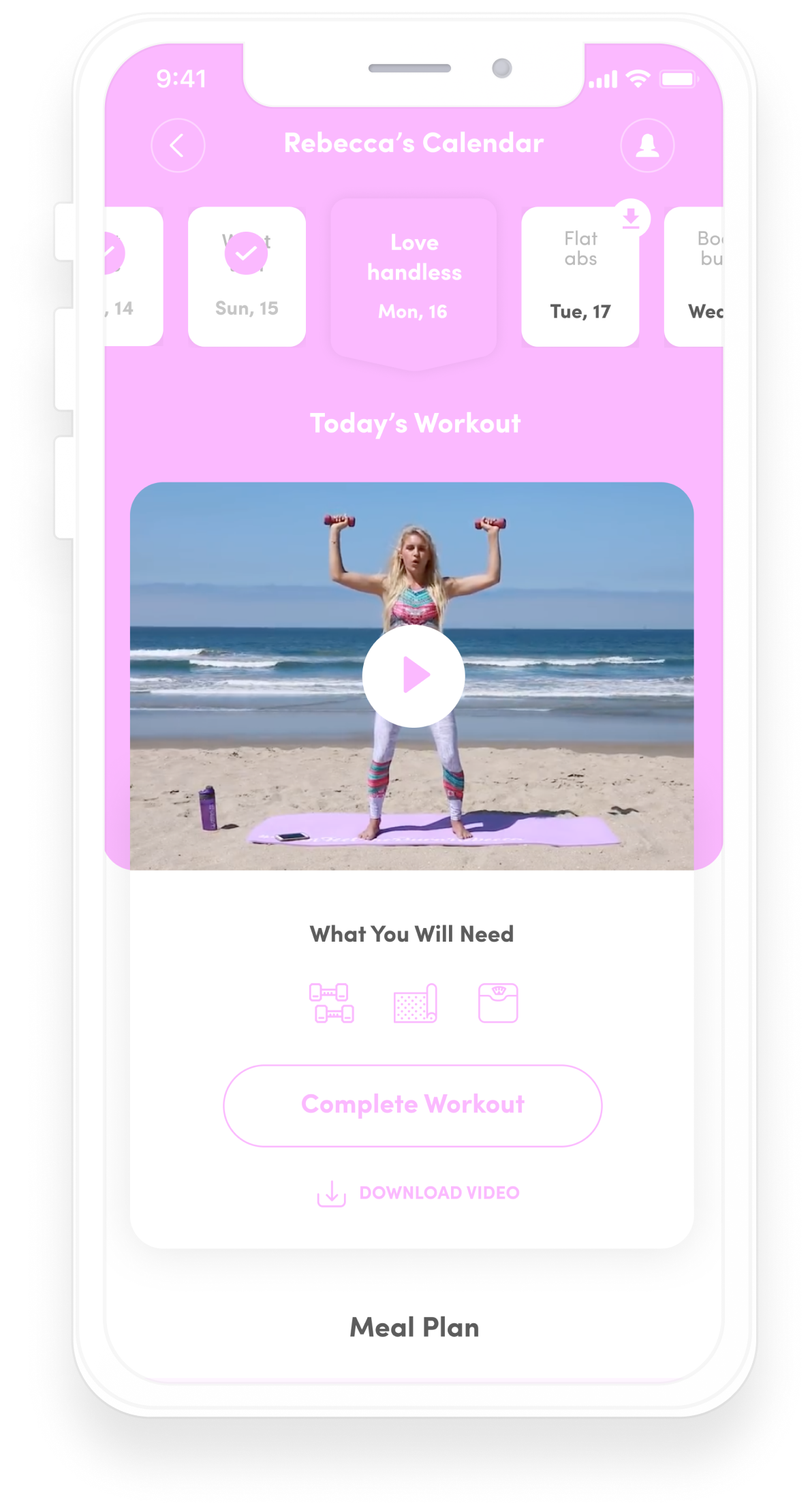
Burn app
Personalize the App Experience
Users love nothing more than personal touches that make apps feel like they know their preferences and needs. Adding personalization hooks users up on your app and definitely is among the tricks for increasing user engagement.
Imagine this: you open an app and see exactly what you need or get a suggestion that perfectly matches your taste. Why wouldn’t you tap it?
Here are some examples of personalization features you can implement:
- Smart product suggestions with AI: Use AI to analyze user preferences and browsing history to recommend products that suit their interests.
- Workout, meditation, or content suggestions based on user history: Offer personalized suggestions for fitness routines, meditation sessions, or articles based on the user’s previous choices.
- Activity history: In Perpetio's workout app, users see a "Just like your last workout" banner on the home screen. This allows them to easily repeat their previous routine, making it easier to get started with familiar exercises.
- Location-based recommendations: Suggest nearby restaurants, stores, or events based on the user’s location, giving them relevant options wherever they are.
- Custom notifications: Let users choose the type and frequency of notifications they receive, ensuring they only get alerts that matter most to them.
- Personalized themes: Allow users to customize the app’s appearance with themes or color schemes that match their personal style.
- In-app content tailored to user preferences: Whether it’s a news app curating stories based on reading habits or a streaming service suggesting new shows, tailored content keeps users engaged.
By implementing these personalization strategies, you not only create a unique experience for each user but also increase retention by making your app a part of their daily routine.
Prioritize Accessibility
You can't keep your users engaged if your app is difficult to navigate, stubborn to adjust to their needs, or simply unavailable for certain users. Accessibility is among top recommendations for user engagement.
Accessibility is not just about meeting compliance standards — it’s about ensuring that all users, regardless of their abilities and tech proficiency, can comfortably use your app. Here are some tips to increase accessibility and improve your user engagement strategy:
- Give font options: Allow users to adjust text size and choose from different font styles for easier readability.
- Enable Siri or other voice control; provide audio versions of content: Voice commands and audio alternatives make your app more inclusive. Use AI to generate audio versions of your content to cater to users with visual impairments or those who prefer listening.
- Let users choose between colors, palettes, designs, etc.: Providing color customization options, including high-contrast or color-blind-friendly palettes, ensures that your app is accessible to users with different visual needs.
- Simplify navigation: Make the app’s layout and navigation straightforward. Clear menus, intuitive pathways, and easily identifiable buttons not only improve accessibility but also enhance the overall user experience. This should always be a priority.
- Use simple vocabulary and clear CTAs: All users, regardless of their tech skills, should understand what a button or feature does instantly. Instead of complicated or confusing language like “Terminate operation without preservation,” go for something clearer like “Exit without saving.” Simpler UX writing leads to fewer misunderstandings and smoother interactions.
By incorporating these strategies, you’ll create an app that is not only accessible to a broader audience but also provides a smoother, more engaging experience for all users.
Consider Perpetio Your Trusted Partner
At Perpetio, we believe in creating user experiences that not only attract but also retain users. What good is a high download rate if your users delete the app the same day because it's inconvenient?
One prime example of this philosophy in action is our collaboration with the Eargym app, where we focused on enhancing user engagement through innovative design and research-driven strategies.
One notable innovation our team proposed for the eargym app was a subscription monetization model. Collaborating closely with eargym’s in-house research team, Perpetio specialists explored the time it typically takes for users to adopt a new habit, such as completing exercises in the app. Our research indicated that it generally takes 14 to 21 days to form a new habit, and we leveraged this insight to develop a new monetization strategy for eargym.
As a result, eargym now offers a 14-day free trial, encouraging users to establish a daily routine for caring for their hearing. This approach has shifted user motivation from impulsively purchasing a subscription to gradually investing in a monthly membership after experiencing the app’s value. A/B testing has shown promising outcomes, revealing a 40% increase in active users since implementing this innovation.
At Perpetio, we believe in designing apps that not only meet user needs but also engage them and simply be fun. If you’re looking to enhance user engagement in your mobile app, let’s work together!
Contact us today to explore how we can help you create an app that users love and keep coming back to.
