Data visualization is a form of communication that portrays dense and complex information in graphical form. The resulting visuals are designed to make it easy to compare data and use it to tell a story — both of which can help users in decision making.
Why do we need this?
We are an inherently visual world, where images speak louder than words. In the current era of Big Data, understanding how to visualize data is an important skill!
Nowadays more and more companies are using machine learning to collect mass amounts of data. While it’s great that they’re able to do this so quickly and effectively, it also calls for a way to sort through, comprehend, and explain this data in a way that makes sense to both the business owners and stakeholders.
Data visualization can also:
- Identify areas that need attention or improvement.
- Clarify which factors influence customer behavior.
- Help you understand which products to place where.
- Predict sales volumes.
One of the biggest challenges for business users is deciding which visual should be used to best represent the information. So here are some tips:
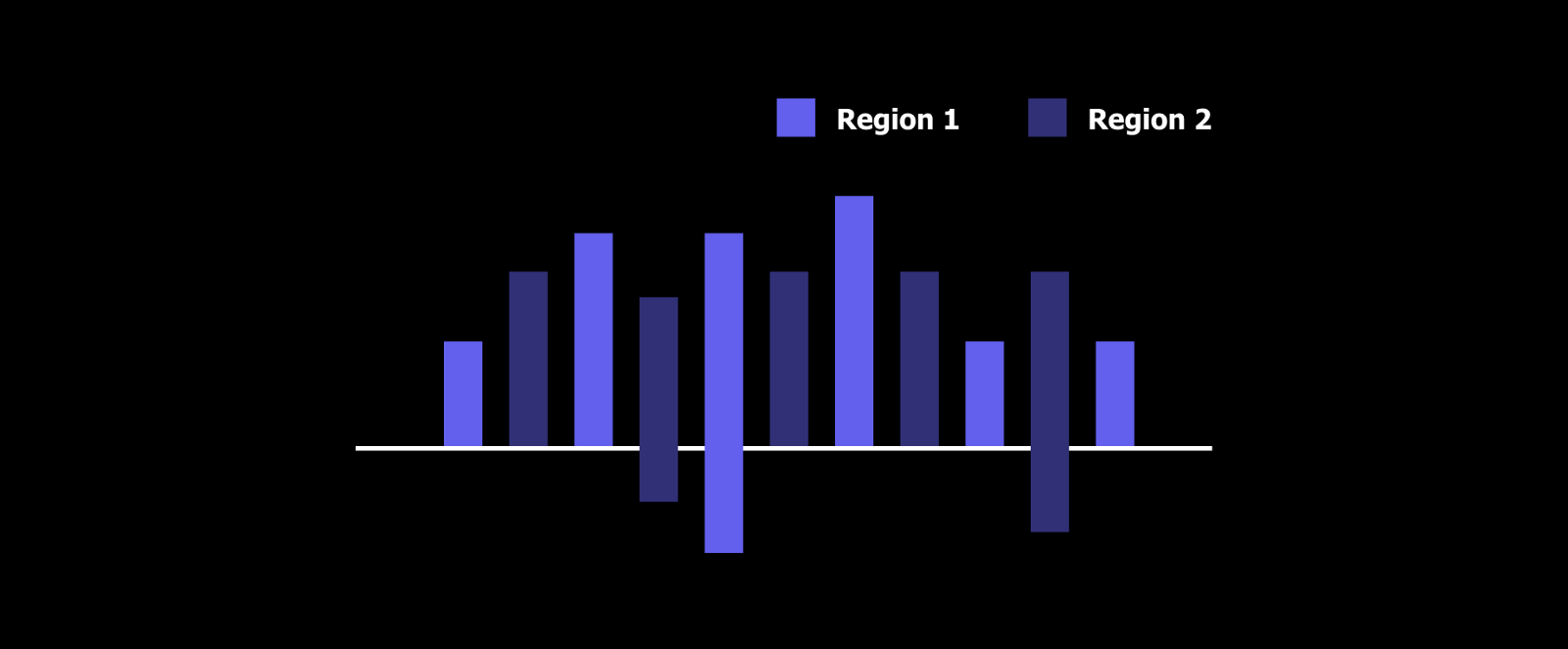
Bar Chart
The classic Bar Chart uses either horizontal or vertical bars (column chart) to show discrete, numerical comparisons across categories. One axis of the chart shows the specific categories being compared and the other axis represents a discrete value scale.

Quick tips:
- Use a bar chart on both sides of the coordinate axis.
- Don’t place your legend under the chart. Legend is an important part of your graph.
- Legend elements order = chart elements order.
Multi-line
The multi-line chart shows the relationship between the independent and dependent values of multiple sets of data.
The primary use of line charts is to display trends over a period of time (marijuana use by youth by year, trends in clients served at a food pantry by quarter, website page hits by hour). The Time unit (years, quarter, months, hours of the day, etc) is distributed evenly along the horizontal axis. The magnitude of each data element in the series is represented by its position on the vertical axis. The line in the Line Chart connects the individual data points across the time period.
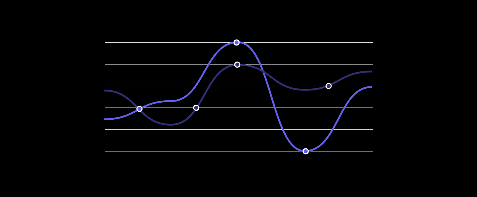
A quick tip: Select proper chart height and line thickness. It must be readable but not overweight.
Pie
Pie Charts help show proportions and percentages between categories, by dividing a circle into proportional segments. Each arc length represents a proportion of each category, while the full circle represents the total sum of all the data, equal to 100%.
Pie charts have a fairly narrow use-case that is encapsulated particularly well by its definition. In order to use a pie chart, you must have some kind of the whole amount that is divided into a number of distinct parts.
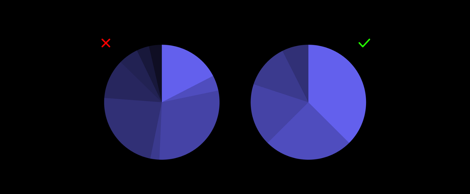
Quick tips:
- Limit the number of divisions inside the chart.
- Arrange chart segments from largest to smallest by clockwise.
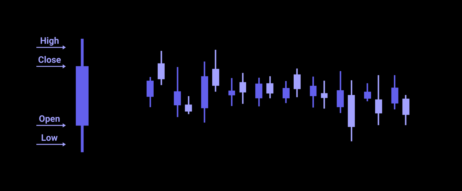
Candlestick
A candlestick chart (also called Japanese candlestick chart) is a style of financial chart used to describe price movements of a security, derivative, or currency. Each “candlestick” typically shows one day, thus a one-month chart may show the 20 trading days.
Compared to traditional bar charts, many traders consider candlestick charts more visually appealing and easier to interpret. Each candlestick provides a simple, visually appealing picture of price action; a trader can instantly compare the relationship between the open and close as well as the high and low.
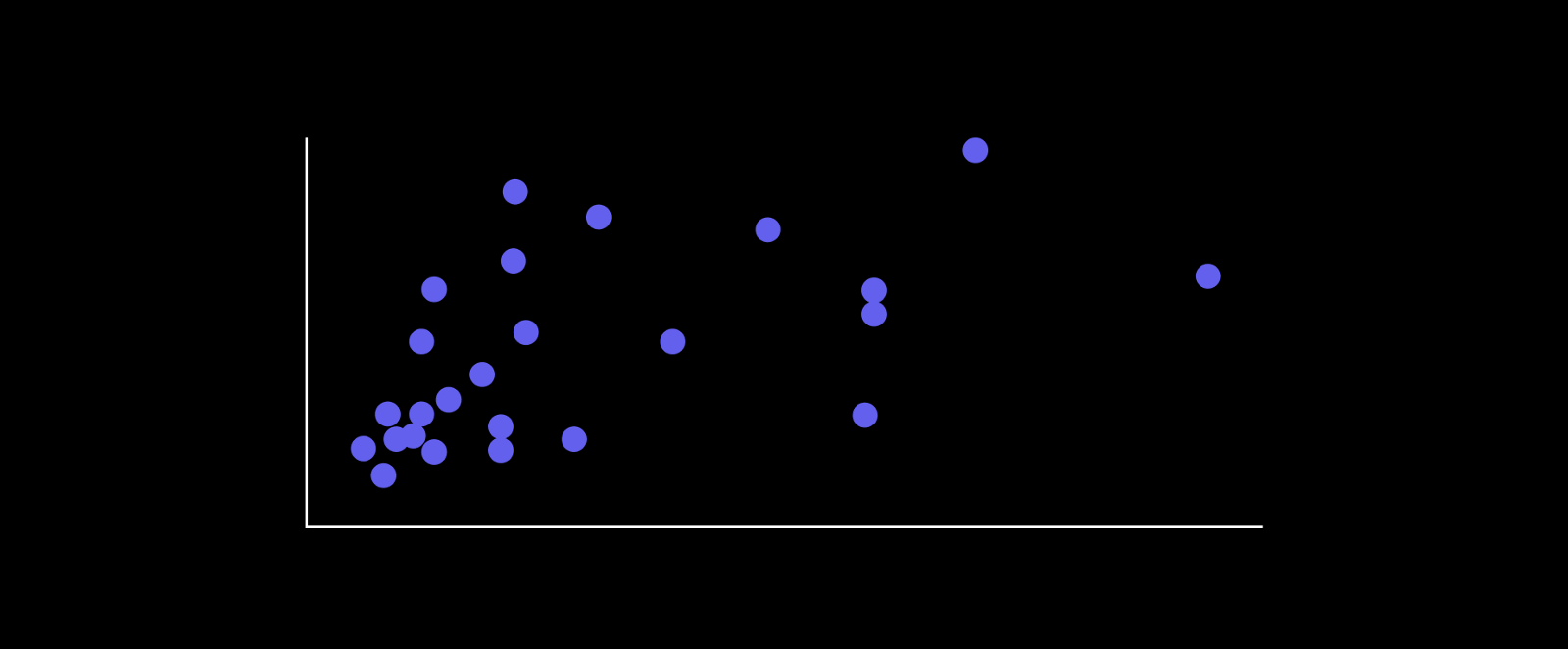
Scatter plot
A scatter plot (aka scatter chart, scatter graph) uses dots to represent values for two different numeric variables. The position of each dot on the horizontal and vertical axis indicates values for an individual data point. Scatter plots are used to observe relationships between variables.
The dots in a scatter plot not only report the values of individual data points but also patterns when the data are taken as a whole. Scatter plots are sometimes called correlation plots because they show how two variables are correlated.
This is an effective way to give users a sense of trend, concentration and out of collection data.
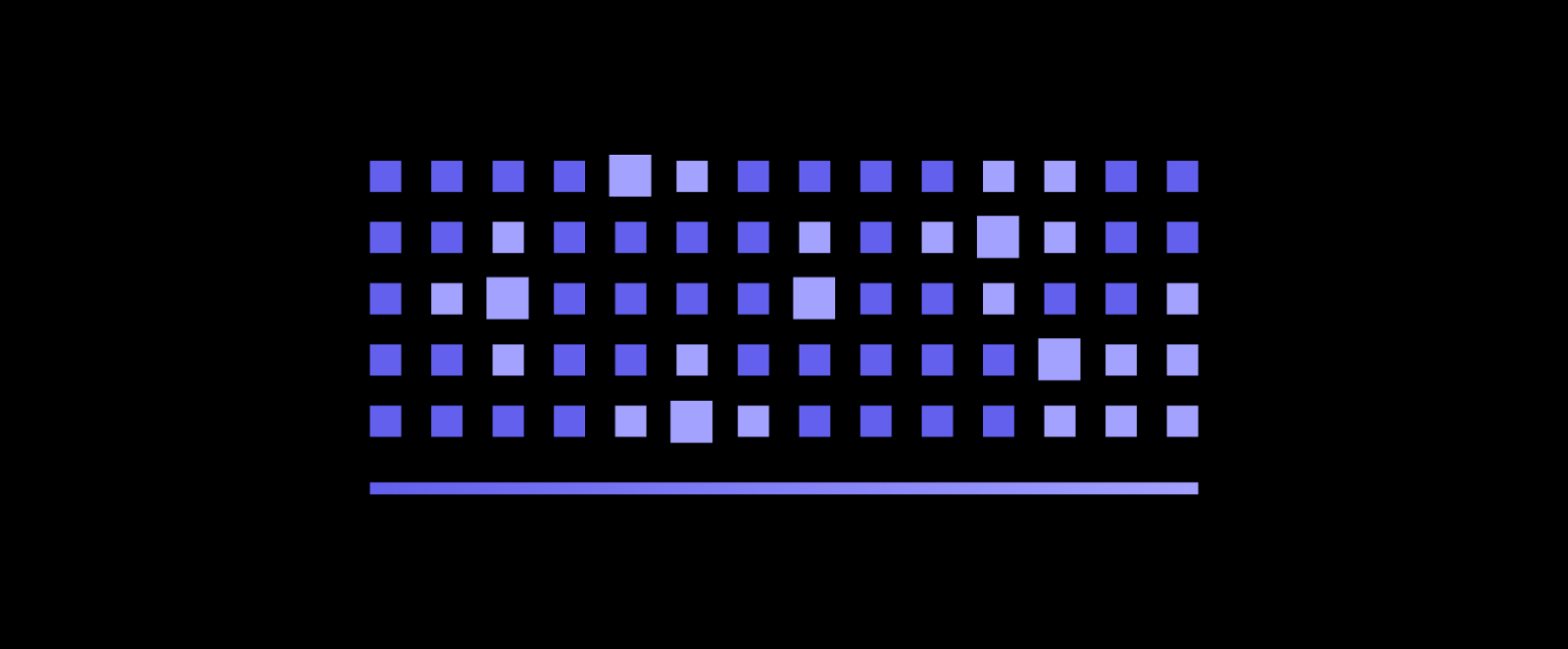
Heatmap
A heatmap (aka heat map) depicts values for the main variable of interest across two axis variables as a grid of colored squares. The axis variables are divided into ranges like a bar chart or histogram, and each cell’s color indicates the value of the main variable in the corresponding cell range.
Cell colorings can correspond to all manner of metrics, like a frequency count of points in each bin, or summary statistics like mean or median for a third variable.
As an associated note, it is generally required for a heatmap to include a legend for how colors map to numeric values. Since color on its own has no inherent association with value, a key is vital for viewers to grasp the values in a heatmap. An exception for including a legend can come when the absolute association of value to color is not important, only the relative patterns of data plotted.
Radar
As known as: Spider Chart, Web Chart, Polar Chart, Star Plots.
Radar charts are a way of comparing multiple quantitative variables. This makes them useful for seeing which variables have similar values or if there are any outliers amongst each variable. Radar charts are also useful for seeing which variables are scoring high or low within a dataset, making them ideal for displaying performance.
Each variable is provided with an axis that starts from the center. All axes are arranged radially, with equal distances between each other, while maintaining the same scale between all axes.

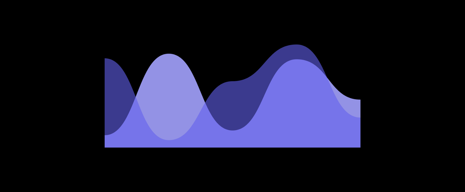
Area chart
An area chart combines the line chart and bar chart to show how one or more groups’ numeric values change over the progression of a second variable, typically that of time. An area chart is distinguished from a line chart by the addition of shading between lines and a baseline, like in a bar chart.
An area chart is typically used with multiple lines to make a comparison between groups (aka series) or to show how a whole is divided into component parts. This leads to two different types of an area chart, one for each use case.
References:
1. https://chartio.com/
2. https://datavizcatalogue.com/
3. https://www.sas.com/
4. https://school.stockcharts.com/
5. https://www.investopedia.com/
Got interested? Just describe your idea and we will get back to you! contact@perpet.io
Follow us:
Facebook Instagram Dribbble Behance
Check out Perpetio featured as Top App Design Company.