I’ve been inspired by so many people at #krupa2019 🤩
We have a HUGE design community! Thanks to @prjctr_kyiv for organization! Many design careers started there, so did my 😊
I decided to collect all the info from the courses and start sharing UI basics. Let’s start from typography!
1. Hierarchy
Just by resizing the elements you can phrase a bold, easy to read copy.
There are numerous ways to establish hierarchy: contrast, color, size, weight, layout. We’ll be discussing all of this, so keep reading 🧐
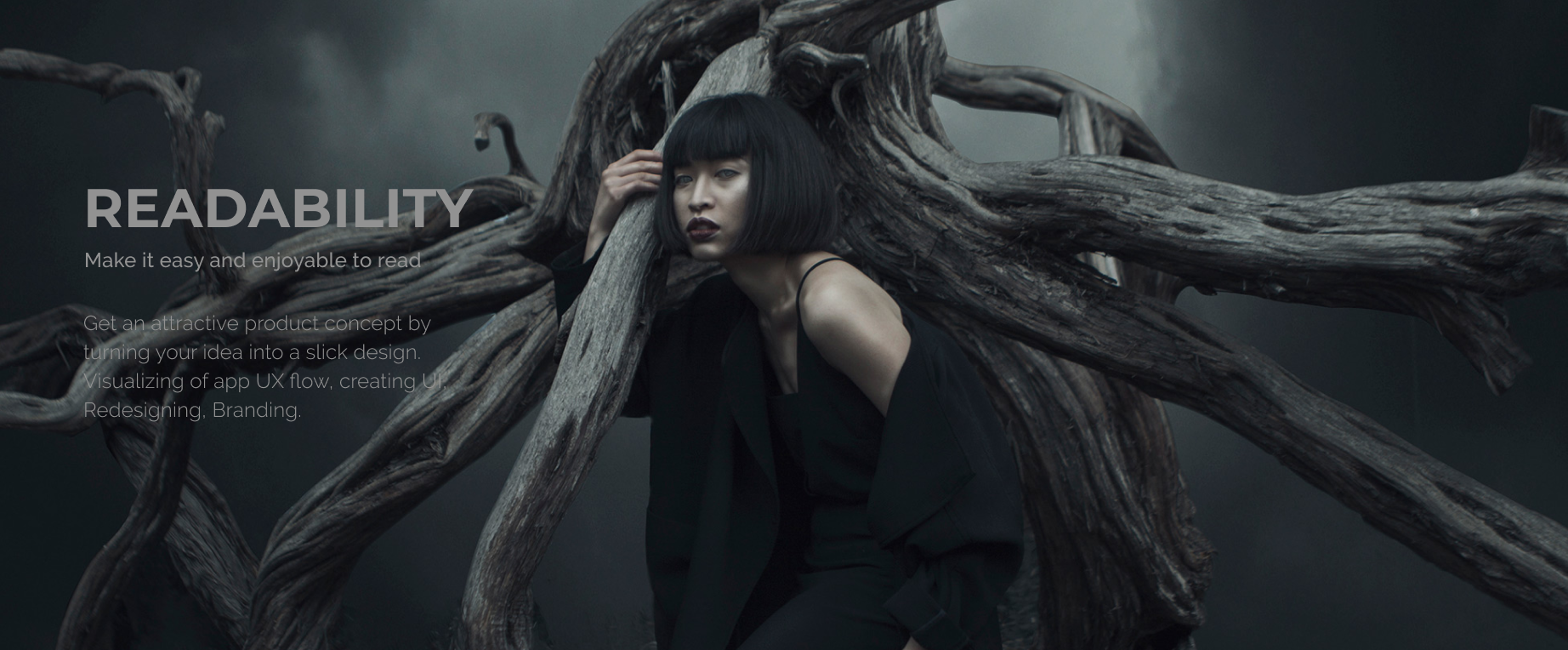
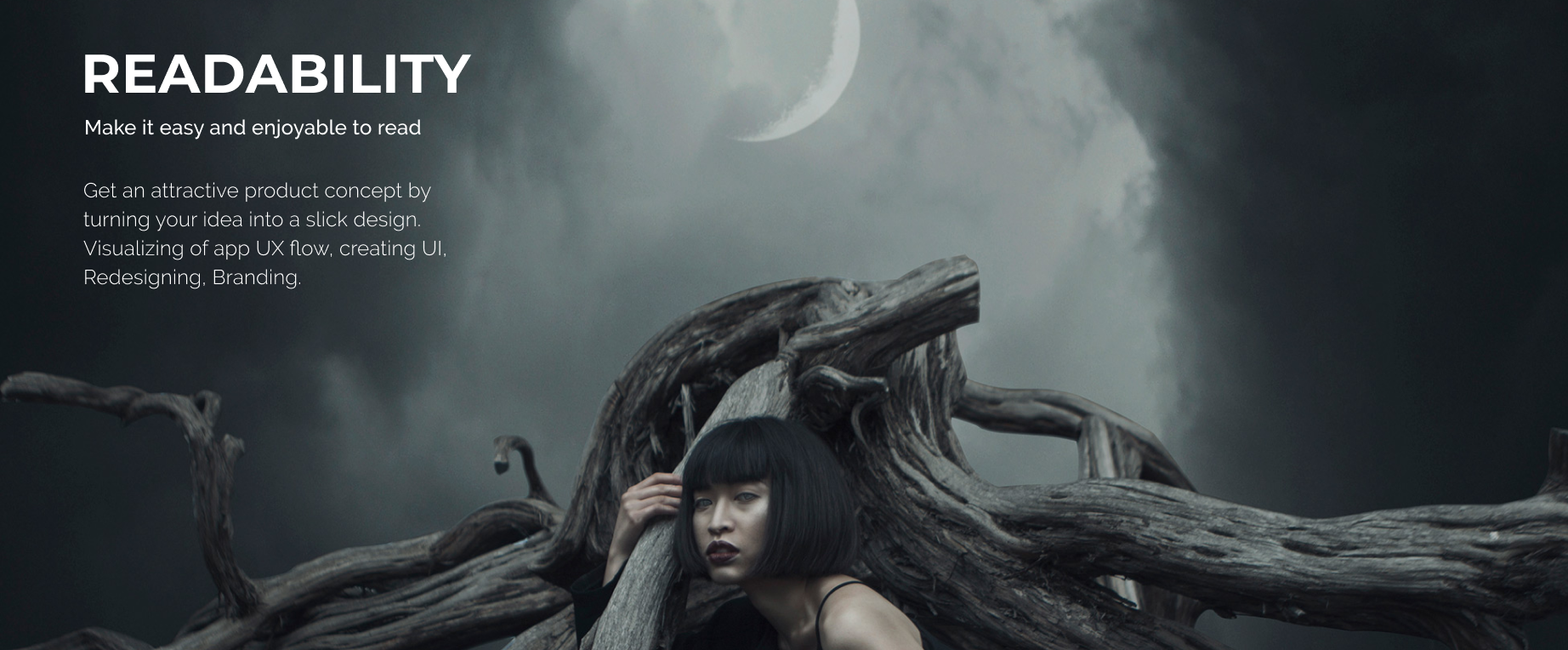
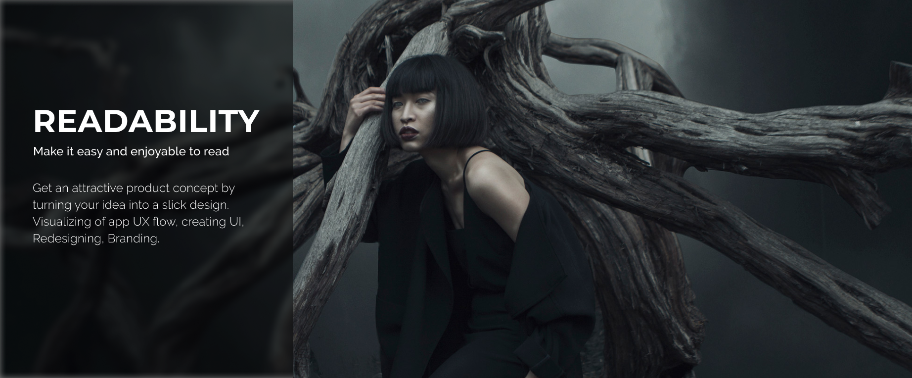
2. Readability
The text is readable when it has the following:
– Contrast, especially value contrast (difference in brightness, as opposed to the difference in hue or saturation)
– Appropriate tracking (space between characters)
– Appropriate leading (space between baselines)
– A typeface without bells and whistles
– Sufficient size
– Noise-free background
– White space around
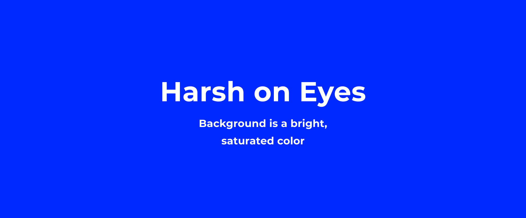
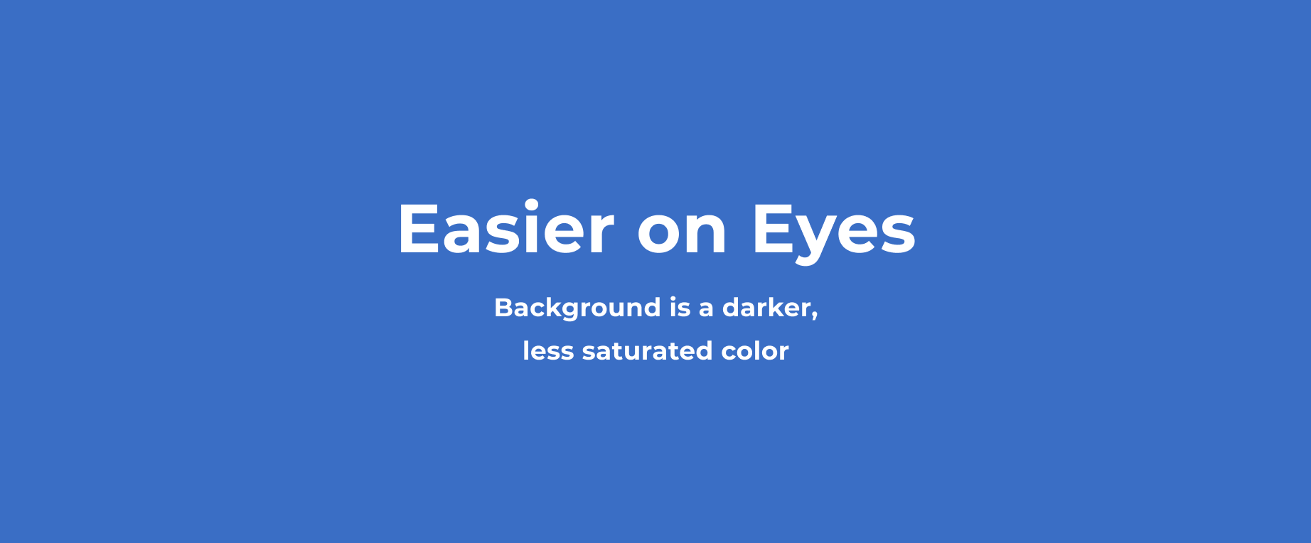
3. Color
Don’t use the same or similar colors for text and background. The more visible the text, the faster users are able to scan and read it. The W3C recommends the following contrast ratios for body text and image text:
– Small text should have a contrast ratio of at least 4.5:1 against its background.
– Large text (at 14 pt bold/18 pt regular and up) should have a contrast ratio of at least 3:1 against its background.
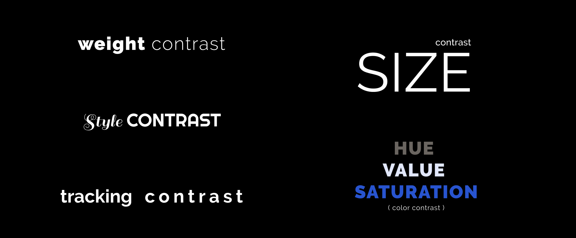
4. Contrast
When we talk about contrast in typography, it can mean several things:
– Size Contrast
– Weight contrast
– Color contrast
– Tracking contrast
– Style contrast
Try clashing different styles for frivolous typography which doesn’t give a damn. For example, handwritten Script and monumental Slab.
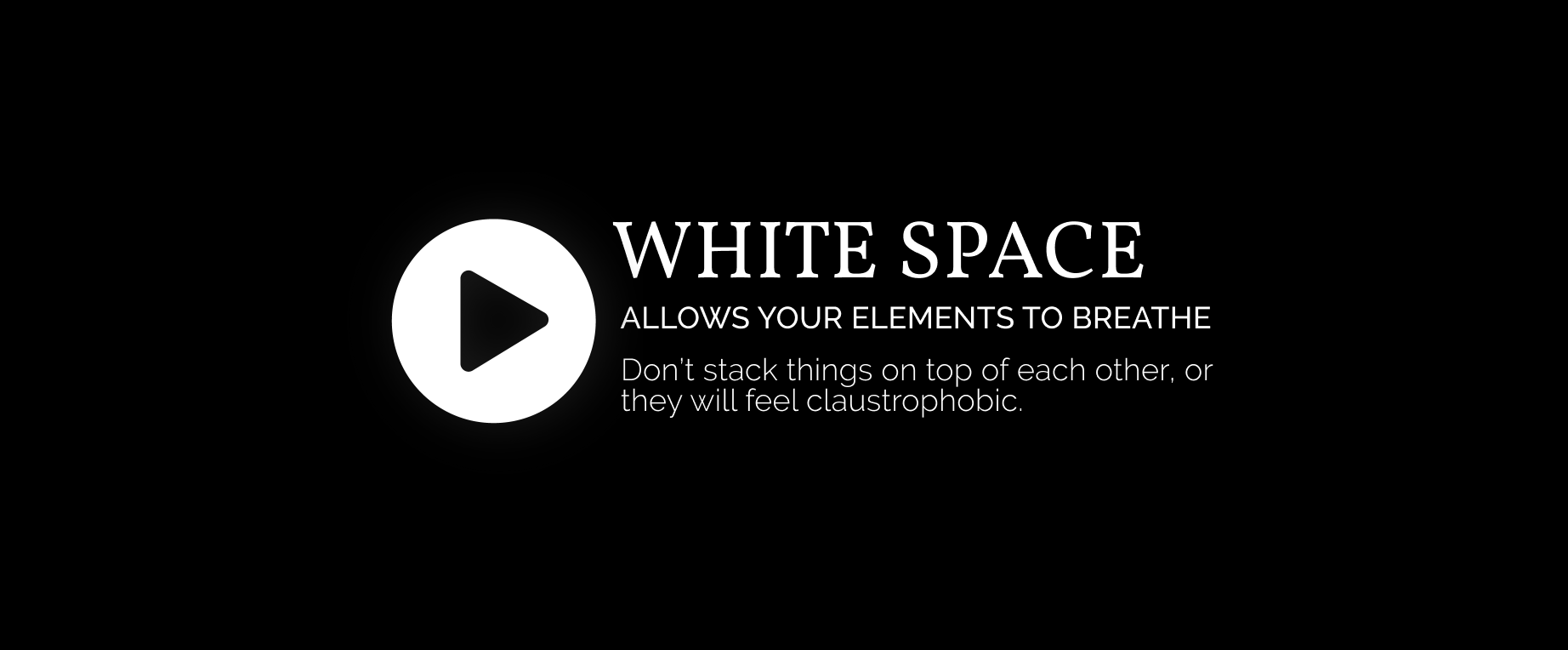
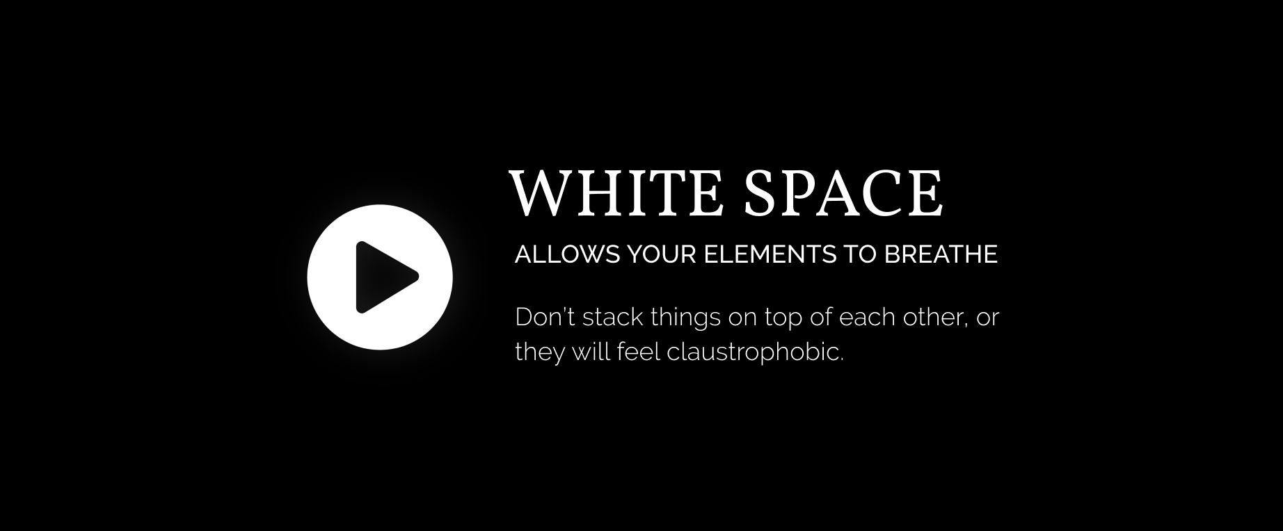
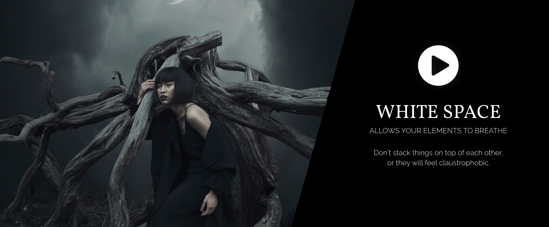
5. Whitespace
Design elements need some air to breathe. Separate the blocks of text by adding the empty (or we say white) space in between them. Mind the margins and stay away from the edges of the image.
Clumping design elements together is easily one of the most common typography mistakes, so be aware of it ☝️
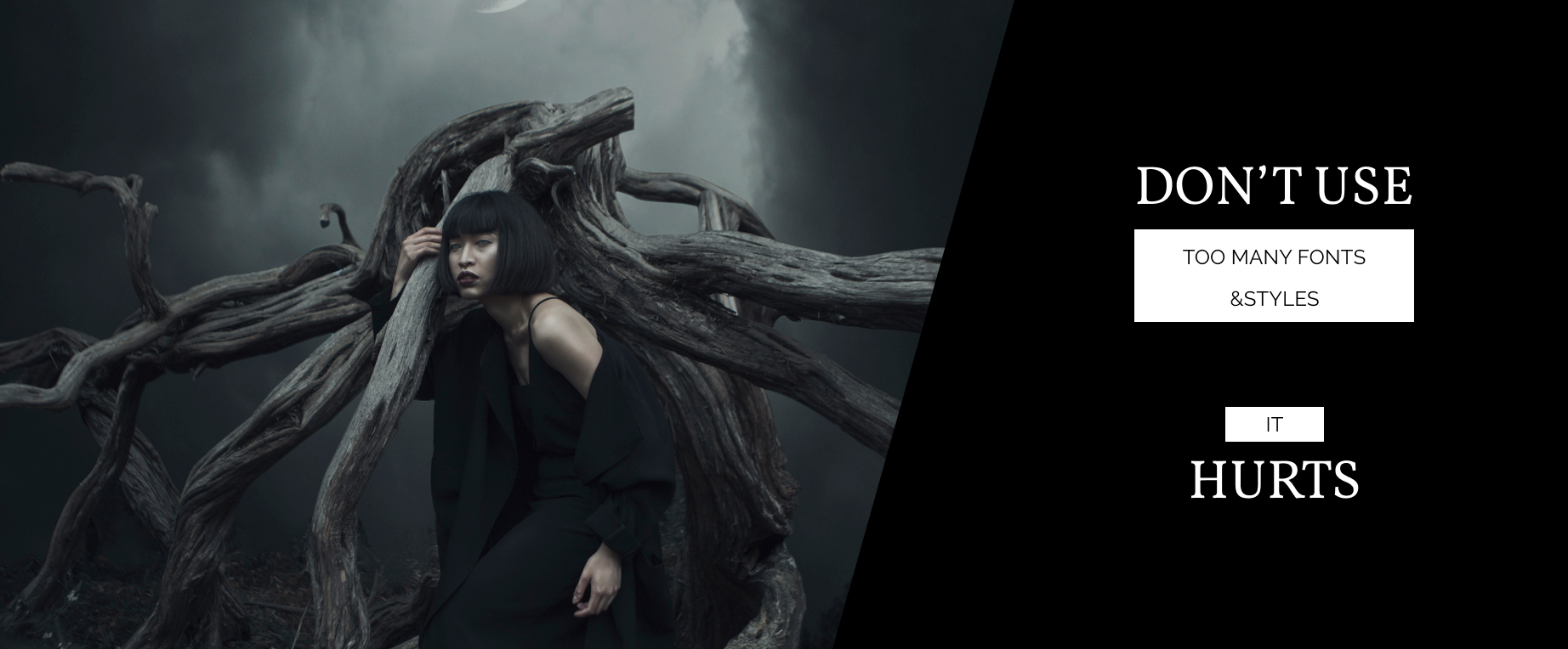
Quick tip: Use more than two fonts only if you are forced to.
6. Alignment
Be consistent with the alignment. Draw an imaginary grid that sticks on top of your design. Then align the elements according to this grid. Avoid the parts that penetrate the outer walls of the grid. Align the most of the elements to the left, center or right side.
Ask yourself, what would Forrest Gump do? 🤔
Often the simplest solution is the right one. Say, just left-align everything.
Quick tip: White space is a crucial part of the alignment.
7. How to pair fonts
– Stay away from pairing two Serif typefaces. It’s better to pair Serif and Sans Serif.
– Be careful with the fonts of similar weight. It’s much better to pair super heavy and hairline, than bold and semi-bold.
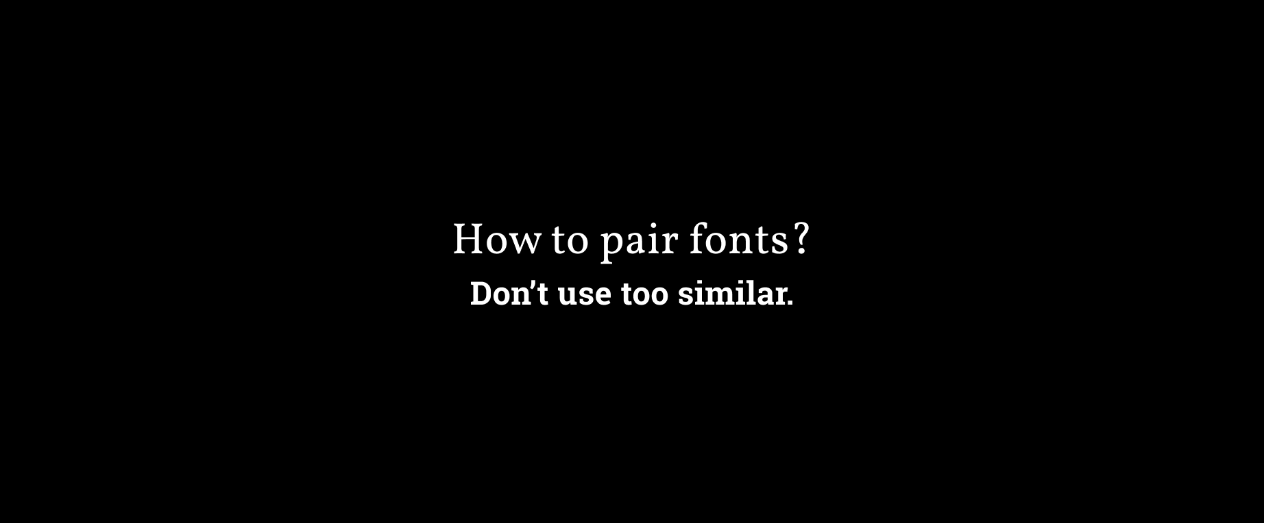
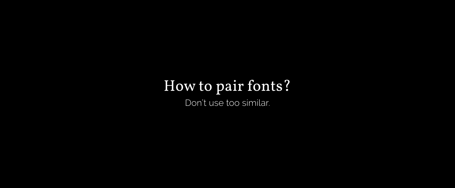
Other ways of adding much sought-after contrast is tweaking the tracking (space between characters). Or you can try pairing the radically different styles, for example, Sans Serif and Hand-written Script.
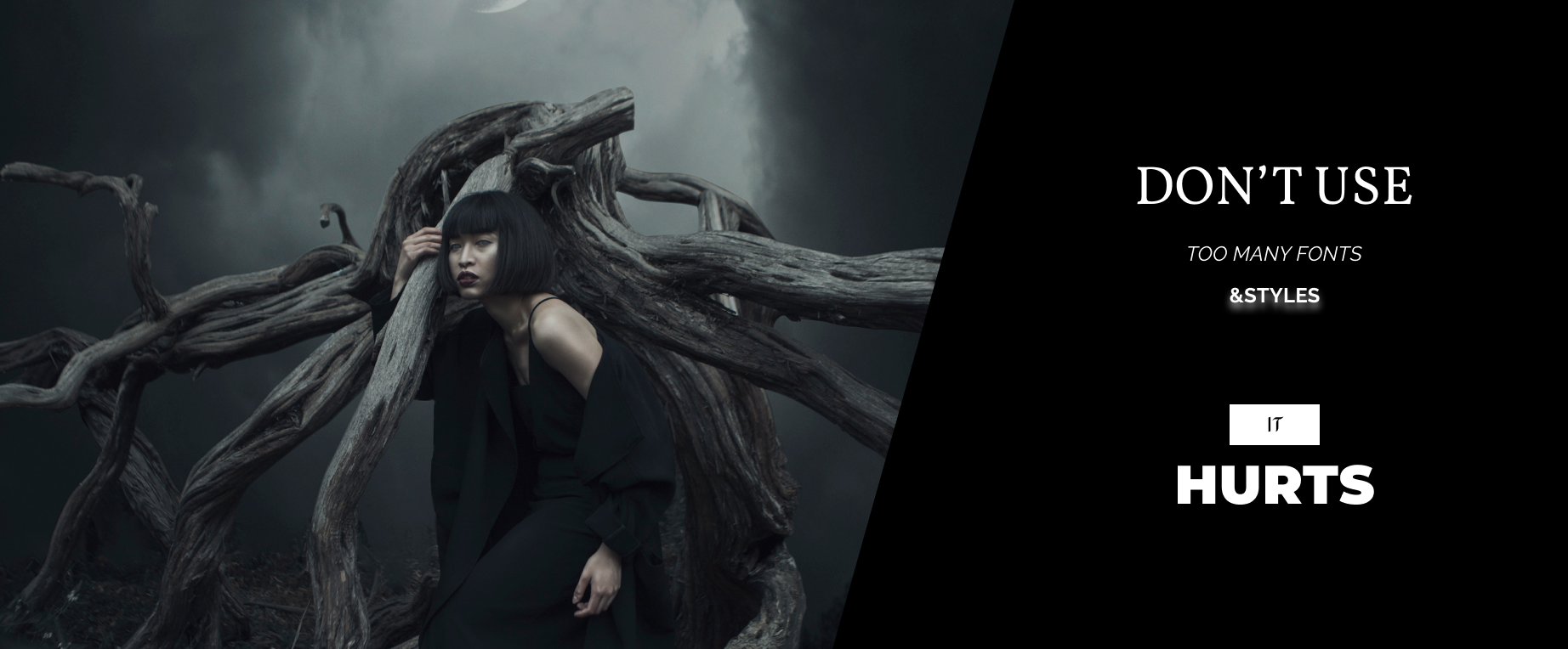
8. Consistency
Consistency is gold ⭐️
Be humble, stick with no more than a couple of fonts per image. Limit the cheesy effects like shadows, outlines, and gradients. These self-limitations don’t cripple the creativity as it may seem. On the contrary, they fuel our creativity engine by making us choose wisely. Use repetition and stick to one visual language throughout the design to avoid clashing styles.
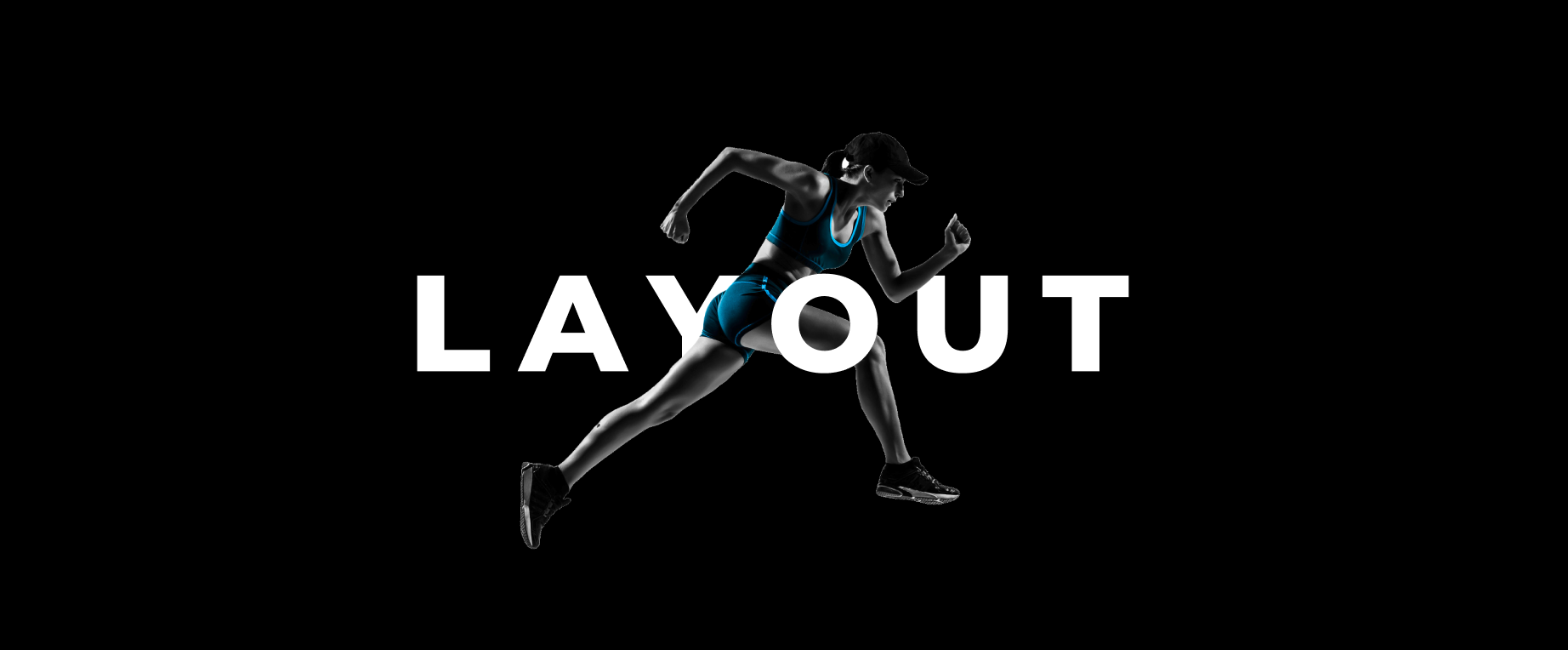
9. Layout
How to master text layout?
– Pick colors that work
– Pair your fonts
– Use headers properly
–️ Karate chop your paragraphs
–️ Use bullet points and numbers
–️ Mix up your content
10. Extra variety
As a finishing touch, throw in some extra chocolate chips. It can be anything, as long as it adds to the Oomph factor 🤩
– Labels
– Icons
–️ Lines
–️ Hand-painted elements
–️ Modified symbols (reversed V letter instead of A)
–️ Tiny irregularities (chopped angle, extra dot beneath the I letter)
–️ Use non-textual elements to bring the extra cool to your typography.
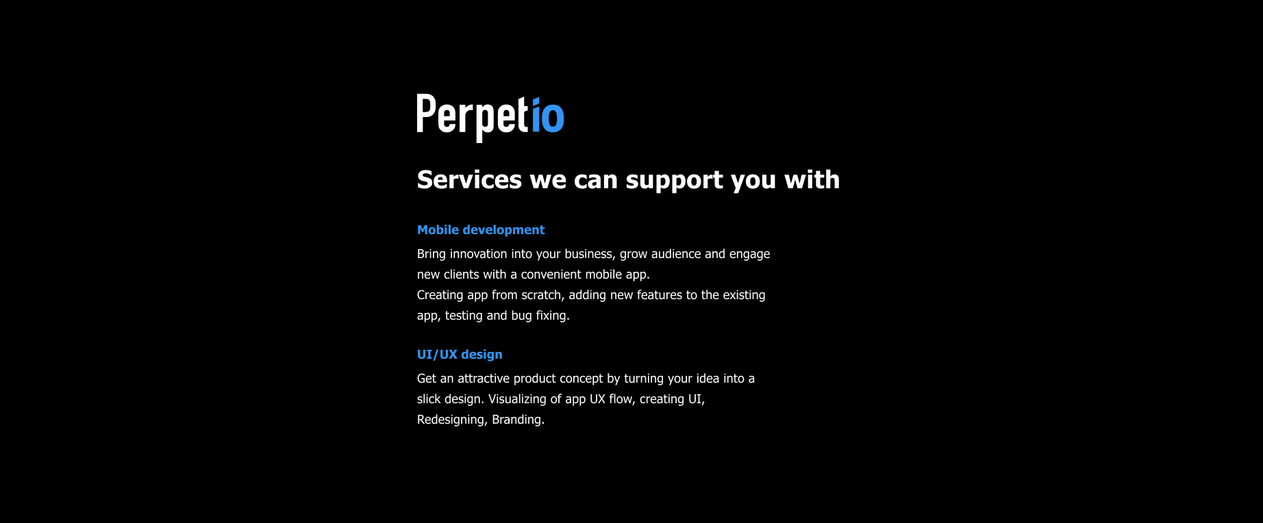
Got interested? Just describe your idea and we will get back to you! contact@perpet.io